Posts for: jmdenver
Apr 26, 2018 07:00:54 #
Apr 25, 2018 22:45:06 #
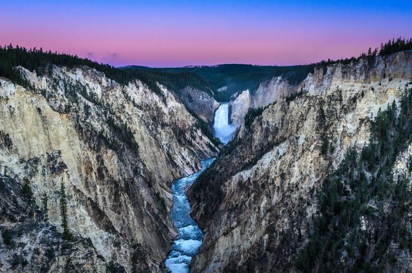
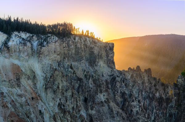
I took these photos from one of the observation areas a couple of years ago at sunrise. Definitely worth getting up early if you are in the area. The second photo is about 180 degrees from the first. I was so enamored with the falls that I almost forgot to look behind me.
Apr 25, 2018 22:36:09 #
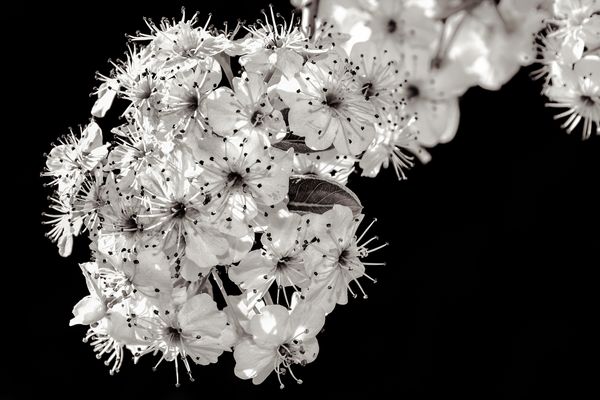
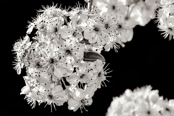
allanj wrote:
Very nice picture. I might try getting rid of out-of -focus bloom in lower right. I think it detracts from image. At least worth trying.
allanj, I took your advice and eliminated the foreground flower. Here's the result. What do you think?
Apr 24, 2018 22:31:04 #
That you all for your remarks. I appreciate you taking the time to look and comment.
Apr 24, 2018 12:29:17 #
I attempted to post this photo earlier but for some reason, it didn't load. I am trying to do it under a new thread. Success!
Apr 23, 2018 22:08:52 #
Great shots. It is hard to locate these nests in the wild. They are so small and usually well camouflaged. Good eyes! What state were these taken in?
Apr 23, 2018 22:00:30 #
Thank you to all who took the time to offer your opinions. I appreciate your collective knowledge and input.
Apr 23, 2018 21:57:26 #
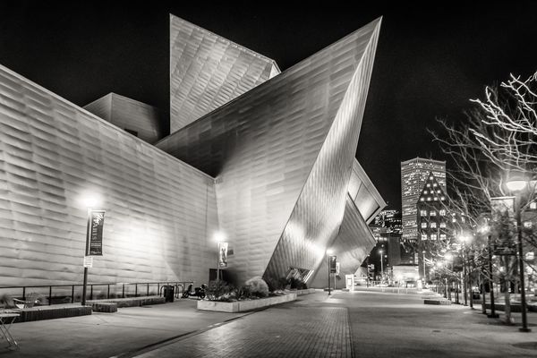
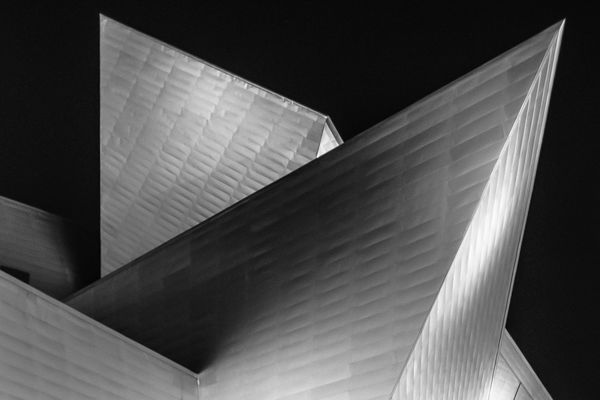
The Frederic C. Hamilton Building, better know as the Denver Art Museum extension, is a unique geometric structure designed by Daniel Libeskind. The building is clad with 9,000 titanium panels that cover the building's surface and reflect the Colorado landscape. The building is situated near the heart of the city, but construction around the museum has made it difficult to find uncluttered opportunities to photograph it. I thought some night shots might enable me to isolate the building and obscure some of the clutter. Again, I feel these photos are better represented in B&W than in color. Constructive comments are always welcome.
Apr 23, 2018 08:32:31 #
fergmark wrote:
I have continued to play with this photo and its just full of possibilities. Blue and red/yellow dominate. Using a blue filter vs a yellow filter yield radically different approaches, but I think either makes a good places to start. I think there are many more than one very successful black and white versions.
I'd love to see what you came up with using your filters. Would you mind posting?
Apr 22, 2018 18:17:08 #
jayd wrote:
Think i like the color better
Thanks for offering your opinion, jayd. In this case, I think I prefer the color better too.
Apr 22, 2018 18:15:31 #
alx wrote:
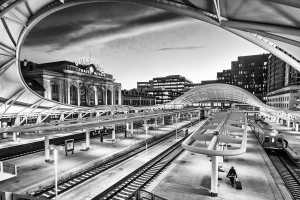
Don't hate me, but my gut was right. At least for me, I definitely prefer the original. The others are nice posters, and that may have been your intention, but I feel I could walk into the original. That works best for me.
I agree with Linda in that a little more of that top curve would be nice, especially in the posters.
I agree with Linda in that a little more of that top curve would be nice, especially in the posters.
Not in the slightest, alx. I appreciate the input. I, too, wish I had a bit more of the roof. As I recall, when I tilted the camera up even slightly, it distorted the buildings to a degree that I found unsatisfactory. I probably could have fixed the issue in PS to a degree, but I had to make a decision. I should have shot it both ways and made a decision once I was looking at the photo on a full size monitor, but I failed to do so. Experience is sometimes a painful teacher!
Apr 22, 2018 17:57:38 #
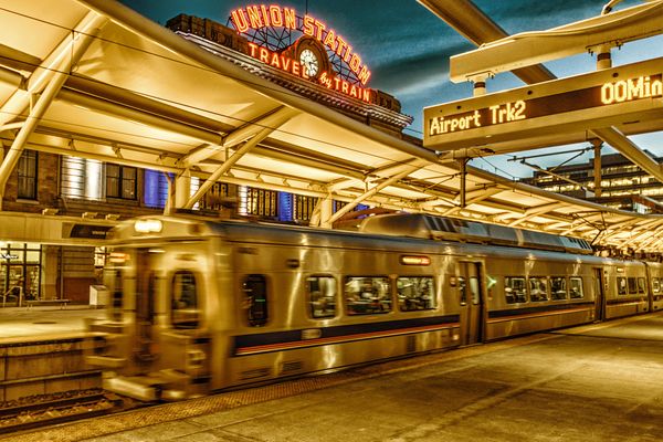
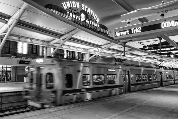
Here are two more from my Union Station outing. Still comparing color to B&W. Comments welcome.
Apr 22, 2018 17:56:30 #
Thanks for the translation, Ken. Before I saw the second line, my mind instantly jumped to something else!
Apr 22, 2018 17:45:28 #
wdross wrote:
I think this is the stronger B&W. Good job. And although the original is really good, I think I like your "treated" color shot better. Normally for me, it is just the opposite; normally it is the straight shot over the treated..
Thank you, wdross. I agree the second B&W is a better one. The added contrast, while subtle, gives just a bit more punch. I agree with you also. I am not usually one to modify photos too much from the original but I liked the look of the edited photos better than the original which was rather flat.
Apr 22, 2018 17:18:09 #
Linda, thank you for your reply. I went back and made the whites a bit whiter, to the point where some of the lights in the office building in the background are blown out. I don't think it detracts from the overall effect and the platform is now a bit whiter.