Posts for: FunkyL
Jul 6, 2023 09:55:28 #
Linda From Maine wrote:
Nice work!
The vertical aspect (portrait orientation) and the way the flag folds are the strengths IMO. I agree about making the flag brighter. Though I would say composite, I noticed that PS Elements has a guided edit called "Double Exposure."
https://www.digitalcameraworld.com/tutorials/how-to-create-a-double-exposure-in-photoshop-elements
.
I also use PSE, and was all set to be embarrassed that I hadn't seen that guided edit, but I checked my PSE 2019 and don't see that. I got a little help from a video that mostly used luminar, but mostly stumbled around on my own. Maybe I should move "upgrade PSE" a bit closer to the top of my want list.... I'm looking forward to viewing the link you sent. Thank you!
Jul 6, 2023 09:45:53 #
Jul 6, 2023 09:44:42 #
DirtFarmer wrote:
Since it started out as two separate exposures I would have called it a composite rather than a double exposure. Coming from film, 'double exposure' means to me two exposures on a single piece of film. Some digital cameras have that capability (using the digital sensor instead of film).
Purely semantics.
Purely semantics.
Semantics are especially important when asking for help on UHH. If I don't choose the right word, I may not get the correct answer. Composite it is!
Jul 6, 2023 09:39:15 #
Jul 5, 2023 18:24:26 #
Jul 5, 2023 18:23:42 #
joecichjr wrote:
A stupendous creation ❤️🤍💙🤍❤️
Thank you!
Jul 5, 2023 18:23:18 #
DirtFarmer wrote:
I would have used two (or more) separate images in Photoshop rather than try a double exposure. That allows you to better control the brightness of the individual images. I would make the flag in the background a bit brighter so it stands out better. But I think the idea is good.
I'm glad you like the idea. It started out as 2 separate images, the flag taken yesterday, and the fireworks a couple of years ago. Is that what you mean? Yes, deciding how bright to make the flag was one of the things I struggled with... Thanks for your comments!
Jul 5, 2023 16:59:16 #
I manage the FB page for our local group affiliated with a national organization that provides fly fishing training and outings for disabled veterans. I wanted to post a Happy Independence Day photo featuring a double image - didn't like what I came up with, so posted something more straightforward for this year, and went back to the original idea today to try again, maybe for use in a future post. What do you think? How is it technically, and is it too corny?

Jul 2, 2023 18:08:58 #
Jul 2, 2023 10:21:32 #
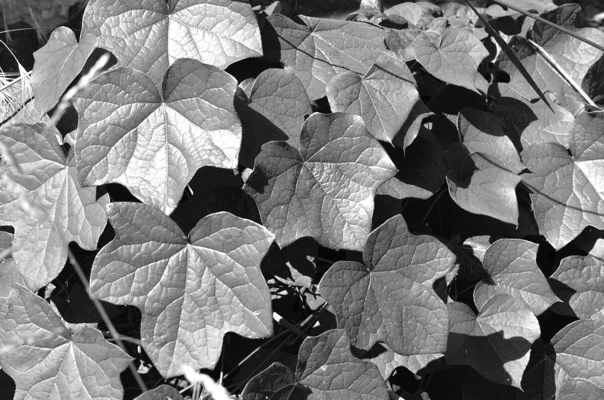
I was attracted by the sheen of light reflecting off these leaves more than the leaves themselves, so I converted it to B&W, hoping that would make that sheen more important in the photo. What do you think of it?
Jun 29, 2023 13:41:24 #
Hip Coyote wrote:
IMO, the subject appears washed out or muddy. A photo like this has to be crystal-razor sharp with fine detail on the shell. The dead centering of the shell detract from the composition as well. Can you up the detail, focus and contrast of the shell?
Cropping to move the shell off center would be easy, but the shell was worn and badly stained, and I've worked on it a fair bit already. Cropping would make it take up more of the frame, and likely make it's less than pristine state more obvious. I'm thinking that if I want a shot like this, but better, I should learn from this one, and go for a do over next time I'm at the beach, bring one I've picked up in the past, so I can pick my time of day and not have to hope for one to wash up. Even if I choose not to work on this one further, I thank you for your critique and suggestions.
Jun 29, 2023 13:17:10 #
magnetoman wrote:
I like both versions, cropped and not, but for me the ‘not’ wins as it gives setting, just like your original intention. I like that sort of detail.
Thanks Magnetoman!
Jun 28, 2023 08:07:52 #
magnetoman wrote:
I have the same problem, just cannot resist picking ‘em up!
With this shot I’d close in a bit on the subject and get it off centre. Then sharpen just the subject - and possibly play with the colours a little too. It will stand out nicely then.
With this shot I’d close in a bit on the subject and get it off centre. Then sharpen just the subject - and possibly play with the colours a little too. It will stand out nicely then.
I had tried cropping it closer, and know off center is generally more aesthetically pleasing... I ended up leaving it centered with a lot of OOF area around it to emphasize my spotting it from a distance and zeroing in on it as I walked "Ooh! Ooh! there's another! Is it pretty? Can I grab it before the next wave drags it back into the water?" I realize the viewer can't know that. It didn't occur to me to sharpen just the shell and try playing with it's color - sounds like a good idea, thank you, magnetoman!
Jun 27, 2023 19:43:49 #
Jun 27, 2023 19:39:11 #
photogeneralist wrote:
Yes!!!!!
Thanks for your suggestion photogeneralist, I like it!