Posts for: Wendy2
Dec 8, 2015 18:56:00 #
donolea wrote:
Thanks, I think bringing back some luminance to the chairs helped as well. :thumbup:
Yes, definitely!!!
Dec 8, 2015 14:32:26 #
Yooper 2 wrote:
It was. and that was after darkroom work. People who believe good photographers in the past didn't retouch are so wrong. Professional photographers did the most retouching. Now if I could just get as knowledgeable as Donolea. I haven't mastered layering yet.
It just takes patience and time!! You will be surprised at how proficient you can become at it by just doing it!!
Dec 8, 2015 14:21:14 #
Yooper 2 wrote:
I saw that too right away too. Heads in the origin... (show quote)
Wow! Now that would be a lot of work!!
Dec 8, 2015 13:51:16 #
Dec 8, 2015 13:50:18 #
robertjerl wrote:
Do any of you people really think this wasn't a planned staged video event?
Maybe so, but it get the point across!
Dec 8, 2015 12:34:02 #
Yooper 2 wrote:
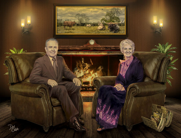
Much better. Very close to the OP's edit.
Yes.
What bothered me about the photo is that it looked like their heads did not belong ;)
Dec 8, 2015 12:32:49 #
Yooper 2 wrote:
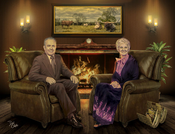
I did download them. Don't care for the pink saturation especially in the lady's hands. I still prefer the original. Of course it's just my personal opinion. Please don't take it personally.
I didn't do anything to her hands. In general the original was very pink.
Dec 8, 2015 11:13:54 #
He deserved the humiliation!!
Dec 8, 2015 11:09:08 #
donolea wrote:
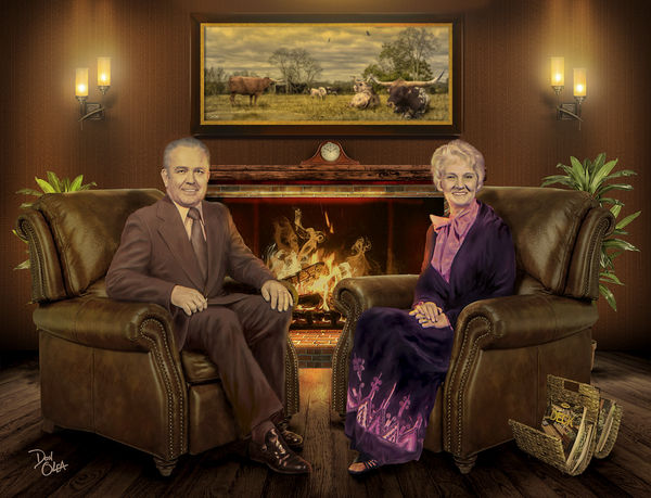
I toned down each face by 6%, and increased the brightness on both chairs to achieve a more realistic balance. I appreciate everyone's input.
I have a general question for you or anyone that might be able to shed light on this issue.
I noticed that when I see your original and compare it to your download, they look pretty much the same. BUT when I see my "original" and then download it, they look different. That is rather strange. Just wonder if anyone has an answer to why yours has consistency and mine does not
Dec 8, 2015 11:02:06 #
donolea wrote:
I toned down each face by 6%, and increased the brightness on both chairs to achieve a more realistic balance. I appreciate everyone's input.
Much nicer!!!
Dec 8, 2015 10:59:24 #
donolea wrote:
I downloaded them and I agree, no vibrance. And seeing how it's my piece I think I will go with what I like. ;-)
Of course you should go with the one you like and worked on. I think the job you did is remarkable. The only concern I have is how the heads look out of place.
Here I simply adjusted the heads and not the rest of the image.
Dec 8, 2015 10:00:35 #
CO wrote:
I recently got the Phottix Ares 8-channel transmitter and receiver kit. It was approximately $57. The receiver has a hot shoe to mount the flash. Cables are included for connecting the receiver to a studio strobe. The transmitter can be tilted forward to give it a low profile.
You have to deal with cables then.
Dec 8, 2015 09:56:30 #
Yooper 2 wrote:
Wendy, these are too dark for my taste. The scene has lost it's vibrance and cheerfulness.
Did you download them? The vibrance and cheerfulness is there, just does not show until the download. That it does not show until the download has been a problem with UHH...too bad.
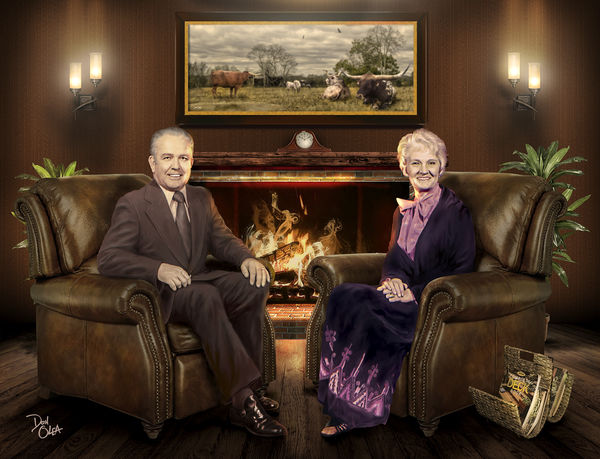
The main objective was to make the heads look like they 'fit in'. The originals (the heads) look out of place. I am going to try to tone down the warming tone a little.
Dec 7, 2015 20:41:44 #
donolea wrote:
Looks to me like you may have added a warming filter over the entire image? It has a yellowish tint which I don't care for. I'll revisit their faces tomorrow, I know of a few other ways to achieve the same results without changing the tint.
No, no warming filter, I believe in part it was saturation. I am going to try to tone that down.
Dec 7, 2015 20:00:46 #
I posted a re-work. I realize some people don't like others doing this and I will be happy to delete it. Let me know if it is OK.
My re-works look very much alike until you download them. Then you can see one is warmer, one is cooler and one is more saturated.
My re-works look very much alike until you download them. Then you can see one is warmer, one is cooler and one is more saturated.