Posts for: magnetoman
Jun 21, 2018 02:28:23 #
Linda From Maine wrote:
The multiple, strong vertical and diagonal lines of the grasses in #1 add a great deal of interest IMO. I'm with Bob on the unique qualities of #2. Actually, it looks like there may be more than one exoskeleton or nymph case on that piece of wood. Strictly for composition, I'd crop just above the green stem and horizontal brown piece on water. For me that makes a little less messy and emphasizes the forms.
#1 is an auto-focus nightmare with all those reeds but, as you say, they add to the composition.
Don’t think I want to crop #2 as you’re suggesting Linda - you’d be in danger of amputating the lower half of the nymph case, if I understand you correctly. Better to clone-out the unwanted bits. That way the tapering trunk is retained as well, which I rather like. What do y’ reckon?
Jun 20, 2018 19:26:32 #
artBob wrote:
Quite enjoyable. While #1 looks fine, it is #2 that strikes me as, well, striking (unique and uniquely beautiful, the orange/blue complementary colors unify and strengthening the piece).
Thanks Bob - I was pleased with pond colours today, they were quite unusual as it’s normally very clear. Certainly helped with the shot.
Jun 20, 2018 18:57:02 #
Walked the dogs this afternoon at our local nature reserve and visited our favourite bomb-crater pond. Only these rather dumpy chaps about but happy with the shots. Look below the fellow on the tree stump and you'll find a discarded nymph case. Difficult to imagine being able to extract themselves and leave such a perfect case. I was lucky enough to witness the event some years ago in our then back garden pond.
Not bad shots for hand-held, dog on lead, I reckon. Your thoughts on them welcome.
Not bad shots for hand-held, dog on lead, I reckon. Your thoughts on them welcome.


Jun 20, 2018 07:09:54 #
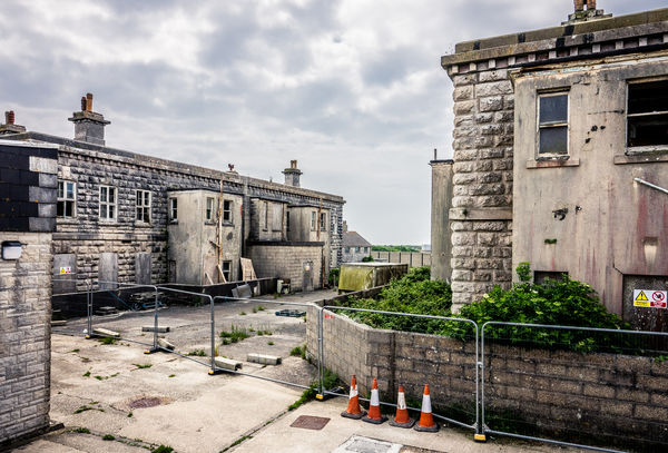
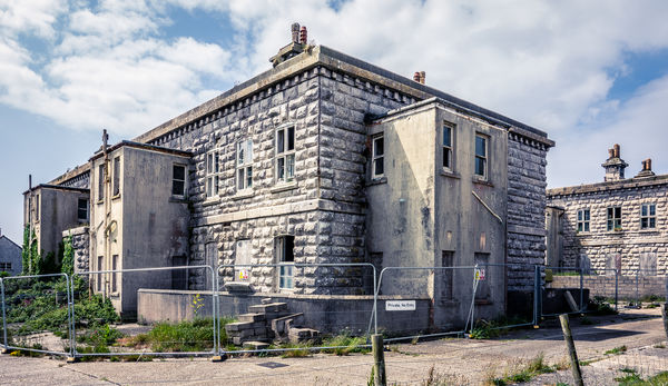
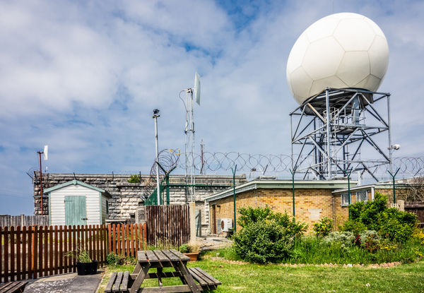
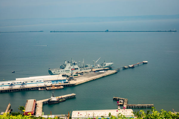
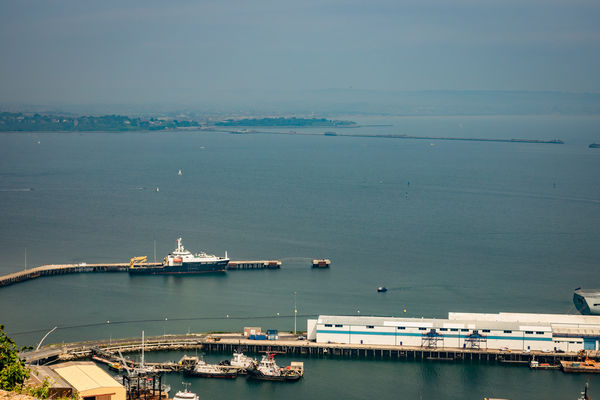
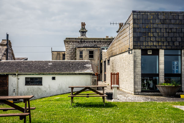
The Verne Jailhouse Cafe to be precise. The Verne is an old prison on Portland (UK), situated within a military citadel. It was built in the mid-nineteenth century and became a prison in 1949 and remained so until 2014, when it converted to an immigration holding centre. Its due to reopen as a prison in July 2018. Within the area is The Jailhouse Cafe, a relatively modern building originally run by inmates and serving the public. At present it's run on a local community basis - I don't know whether it will return to inmates come the re-opening of the prison.
Anyway, I thought it might be a novel place to take some visiting friends - the views over Portland Harbour and Weymouth Bay came highly recommended. Unfortunately it was rather misty during our visit and everyone wondered quite why I had taken them there. I enjoyed it though!
These shots show the surrounds and view (much dehazed). I assume the buildings shown will not form part of the reopened prison!
Posted more for your amusement than critique but feel welcome to comment as you see fit, it's always welcome.
Jun 20, 2018 05:54:18 #
A beautiful building indeed, and nicely taken. Download to fully appreciate. The cctv and loudspeaker are signs of the time. Does the photography ban seems slightly odd when visitors to India shoot from all angles?
Jun 20, 2018 05:45:26 #
Jun 19, 2018 18:09:57 #
ebrunner wrote:
I think that I prefer the original. The reason is that the bigger pony now takes center stage and the figures by the windmill really do become background. I feel that the figures standing by the windmill and interacting is more interesting than you lovely pony. That, of course, is just one subjective opinion. Your vision is the one that counts.
Erich
Erich
Thanks for taking a second look Erich. I reckon the the mill and the figures are central enough to stand their ground here, so I go for the revised version. I particularly like the scale and composition compared with my first attempt but, as you point out, it’s just personal taste.
Jun 19, 2018 10:27:25 #
Linda From Maine wrote:
I don't think the pony "steals" the scene because the composition is nicely balanced, including with the light. You're definitely going to look at the windmill and figures - possibly even before looking at the pony if exploring from left to right as I often tend to do. I like both versions!
Good of you to come back on it Linda. I think I prefer the later version - the perspective scale is improved. I originally avoided placing the pony to the right as the ladies are generally looking centre or left but having seen this new version I now feel they are fine looking as they do. Might try a print!
Jun 19, 2018 09:50:14 #
ediesaul wrote:
Erich's comment about Vermeer is what came to my mind as well. A wonderful composite. I do like it much better than the original. I am in awe of your imagination and skills.
Glad you looked-in Edie, I value your opinion and I'm pleased you approve.
In a pm, a viewer has suggested an edit to improve the perspective. I haven't gone quite as far as the suggestion made but the pony is bigger than the original composite (and repositioned). I wonder what you and other responders think of this version - does the pony tend to steal the scene or is the whole an improvement?

Jun 19, 2018 09:44:04 #
jaymatt wrote:
Nice work.
Thanks for taking a look John, pleased you like it.
Jun 18, 2018 17:05:27 #
ebrunner wrote:
While the light might be a tad bright for a night scene, it is essential . It being your scene, you can do with it what you like. It does not always have to be completely logical. Besides, you got a dreamy quality to that light that really makes me think Vermeer. I really like it.
Erich
Erich
Glad it pleases you Erich. The light does need to have an impact I think, otherwise the image is in danger of becoming a murky mess with no detail.
Jun 18, 2018 17:00:33 #
R.G. wrote:
I think Linda summed it up nicely. Every picture tells a story, and your edits tell fairy stories.
I hadn’t thought of it as a fairy story RG. My inspiration for this type of composite is old oil paintings, where the artist can take a good slice of licence.
Jun 18, 2018 13:59:55 #
artBob wrote:
Good to hear all your views. Actually, one I especially liked said the sun "hurt my eyes." That's because, like many of you, I have driven into that kind of glare, actually, on I 80/94 shown here. There is something emotional for me about being on the road, going somewhere, thus the dramatic lighting. At the same time, distance and aloneness come to mind, blowing past farmland and people who have worked that land without the slightest knowledge of them.
I understand that feeling whilst on the open road, I’ve enjoyed it from the moment I got out on my first motorbike. Long distances still appeal, although as I’m now ancient they demand a few stops. In the last six months I’ve done three seven-hour drives and that’s long enough nowadays.
Thanks for the explanation Bob.
Jun 18, 2018 13:51:36 #
Linda From Maine wrote:
#1 has a highly appealing fairy tale feel to it. I think you should write a story to go with this!
I think #2 has a lot going for it in its own right. If you remove the pieces from the top of the marker beacon, I see a rather unique and engaging minimal look: the clean stark shape beside the couple strolling over the crest towards the mountains in distance.
I think #2 has a lot going for it in its own right. If you remove the pieces from the top of the marker beacon, I see a rather unique and engaging minimal look: the clean stark shape beside the couple strolling over the crest towards the mountains in distance.
The composite was done to make up for my photo shoot in Wales being cancelled at the last minute - the weather was just too inclement apparently. Not sure my imagination would run to a story Linda, but when I asked one of the ladies why they were about at that time of night she said they had been out looking for the pony and he had just turned-up of his own accord. Typical!
I do think the original shot has some merit of its own. I saw it much as you describe and just wish the couple were facing away, toward the mountains. Perhaps if put into full silhouette I’ll get away with it.
Many thanks for your thoughts on both, appreciated as always.
Jun 18, 2018 13:39:49 #
artBob wrote:
Beautiful work.
Thanks Bob, glad you like it.