Posts for: magnetoman
Aug 14, 2018 14:02:31 #
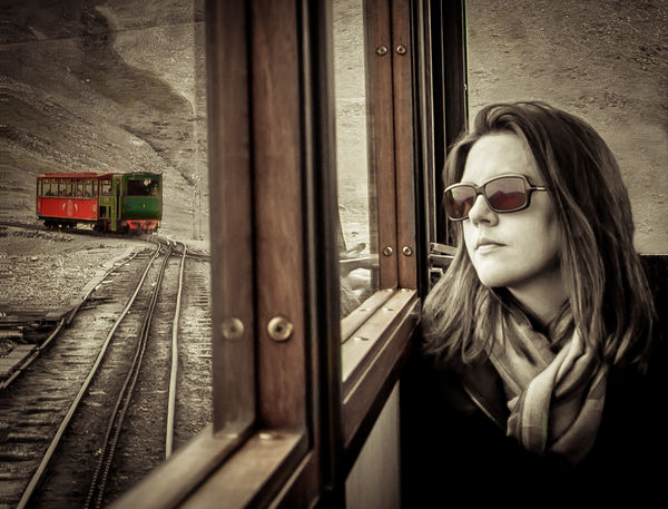
StevenG wrote:
Great photo! From the look on her face, we don’t know what she is thinking or feeling. Is she thinking of where she has been, and what has happened, or where she is going and what she will encounter when she gets there? Additionally, I think the processing is spot on!
Steve
Steve
Thanks Steven, you’ve pin-pointed what I feel - we don’t know what she’s thinking, and why should we? How would we? Many thanks for joining the discussion.
Aug 14, 2018 08:36:13 #
NJFrank wrote:
I like the composition of this shot. The woman, for me is perfectly placed in the pic. Her facial expression sets the mode. So much can be read into it. My only nic pic is the red train. I find the color to be a distraction. Perhaps putting the woman in color and not the train would work better. Just a thought.
That’s a thought Frank. Won’t be quite so colourful but may work in a different way. The only problem is, we may discard the train as of no consequence. I’ll have a look at it.
Aug 14, 2018 08:13:30 #
I wouldn’t have noticed the colour in the windows, but the effect is perfect. Definitely keep that in the final. I like Erich’s ideas and I’m sure you’ll be giving them a go. Be careful when using a low angle that you don’t make the statues legs look disproportionate, it’s easily done. Getting low will help cut down some of the less interesting background and bring the building more into play, which will be good. I’d try to make sure the emphasis is on the statue - good light and detail are essential. Look forward to seeing what you achieve Keni.
Aug 14, 2018 06:06:57 #
Great set Erich, love them all. Think I'd darken the reflection in 1 by the tiniest amount. Perhaps denoise the mist slightly in 2, and L2 let the goose out of the bag on 3 - better do something about that (the goose, not L2!). Wish I'd been with you!
Aug 14, 2018 03:20:44 #
ebrunner wrote:
I don't have a problem with the color of the oncoming train. I think that it does draw some of the viewer's attention without distracting us from the real subject which is the woman. I would consider printing this. I find myself really attracted to the composition. You nailed this one!
Erich
Erich
Thanks Erich, glad you approve.
Aug 14, 2018 03:18:12 #
ebrunner wrote:
The fellow in the front seems to be ambling along. The guys behind him seem to be in much more of a hurry. It seems a bit incongruous to have them as close as they are and traveling at different speeds. Other than that, the impression is good. I love the colors and the animated poses of the horsemen.
Erich
Erich
Not exactly ambling, but he wasn’t in full flight Erich, having started to rein-up. I shall try a different shot of him in the centre that should improve matters.
Hope the camping trip went well?
Aug 13, 2018 14:13:28 #
deer2ker wrote:
Really really nice thought provoking picture! I am in agreement with Linda - love the color saturation of the wood trim and glasses but the railway car is a little bright for me. I like the idea of color but maybe muted more?
Yep, muted more is the consensus here deer2ker. Thanks for your comments.
Aug 13, 2018 14:12:25 #
kenievans wrote:
Dave I really like what you have done here. Great... (show quote)
I’m not offering a story, you have to make your own a Keni, but I agree the train needs toning-down a little. I just want it to be part of your story. Many thanks for contributing, it all helps.
Aug 13, 2018 14:10:05 #
artBob wrote:
Nicely done, evocative. The train car seems too saturated to me, overpowering the composition and the main subject.
Thanks Bob - I accept the need to desaturate the train a bit.
Aug 13, 2018 14:09:24 #
Linda From Maine wrote:
I am stuck because I can't find a reason for the t... (show quote)
Maybe the train is too saturated, most seem to think so - I just wanted the viewer to include it when looking, not push it aside as of no consequence. I want it to be an essential element for whatever story you want to follow. Now, if I blur what’s behind the girl, it means I should blur everything at that distance outside the train windows. I’m not sure that would be good? As for the train’s angle, we’re on a single-track line with passing loops, one of which we have just come round in order to let the colourful train by. Ships that pass, and all that. I rather like that angle. Thanks for your thoughts Linda, always interesting. If I were to print, which is unlikely, I would do the desat.
Aug 13, 2018 13:58:04 #
rmalarz wrote:
I think this is a classic. Trains invoke thoughts of travel. The frozen glance out of the window invoke thoughts of destination, whether it is known or unknown.
This photo reminds me of one I took years ago but in a completely different setting.
--Bob
This photo reminds me of one I took years ago but in a completely different setting.
--Bob
Thanks Bob, I’m glad it works for you. If you can find that photo and would like to append it, please feel free, I’d be interested to see it.
Aug 13, 2018 09:21:25 #
Your thoughts upon effectiveness appreciated should you feel inclined.
Aug 13, 2018 07:12:36 #
I’d remove it - the gondola will then have freedom and height.
Aug 13, 2018 07:08:33 #
kenievans wrote:
I have been playing in post processing again. I couldnât be as meticulous as I would have liked with my color painting. I am having trouble with the screen on my laptop so this was done on an iPad mini. I’m not sure what to do about the bare vines. Should I paint them as well or leave them B&W? If I leave (no pun intended) them B&W should they also be B&W where they cross the leaves?
Your thoughts, comments and downloads are appreciated.
Your thoughts, comments and downloads are appreciated.
My preference would be to keep them black and white, with just the leaves green. That way the intricate patterns will be more obvious - provided that holds good across the leaves. The present mix just looks wrong to me.
Aug 13, 2018 06:59:30 #
This is a shot I might take but would not post. I don’t see enough in it to interest people, although I probably would have enjoyed the moment of taking it. And I would have fiddled with it to destruction in pp I expect! I don’t think deeply enough I guess. The responses to it have been very good and explain where interest lies for different people. I’ve enjoyed reading them and yet feel I have nothing to offer that would help in any way. It’s me, not the photograph.