Posts for: artBob
May 10, 2012 13:59:44 #
I'm wondering why (and how, for that matter how ;)) you spotlighted the center. Just for fun, I changed that. How do you see the difference between our two statements?
May 10, 2012 13:48:54 #
This is a good idea. I'd shoot a lot, at different shutter speeds, to get some that had motion in one direction, but not the back and forth that suggest blurriness rather than wind.
May 10, 2012 13:46:12 #
I like the comments so far, and would add SQUINT at your shots, to see where the eye unconsciously goes. Do you really want people to leave your pix on the right side? Probably better to have the center of interest somewhere near the left-center, so the viewer "comes back into" your shot rather than exits stage right.
May 10, 2012 13:38:49 #
The first two are strongest, because of the range of tones. The bird is a unique, not a cliche shot. Depends upon the juror, whether they can go beyond the trite and true, if your best work is selected. Luck of the draw. My advice is to always go beyond: you may get a good juror; and "you are who you keep company with"-- it's better that your best work be seen than that you get another line on your resume or a ribbon for your exhibition booth.
For that reason, I like your original Blue Angels shot, too. The cropped version is technically beautiful, but just another plane shot with no "hook." The original, however, does two things: brings the viewer into the action since the F-18s have space to GO somewhere, and emphasizes the nearness and the teamwork these guys have contrasted to that big expanse they work in.
For that reason, I like your original Blue Angels shot, too. The cropped version is technically beautiful, but just another plane shot with no "hook." The original, however, does two things: brings the viewer into the action since the F-18s have space to GO somewhere, and emphasizes the nearness and the teamwork these guys have contrasted to that big expanse they work in.
May 8, 2012 16:50:05 #
Try going to "Curves," selecting the adjust for grays eyedropper (the middle one of the three in the curves dialog box), and moving the cursor (now a sight) over a white and clicking.
May 7, 2012 21:40:21 #
I think you have an "eye," catching things at the right time and in the right place, although the grass has been done.
May 6, 2012 00:15:06 #
Quote:
so in essence you agree but in substance you don't? Or what exactly?
What's the "essence," technique or idea? I like the idea of sharp edges. Some of the critiques seemed to want to help you make the usual type of lily picture, and "the usual" is usually boring to me. The essence ("art") of a pic is the unique view of the photographer; the technique ("craft") serves the art.
May 5, 2012 21:09:52 #
The photo does not show what you wanted (like waterfall) enough. If you get a crack at the shot again, I suggest you take a lot of shots with your waterfall idea in mind (exposing for the whites, which seem too overexposed here), and do some serious tossing away until you get the photo that "says" what you thought/saw.
May 5, 2012 21:00:50 #
I don't agree with most of the critiques because they seem to want to make your pix look like hundreds of other "pretty lily" pix. The sharp edges of the leaves (photo 3) present a new, stronger idea, but I would burn the blown out areas, just to bring a tad more attention to the lily.
May 5, 2012 18:06:01 #
"Like a wolf pack, six pages now of telling someone their posted photo is crap. Has anyone noticed the OP hasn't said a word since page one?"
Perhaps he's smart. The critiques seem to be narrowly focused, like a 600mm shot pretending to be a 28 mm shot. "14kphotog" had good questions. In my thinking, before a good crit can be made, an understanding of the intent/content/statement of the pic has to come.
Perhaps he's smart. The critiques seem to be narrowly focused, like a 600mm shot pretending to be a 28 mm shot. "14kphotog" had good questions. In my thinking, before a good crit can be made, an understanding of the intent/content/statement of the pic has to come.
May 5, 2012 14:30:01 #
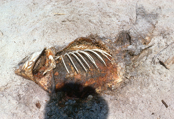
rlaugh, I don't know what you mean by "fishy." Or, was that the raccoon hopefully thinking? Or, if you want a fish, here's one I shot
Fish and Shadow
May 5, 2012 09:13:34 #
If I "get" this photo, the gilt-dressed angel is imprisoned, a good statement. Assuming you had to shoot in available light, I wonder if a crop at the top and a little more of the garment might have given a richer aha" moment.