Posts for: Fran
Jun 3, 2015 18:30:24 #
SonyA580 wrote:
If you are referring to purple/blue fringe, it's c... (show quote)
It worked!!! Yay!!!
Jun 3, 2015 14:58:10 #
SonyA580 wrote:
If you are referring to purple/blue fringe, it's c... (show quote)
Thank you. This is very helpful. I'll adjust the chromic aberration setting in LR.
Jun 3, 2015 09:25:13 #
what is causing the aura around my subjects in this shot... If you zoom in its very apparent. Thanks! Fran
Check out Astronomical Photography Forum section of our forum.
Apr 24, 2015 21:54:53 #
Lundberg02 wrote:
There is no way to get meaningful feedback. Too many variables.
The feedback was actually meaningful and the problem resolved. Love the photographers on this site. :)
Apr 24, 2015 15:36:36 #
CaptainC wrote:
I have not seen this mentioned, so maybe it is wor... (show quote)
Thanks, I'm sticking with sRGB...
Apr 24, 2015 11:14:10 #
burkphoto wrote:
In-camera white balance settings really affect onl... (show quote)
Thanks for taking the time to provide the detail in a clear and understandable manner. :)
Apr 24, 2015 11:11:17 #
CHOLLY wrote:
Yes. AdobeR&B was made for commercial/professional printing.
Thanks!
Check out People Photography section of our forum.
Apr 24, 2015 09:43:25 #
[quote=jcboy3]As stated, make sure you export in sRGB space and not AdobeRGB. This is one of those reasons to shoot RAW; AdobeRGB is great for printers, sRGB is great for web.
jcboy, do you always change the setting to AdobeRGB when printing? Is there a big difference between RGB and Adobe RGB in prints? Thanks.
jcboy, do you always change the setting to AdobeRGB when printing? Is there a big difference between RGB and Adobe RGB in prints? Thanks.
Apr 23, 2015 19:19:20 #
What a difference changing the setting has made! Thank you, thank you, thank you!!,
Before

After

Before

After

Before

After

Apr 23, 2015 18:24:25 #
Los-Angeles-Shooter wrote:
I mostly shoot in studio and I always do a white balance with the studio strobes. I shoot in sRGB and the colors are nailed. I am amazed when I hear of other photographers NOT doing a white balance and figuring they can take the RAW and "fix it in post."
For these images I went with auto wb. When viewing the images during post processing, I felt the camera made the right choice using auto wb. Perhaps setting my wb could have alleviated my issue; But I'm not sure. The issue occurred during export. Changing the export function to sRGB made the difference. Thanks for the comment regarding the camera setting being the same...I need to check my setting as I recall setting it up using Adobe sRGB.
Apr 23, 2015 18:00:34 #
I think it was the RGB setting. It was set to AdobeRGB. I changed it, as suggested by a couple of you, and it looks much better. I'll reattach. Please let me know if it looks clearer, less muddy, etc...
THANK YOU!!!!
THANK YOU!!!!

Check out Digital Artistry section of our forum.
Apr 23, 2015 15:56:33 #
davidrb wrote:
Fran, do you remember when HD TV came into being? The public was upset because nothing was being broadcast in HD, so the picture on the new TV was just like the old TV. We thank you for thinking so highly of us, but we don't have anything to make us appreciate your kindness, yet Wait until we catch up to you, then we will be more appreciative. Until then, thanx.
That's what I was thinking... The image quality is grand on my Mac...not so much on my older equipment...
Apr 23, 2015 15:40:00 #
Los-Angeles-Shooter wrote:
On my Samsung monitor, running Windows 7 pro and using a Chrome browser, the image appears a little dark, muddy, low-contrast, and unsharp. The highlights in the glass, for example, are not a crisp "white" white, they are a little muddy and darker than pure white. Hope this helps.
It's interesting...that's not what I seeing on my Mac...
Apr 23, 2015 15:09:44 #
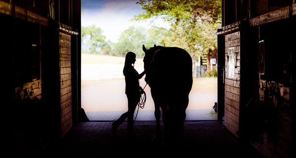
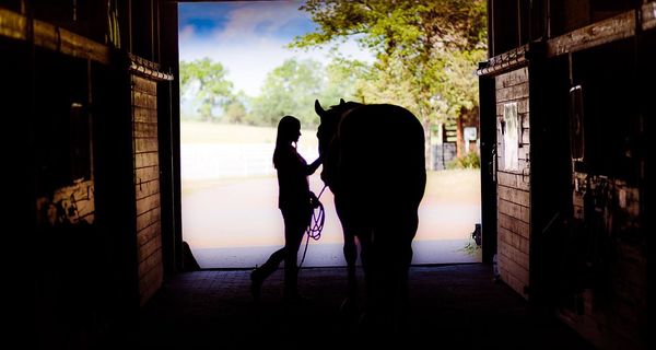
I process my images in LR on a Mac laptop with retina display. I also use colormunki to calibrate my monitor. When I send the images via the web, the image quality is poor on other devices including my iPad and desktop monitors. What causes this???
I'm adding an image...not sure how it will appear...
Thanks!!!
Fran
I'm adding an image...not sure how it will appear...
Thanks!!!
Fran

Nov 30, 2014 09:51:20 #
PNagy wrote:
This is from a high school basketball game with the very lens I suggested, the Canon 28-300mm F3.5-5.6. Go ahead, tell me it is too dim.
Definitely not too dim. The ISO on this image was bumped up to 4000. Will a lesser camera body handle the higher ISO as well?
Check out AI Artistry and Creation section of our forum.