Posts for: CatMarley
Apr 15, 2014 10:01:17 #
Delderby wrote:
From a Brit - Why do you need to carry or own? If I appear ignorant - I beg your pardon.
"The beauty of the Second Amendment is that it will not be needed until they try to take it." - Thomas Jefferson
Your question is the reason for 1776.
Apr 15, 2014 08:14:31 #

Apr 14, 2014 23:09:14 #

Apr 14, 2014 18:44:57 #
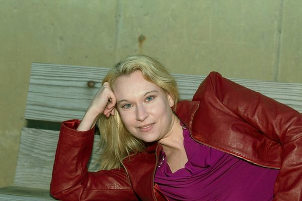
dpaulham wrote:
yes the forehead is greenish hue can i sent u a few pixs to view
Sure. We have proven my point. Your monitor shows things more to the green yellow tint and mine more to the magenta blue tint. I have calibrated this monitor some time ago with a colorimeter. I have just sent for another, more modern one, and will recalibrate it again. This calibration helps with printing - you get what you want the first time without wasting a lot of photo paper.
cm
Apr 14, 2014 18:20:37 #
snapshot4619 wrote:
My edit of your image?
I think you did not leave enough space in front of her facial direction. She should not be looking at a blank edge so close to her face. One of the rules of portraiture is that the person should be looking Into not out of the picture.
Apr 14, 2014 16:55:15 #
Chet wrote:
My try at wb.
Your monitor is different from mine. On my monitor, this photo is too blue and magenta. Her face has pale purple shadows. Only proving my point - that color values (color temperature) cannot be evaluated unless we have identical and identically calibrated monitors. And WB is just that- white is white and black is black with no color casts. On your monitor that is probably true , but on mine, your white is my pale purple, because your monitor is adjusted differently than mine. The shadow and highlight detail is right on in this photo, so at least the brightness/contrast is comparable between our two monitors.
My white on your monitor is probably pale greenish yellow. Let's see if that is true. I have adjusted your photo to my monitor. Is she greenish looking ?
Apr 14, 2014 14:33:20 #
Weddingguy wrote:
I am looking at your edited versions of these two images on a calibrated screen and your adjustments are close to blowing out areas of the face. The original may be a bit off on WB, but I would not say that they are in any way underexposed.
I did not change any of the values on those files except for hue and composition, so any differences are, as I said several times, the result of repeated degradation of the original electronics by repeated copying and transmission, plus the different electronic rendering by our various equipments.
I made the point, (several times), that the apparent underexposure was most likely the result of differing brightness of monitors. (Yes you can blow out highlights by turning up the brightness and contrast on your monitor, DUH!) (Or make everything look underexposed by keeping your monitor at a lower level of brightness and contrast) We are dealing here with electronic images! The only way to make for general agreement about WL, brightness and contrast would be for everyone on this forum to buy the same monitors and calibrate them with identical colorimeters and software.
Apr 14, 2014 13:46:08 #
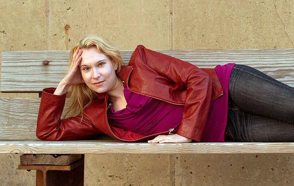
13oct1931 wrote:
I would have cropped out the Structure of the bench. Alyn
I think it would make a more interesting composition to play with the series of rectangles made by the bench and the girl's arms. Other rectiliear lines appear then and the whole thing becomes a picture instead of just a girl lying on a bench.

Apr 14, 2014 09:52:34 #
dpaulham wrote:
i will agree that it was off..but the final adjustments looked better.I will get better in time...
I think you misunderstand. It may not be off at all. This is a digital image caused by magnetic impulses displayed in photoelectric dots. what you see is entirely dependent on so many factors that you have little control of and are changed every time they are transmitted. First the signals went from the sensor in the camera to the recording chip. From the recording chip to the computer drive, then from the computer over a cable to another series of computers to cables and finally to the viewers computer drive and then to his monitor.
Each time this information is transmitted and reformatted, it is subject to changes of various kinds, Your monitor, on which you view the file is completely different from mine - different contrast settings, different brightness, different pixel content, different color temperature.
We are not seeing the identical picture - only a similarity of one. The only commentary that is valid is that of composition, and relative intensitiy values.
Apr 14, 2014 09:13:05 #
phlash46 wrote:
WB looks perfect. Nice shot!
You can't judge WB of a digital photo on a screen unless you have a calibrated monitor in ideal viewing conditions. Your monitor may have quite different brightness, contrast, and color temperature than his monitor. You would need a print to judge the WB of his photo properly. Ant even thin, the brightness, contrast and color cast of the ink of the printer would be the deciding factor. On my monitor, his original files came up as too magenta and too dark. I would guess that his monitor is brighter than mine and has a higher green drive. I calibrate mine with a colorimeter and calibration software. but even then, the adjustments are made by me and the judgment of my eyes.
Apr 14, 2014 08:17:22 #
Cecil wrote:
Paul, which of these two is closer to the actual subject? I used Levels and a little sharpening! Your photo is excellent.
Cheers
Cecil
Cheers
Cecil
Everybody's computer screen is different, so the color values and color temperature (WB) can't be judged except in a print. I use a program to calibrate my monitor - forget the name of it just now - it has a colorimeter that you hang on the front of the screenthat reads the colors off a program and has you adjust the colors accordingly.
Apr 13, 2014 22:03:33 #
Go a little North and see Bryce Canyon.

Apr 13, 2014 16:00:33 #
jethro779 wrote:
So far you have not added Yuma Territorial Prison, London Bridge, Jerome, Toozigoot monument, Canyon De Chelley, Painted desert, Petrified Forest, Meteor Crater, Old Route 66, Casa Grande Ruins, Cochise Stronghold just to name a few more.Of course to see all there is to see here in Arizona you would need 2 years.
Don't forget Beautiful Valley.
Apr 13, 2014 09:52:08 #
Not so sure about the WB. This photo looks too magenta and underexposed, but that may be my computer. This is what i would do with this photo. I did a crude rush job on it, but muting the yellow curb and cropping out some of the background puts the subject in better proportion. In a glamour shot like this, or any portrait, the subject needs more space in front that behind - needs to be looking into the picture rather than out of it.

Apr 13, 2014 09:35:54 #
Again, just an adjustment of one degree to make the bench level, would make the image a pleasing study of horizontal lines. It is jarring to have an out of kilter element unless it is a contrasting element. Look at the image after straightening.
In addition, the color on my screen is too magenta, and the image underexposed, but that may just be artifact.
In addition, the color on my screen is too magenta, and the image underexposed, but that may just be artifact.