Posts for: SuKai
Jul 10, 2016 19:18:22 #
TheeGambler wrote:
Hi Sue. I really like what you did! Your colors ... (show quote)
I'm glad you liked it.
 It's always fun to see all the different versions of the same shot. They are all great!
Jul 10, 2016 17:02:37 #
TheeGambler wrote:
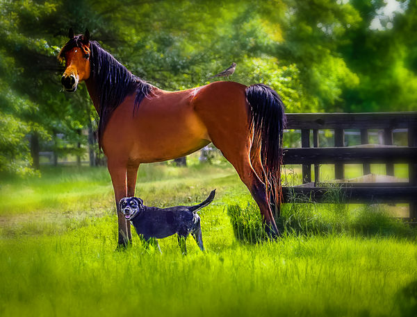
This is something that is pretty straight-forward, and should be easily transformed with PP. I think it is a rather plain photo, kind of boring. Maybe someone can make it more interesting.
TG
TG
Hello I'm Sue, I saw this post and thought it might be fun and see what I could come up with. I wanted to brighten it up a bit so I used Lightroom and added a filter I have called Happy Giraffe. I also wanted to give it a more Bokeh look so I went into Photoshop and blurred one layer and then used a mask to just bring out the sharpened dog and horse. It looks like I used somewhat the same crop as many of the others, but I didn't like that tree I thought it was distracting. Lastly, I added a little bird sitting on his rear end just to be different.
Jul 10, 2016 14:21:57 #

Jul 10, 2016 14:21:05 #
abc1234 wrote:
I think it is still too dark and lacks a fuller to... (show quote)
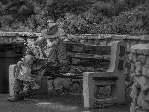
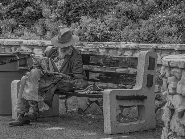
I appreciate your point of view the original does have the entire trash can I just cropped it closer to get the rule of 3rds and focus more on the man. I had to laugh the "graffiti" is just my watermark, I have 2 copies one with and one without, I must have grabbed the watermarked copy when I did my first adjustment. I'm still tweaking it, trying suggested edits and different adjustments until I end up with the right one. Thanks for looking

Jul 10, 2016 00:51:09 #
Thanks to all for all the comments and suggestions, I like the darker as well Apaflo. It is interesting how many different versions one can make with just one image. I shoot in RAW and I don't downsize images when I save them in the JPEG format, maybe that is what makes the different between the original and the download.
Jul 9, 2016 17:17:23 #
P.S. It has to be downloaded. I noticed that it still looks blurry until I did the download and then it looks like what I see on my computer.
Jul 9, 2016 17:12:01 #
Ok, I reworked according to DaveO's suggestions, I hope I didn't spotlight him to much. I did notice that in the original once I compared them side by side that I had made him the darkest part of the picture, which I didn't intend to do. So I darkened the background and added dodge & burn to specific spots plus more sharpening on him. I also added the blur on the sides and parts of the top to minimize the plants from distracting the eye.
Jul 9, 2016 16:51:53 #
Voss wrote:
A great photo. That guy has character, and the composition is great. Technically, Pierre said it all.
Thanks Voss. I really like unique people I am sure he had stories to tell.
Jul 9, 2016 15:45:02 #
Pierre H.J. Dumais wrote:
I like it Sue. br My preference would be to give ... (show quote)

Thank you Pierre, I agree I looked at it after the upload and it lacks that "punch" I think it needs. I will take your suggestions and try to see if I can apply what you suggest Maybe I'll try Lightroom and see if that would make a difference. I edited most of it in Camera Raw then PS.
Jul 9, 2016 15:39:36 #
Thank you Dave,
I agree I prefer the B&W over color for most Street Photography.
I agree I prefer the B&W over color for most Street Photography.
Jul 9, 2016 14:02:25 #
Laguna Beach, CA an elderly gentleman with tattered cloths is relaxing and reading the news. He saw me shooting him and thought my lens was going to send us to space. I said Yes it will, I smiled and wished him a nice day.
Jul 9, 2016 13:33:13 #
What more can a Biker ask for? Gas for the Scoot and a Cold one [or two] for the road is all we need.
May 15, 2016 23:29:47 #
Long time no see UHH
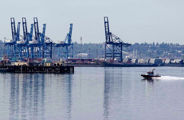
I gave this a little try and this is my result. I used Photoshop and the Camera Raw filter to draw out the colors and add a little pop to the picture. I straighten the horizon and coped it a bit to try and make the boat more of a subject in the shot. I like the different versions so far so here is mine...
I gave this a little try and this is my result. I used Photoshop and the Camera Raw filter to draw out the colors and add a little pop to the picture. I straighten the horizon and coped it a bit to try and make the boat more of a subject in the shot. I like the different versions so far so here is mine...
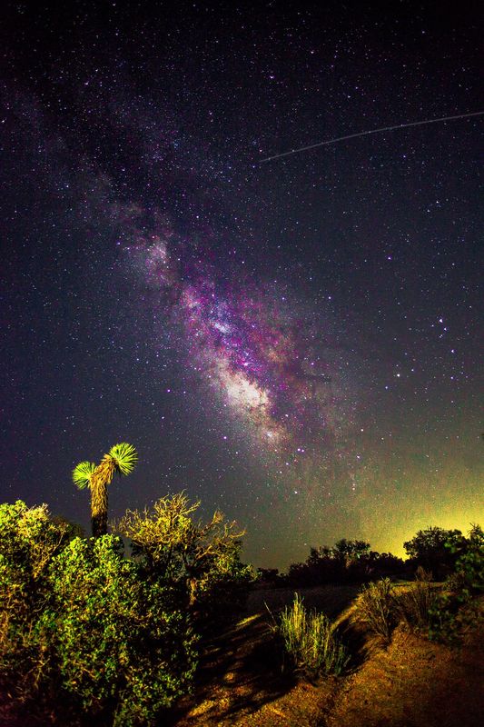
Sep 16, 2015 00:45:20 #
Thanks for the practice. I've been wanting to try a Milky Way shot but haven't had to opportunity to get one. I wanted to pump up the color so here is my try. Lightroom first and then PS to remove that bit of cut-off Joshua tree on the right.
Apr 16, 2015 18:11:22 #