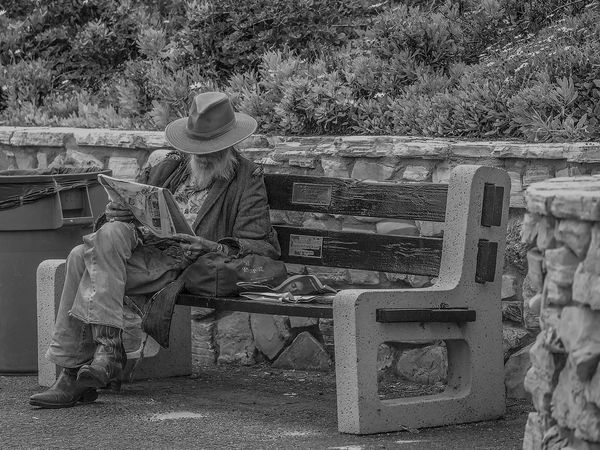
Old Man on a Bench
Jul 9, 2016 14:02:25 #
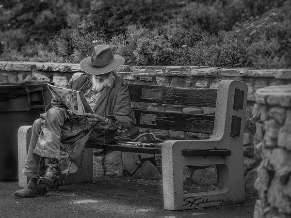
Laguna Beach, CA an elderly gentleman with tattered cloths is relaxing and reading the news. He saw me shooting him and thought my lens was going to send us to space. I said Yes it will, I smiled and wished him a nice day.
Jul 9, 2016 14:05:21 #
Jul 9, 2016 15:12:58 #
DaveO wrote:
Love the composition and B/W was a must!
I like it Sue.
My preference would be to give it a touch more impact, some call it punch. The image might benefit with more contrast -- not a lot, so be gentle. In other words, some, not much, of the darker grey could be almost black. His beard could be a little whiter.
You might also try a tad more sharpening. At the same time, camera far left and camera far right could be blurred a bit so the eye would concentrate more on him, the paper and the bench.
But, it's a nice shot and very much worth another try
Be happy. You've got a good one.

Pierre
Jul 9, 2016 15:39:36 #
Thank you Dave,
I agree I prefer the B&W over color for most Street Photography.
I agree I prefer the B&W over color for most Street Photography.
Jul 9, 2016 15:45:02 #
Pierre H.J. Dumais wrote:
I like it Sue. br My preference would be to give ... (show quote)
Thank you Pierre, I agree I looked at it after the upload and it lacks that "punch" I think it needs. I will take your suggestions and try to see if I can apply what you suggest Maybe I'll try Lightroom and see if that would make a difference. I edited most of it in Camera Raw then PS.
Jul 9, 2016 15:55:49 #
Biker_Chic wrote:
Laguna Beach, CA an elderly gentleman with tattered cloths is relaxing and reading the news. He saw me shooting him and thought my lens was going to send us to space. I said Yes it will, I smiled and wished him a nice day.
A great photo. That guy has character, and the composition is great. Technically, Pierre said it all.

Jul 9, 2016 16:51:53 #
Voss wrote:
A great photo. That guy has character, and the composition is great. Technically, Pierre said it all.
Thanks Voss. I really like unique people I am sure he had stories to tell.
Jul 9, 2016 16:58:14 #
Jul 9, 2016 17:12:01 #
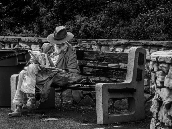
Ok, I reworked according to DaveO's suggestions, I hope I didn't spotlight him to much. I did notice that in the original once I compared them side by side that I had made him the darkest part of the picture, which I didn't intend to do. So I darkened the background and added dodge & burn to specific spots plus more sharpening on him. I also added the blur on the sides and parts of the top to minimize the plants from distracting the eye.
Jul 9, 2016 17:17:23 #
P.S. It has to be downloaded. I noticed that it still looks blurry until I did the download and then it looks like what I see on my computer.
Jul 9, 2016 20:57:07 #
Jul 9, 2016 23:12:29 #

Biker_Chic wrote:
P.S. It has to be downloaded. I noticed that it still looks blurry until I did the download and then it looks like what I see on my computer.
Now that is really interesting. The thumbnail display, both with the original and the edit, is vastly different than the download. And the download also comes in increments, with the first one being approximately what the thumbnail displays.
As a result I was totally confused about what the image was until I downloaded it and looked at it in an editor. I like the basic composition, but think it needs a lot of "manipulation". That's because it is a bit busy, with to much attracting a viewer's attention to no purpose.
It is also significantly oversharpened, which has the same effect. Too much attention ends up focused on every thread and pattern in his clothing, not to mention in the rocks and the vegetation behind him.
So I was thinking that a couple of simple edits to mask off part of the image to darken and give a slight blur to everything but the guy's face... except when I started working on it I blew it and got the masking wrong. Instead of starting over I just divided things up into several masked off areas and did each separately. So basically I diddled just about every part of it separately! I was a little bit astounded at the results too.
I won't post a full sized version, just a thumbnail. This is not meant to replace your images. It's meant as an example of one thing that can be done. It represents nothing particular other than what I like.
Jul 10, 2016 00:51:09 #
Thanks to all for all the comments and suggestions, I like the darker as well Apaflo. It is interesting how many different versions one can make with just one image. I shoot in RAW and I don't downsize images when I save them in the JPEG format, maybe that is what makes the different between the original and the download.
Jul 10, 2016 06:19:56 #
Jul 10, 2016 07:40:52 #

Biker_Chic wrote:
Ok, I reworked according to DaveO's suggestions, I hope I didn't spotlight him to much. I did notice that in the original once I compared them side by side that I had made him the darkest part of the picture, which I didn't intend to do. So I darkened the background and added dodge & burn to specific spots plus more sharpening on him. I also added the blur on the sides and parts of the top to minimize the plants from distracting the eye.
I think it is still too dark and lacks a fuller tonal range. LR will not give you anymore than PS will. You do not need both and depending upon the original file, you might have been able to do the whole thing in LR. Funny how someone took a Magic Marker and wrote on the bench between edits. Prefer it without the graffiti. This is a really good photo and could use some more TLC. I would have preferred more of the garbage can, a sad counterpoint, and less of the out-of-focus brick on the right.
Thanks for posting this nice picture. No significant unwanted elements. Like how you got the right "pose". Compositionally, this picture works for me. The developing does not but that is just my opinion.
If you want to reply, then register here. Registration is free and your account is created instantly, so you can post right away.