Posts for: Guyserman
Apr 21, 2018 23:00:57 #
Look but don't touch. Does that answer your question.
Very nice!
Very nice!
Apr 21, 2018 22:57:05 #
Linda From Maine wrote:
I sent you a pm with a couple of quick edits, just as food for thought 
...per your OK, I am posting the last set I sent to you...
...per your OK, I am posting the last set I sent to you...
They're beautiful. I've got a lot to learn but I'm game. This old dog can still learn tricks.
Apr 21, 2018 21:31:04 #
whwiden wrote:
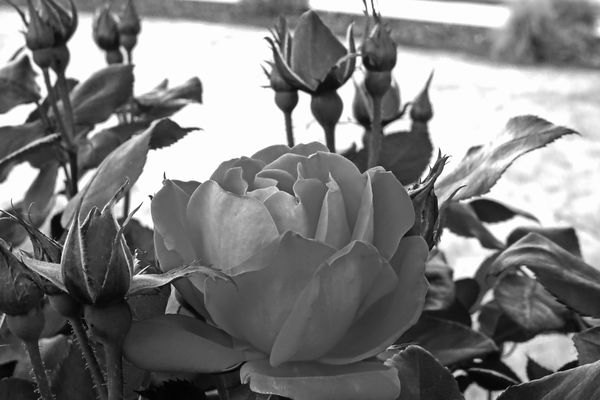
Exactly right. Excellent comment. For an interesting insight, one might enjoy reading how B&W film photographers use colored filters. A classic example is a red rose and green leaves.
You've piqued my interest. I've got a lot of reading to do.
Apr 21, 2018 21:25:12 #
lamiaceae wrote:
I also experiment with Infrared with a converted camera. I can leave the results in False Colors or go further to B&W. IR and UV photography can be totally unreal but amazing worlds of their own. And allow more explorations in to art and creative and abstract photography. ( I don't have the equipment for UV.)
I'll have to pass on infrared. I don't have any infrared film. (That's how far behind times I am. A lot of catching up to do.)
Apr 21, 2018 21:21:45 #
Linda From Maine wrote:
Definitely a concern IMO.
Another idea for converting: using Elements, you could change the color saturation (of either or both colors, up/down) prior to conversion. There are some b&w pre-sets in PSE that can help get you on your way also. But you may love it as-is, in which case I'll stop talking now
Another idea for converting: using Elements, you could change the color saturation (of either or both colors, up/down) prior to conversion. There are some b&w pre-sets in PSE that can help get you on your way also. But you may love it as-is, in which case I'll stop talking now
This was done with one of the presets but I'll certainly experiment with changing the saturation of different colors as well as using the filters. Please don't stop talking.
Apr 21, 2018 21:17:25 #
cabunit wrote:
I like the detail in the B&W, especially the e... (show quote)
I agree the white background in the B&W needs some attention. Maybe I'll repost it with something done about that. I'm excited about having B&W brought to my attention.
I know what to expect from the nay-sayers. I'll mostly just ignore them.
Apr 21, 2018 21:03:08 #
Linda From Maine wrote:
Your conversion demonstrates ...
Thanks, Linda. I didn't expect anyone to see this so quickly. What a pleasant surprise.
I use Photoshop Elements 12... from a few years ago. I think it can simulate color filters for B&W but not sure. I'll check it out.
Apr 21, 2018 20:47:10 #
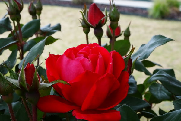
Inspired by the 4/20/2018 discussion about B&W, and needing to experiment with my new Sony HX80 I shot a rose and converted it to B&W in post.
Apr 20, 2018 12:04:42 #
Guyserman wrote:
Including me! 
I just made an avatar and uploaded it.
Apr 20, 2018 10:24:28 #
dsmeltz wrote:
However, you post seems to have had a positive result. A lot of those on the thread seem to be excited about experimenting more with B&W!
Including me!
Apr 20, 2018 10:04:42 #
tdekany wrote:
Can I also assume that when you shot wild life, you rarely go below F22? Because in real life, we don’t see “bokeh”.
Apr 10, 2018 23:27:30 #
MMC wrote:
I tried many times to see 3D effect crossing eyes but it is not working for me and many others. I do not think that this can do everybody but I showed my printed pictures and my images on computer's screen to my friends and relatives and everybody could see 3D effect. It does not needs any efforts and training only anaglyph glasses.
Many years ago before digital I made shots by moving the camera sideways for two perspectives. Instead of mounting them to view cross-eyed, I mounted them to view parallel. I was planning to get a stereo viewer but before I located one I learned to relax my eyes and get the 3D perception so I never got a viewer. I really enjoyed it and built up a good sized collection. The images appeared sharper, clearer and more colorful than the anaglyph images I have seen since. Unfortunately, somewhere in the four moves I have made over the last 49 years, the prints got left behind.
Mar 27, 2018 21:42:23 #
JMCPHD wrote:
Maybe it will help to understand that the f number for aperture is based on the ratio of the size of the opening and the focal length of the lens. Thus in a zoom lens like the one you are using if you go from shorter focal lengths like 18 mm to 300mm the longer focal length divided into the size of the opening produces a smaller ratio and the amount of light reaching your sensor drops.
Glad to see someone mention that it is a ratio. If the lens opening is wide open it might be 1/3.5 of the shorter focal length. It you zoom out to the longer focal length the wide open lens opening would be a smaller fraction of the longer focal length, for example 1/6.3. Simple mathematics.