Posts for: Nightski
Jul 8, 2017 18:27:00 #
Country's Mama wrote:
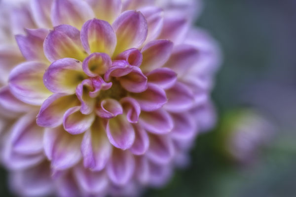
Very pretty. I think the little bud is a distraction from the main show. The colors and softness of this flower are beautiful.
I was waffling on that. I couldn't get the shot without sniping the bud off. I didn't want to crop. But .. my dahlias are just starting to bloom so I'll have lots more subjects. The other thing I wish, was that I had gotten those center tips sharp. They aren't quite there.
Jul 8, 2017 16:18:21 #

Jul 8, 2017 15:25:35 #
(Lensbaby)
I would experiment with inanimate objects first. Manual focus is difficult with people and animals. I think that the Lensbaby does well in landscape shots with natural tunnels or paths. A bridge, a path through the woods, an alleyway. With the composer pro remember, you tilt the optic to blur the things you want to omit and focus on the subject. The more you use the lens, the more you will learn. Experiment with the optic at a certain tilt and aperture for a while until you've got it and then move on to another setting. Those are some things that are helping me to improve.
Jul 8, 2017 15:20:36 #
(Lensbaby)
I love the last one. One thing I would say about this lens ... don't fear the blur. It's hard. We are so trained to get everything sharp. With this lens, things in focus will have blur at the wider apertures. Embrace it. Use your light to enhance the effect.
Jul 8, 2017 13:48:11 #
(Lensbaby)
Taken with the lensbaby velvet 56
It looks better on 500px if you care to look at that upload.
http://500px.com/photo/219002983/dalia-by-sandra-nightski?current_page=4744076271980380160ACYABc7lVxoc784A&from=following&user_id=5883322
It looks better on 500px if you care to look at that upload.
http://500px.com/photo/219002983/dalia-by-sandra-nightski?current_page=4744076271980380160ACYABc7lVxoc784A&from=following&user_id=5883322

Jul 8, 2017 13:46:53 #
Taken with the lensbaby velvet 56
It looks better on 500px if you care to look at that upload.
http://500px.com/photo/219002983/dalia-by-sandra-nightski?current_page=4744076271980380160ACYABc7lVxoc784A&from=following&user_id=5883322
It looks better on 500px if you care to look at that upload.
http://500px.com/photo/219002983/dalia-by-sandra-nightski?current_page=4744076271980380160ACYABc7lVxoc784A&from=following&user_id=5883322
Jul 5, 2017 18:23:26 #
mcveed wrote:
I agree her work is beautiful. I could only detect a texture on one or two of the images I saw and in both cases the texture was only applied to the background and did not cover the main subject. When used with the subtleness that she applies, textures add very much to the subjects she photographs. I do think that the range of subjects that her technique would enhance is quite limited, but with the right subject it is very effective.
Yes, that is what she does. She uses textures to eliminate background distractions. She doesn't do it with all her images. Some are more noticeable than others.
Jul 5, 2017 14:00:07 #
Country's Mama wrote:
I think the hay bales look like they go on forever... (show quote)
I love the way your thoughts are going, Judy. May I add that it would be great to go out and photograph this scene with that in mind. I think you are touching on the point that I made that sometimes it can work .. but I think it needs to be shot with that purpose in mind. I don't think cropping will get you there in this photo because it's taken from the wrong perspective .. maybe I'm wrong .. OP should post a cropped version on a new page.
Jul 5, 2017 13:56:26 #
mcveed wrote:
I think you have the process reversed. Most people... (show quote)
Nicely said, Don. However, may I make an attempt at changing your mind about textures? This lady does them quite purposefully and it's beautiful. Check it out everyone. http://kathleenclemonsphotography.com/flowers/
Jul 4, 2017 16:49:01 #
From the image you have provided it looks like you focused properly. It also looks like you exposed the scene well. Compositionally you have divided the frame into thirds and that is considered to be a good thing, but sometimes breaking that rule can create a more interesting picture. The photographer usually has a reason to break that rule. You have cut off one bale with the frame. This is distraction. It's okay to cut things off with the frame, but it needs to be done purposefully. This looks like the photographer was careless and it's an accident. It is my personal opinion that textures need to be so subtle that the viewer doesn't even know you added one. However, this one is kind of cool because it looks like it's an overlay of a close-up shot. I think the texture helps to add interest to an otherwise sort of mundane picture.
Jul 4, 2017 16:38:48 #
snaggles wrote:
The experts in the Consideration really think putting a texture on a picture is really good so I wanted to try too. I got this picture (top one) of a wheat field and made one of the textures out of another wheat field and I put it on top (bottom). What do you think please? Do you think the experts will like it if i show it to them please.
Hello Snuggles
First off you are supposed to post one finished image in the Photo Critique Section for critique. One image per thread. Since you are new I will overlook, but next time I will delete the second image.
Secondly, we are not here to tell you what other people will like. That is an impossible task. We like people to comment on three things.
Light
Technical
Composition
Everyone is at a different skill level of giving critique, so you should be prepared to take what is useful and discard what is not.
Jul 3, 2017 20:58:08 #
Shoeless_Photographer wrote:
Did this a couple of years ago on July 4th. Zoomed in and then out, or out and then in. Can't remember which came first now.
Canon T3 w/ 18-55mm kit lens
f/11
ISO 800
4-second exposure
Canon T3 w/ 18-55mm kit lens
f/11
ISO 800
4-second exposure
Very cool effect.
Jul 3, 2017 19:17:24 #
I completely agree with Dave. The composition is wonderful .. and all that detail .. texture .. colour .. gorgeous RG
Jul 3, 2017 19:06:56 #

Jul 1, 2017 23:26:03 #
(Lensbaby)
Thank you for all the very kind comments. I'm sorry. I thought I had said which lens in my original post. This was taken with my Lensbaby Velvet 56. I also have a Composer Pro with the sweet 50 and sweet 35, but I am struggling with that one.