Posts for: Photographer Jim
Dec 8, 2018 18:29:55 #
GregWCIL wrote:
Have you considered having it printed on metal or acrylic and mounted with no frame at all? I think it would be stunning.
I do sometimes print abstracts on metal, but I'm not usually a fan of landscapes done on metal. A personal preference. Even when I do print on metal, I still use some form of framing (either mounting flush on top of a metal frame, or set into a floater frame). I may consider doing it as a canvas wrap if I decide to print it very large. If a canvas wrap, then I'll set it into a floater.
Dec 6, 2018 20:18:30 #
RichieC wrote:
I have thought a lot about this on my own and I ca... (show quote)
You and I are pretty much in agreement. I am not a fan of gallery wraps, UNLESS mounted in a quality floater frame (something I do for large 40x30 prints, for instance). To me, gallery wraps (even those with mirrored sides) look “unfinished”. A few years ago, wraps were “the trend” on the art circuit scene, partly because they were becoming more readily available from printers, and partly because they were much more economical as to production costs. Many festival artists began using them as a way of increasing their profit margins. Recently, metal prints have begun to see a similar trend.
My preference for my landscapes is white museum solid matting (double 4 ply with ⅛ inch riser behind), or single 8 ply with 4 ply over), museum glass, and contemporary dark brown frames I buy from a framing shop wholesaler.
In this case, I just threw on a quick mock mat/frame to help me visualize the final presentation. I just happened to upload it rather than the image alone. I’m primarily interested in the impressions of the image. I have experience with matting and framing, and am confident that my final product will be satisfactory.
Floater frame / canvas wrp

My “go to” frame

Dec 3, 2018 13:54:30 #
I’m also a big fan of the Cotton Carrier system. From your description of doing a fair amount of hiking and wanting to carry longer lens mounted to your camera, it may be a good solution for you. IMO, it’s best attribute is that it allows you to carry a camera with long lens at chest height, ready to shoot quickly, but with little to no strain on your shoulders and neck, even on longer hikes. It also has safety tethers to eliminate possible drops when quickly pulling up the camera for a surprise shot. It’s light, well made and very comfortable! It would be worth your checking out.
Dec 1, 2018 00:20:50 #
N4646W wrote:
All our monitors are calibrated, and this is a bea... (show quote)
Thanks Ron. I love coming over the mountain to shoot the eastern side. Mono Lake/ Mammoth are two of my favorite places.
Nov 30, 2018 13:53:28 #
ebrunner wrote:
Outstanding. That sky is fantastic.
Erich
Erich
As I mentioned, this was one of the most spectacular sunset skies I have ever experienced. For about 15 minutes it was like the entire landscape was being wrapped in this fabulous warm lighting. This image is also a good reminder to we photographers that at the time of sunset we should not forget to turn around and look to the eastern sky as well.
Nov 30, 2018 13:43:55 #
AzPicLady wrote:
I know galleries recommend presenting with white m... (show quote)
Thanks for the comments. I try to walk a thin line when it comes to color saturation. I seldom increased saturation in an image globally, but will often boost saturation for targeted colors. I try not to get to a point where the boosted saturation becomes a distraction. How much I saturate a color also depends on the subject matter of the image. For landscapes like this I will be a bit more conservative.
As to framing, I should note again that this was just a quick mock up that I did to get an idea of how the image will work once traditionally framed. In hindsight I may have been better off leaving it out of my post here on UHH. The frame I will be using for my final print is not black, but rather one that I use often when I’m selling works at a festival. I’m not really very concerned about the framing in that I have a fair amount of experience in that area and I’m fairly confident that I will have good results in the end.
Nov 29, 2018 14:55:12 #
bertloomis wrote:
I love it but I think the white border is overpowering.
The mat size may be a bit disproportionately large on this mock up. Once I decide the final size of the print, which I think will be fairly large, I’ll cut mats that are proportional and hopefully balance out a bit better.
Nov 29, 2018 12:53:26 #
I think you’ve done a good job with the overall exposure and the textures within the image. The choice of black-and-white worked well. I also agree that a very slight dodging within the doorway might work well, depending on what textures are exposed. If I have a difficulty with the image it is with the placement of the door so low in the frame. Since the door in is the focal point of the image, placing it so low in the frame creates the perception of it being squeezed down from the top and sides. Showing a bit more of the floor in front of the doorway might balance the composition a bit better. I don’t know if you have cropped or if this is the original framing, but if you have the ability to go back and re-crop, or if you have another image of the same scene were the bottom floor shows more, it might be worth seeing if the composition could be tweaked.
Nov 29, 2018 10:36:49 #
dennis2146 wrote:
Absolutely beautiful photograph. Stunning would be my description of the photo.
No offense intended but do you mean, alpen glow, rather than aspen glow?
Dennis
No offense intended but do you mean, alpen glow, rather than aspen glow?
Dennis
LOL Yes that is what I meant. Sometimes auto type spell correction does funny things!

Nov 29, 2018 10:33:28 #
fergmark wrote:
What a great sky. I am somewhat hypersensitive to... (show quote)
I too have my monitor calibrated and set at only 50% brightness. I agree that that results in a much more realistic view of how the print or come across. Thanks for the feedback.
Yes that is one of the most spectacular skies I’ve happened upon when out shooting in a great location. Interestingly enough the night before there was a brilliant scarlet sky. Unfortunately I was at the wrong spot in Death Valley and couldn’t quite make it to the Badwater salt flats in time to get a shot of that scarlet sky over the salt pan. But hey, one out of two was still pretty spectacular.
Nov 29, 2018 10:30:44 #
dpullum wrote:
I am an ANTI FRAME guy. Your beautiful open space... (show quote)
I appreciate the comment, however traditional framing is my preference, both for those images I hang in my house, and those I offer for sale. Keep in mind this is just a quick computer mock up, and does not represent a true rendition of the high-quality frames and matting that I normally use. Nor does it give the full effect I hope the image will have in its large print format.
Nov 28, 2018 14:54:53 #
R.G. wrote:
I can see why the others think it's a bit too ramp... (show quote)
 .
.I think you may be on the right track here. Toning down to blue a bit, rather than the orange/red/pink may balance things a bit more. I'll keep that in mind as I proceed. Thanks for the comments.
Nov 28, 2018 14:51:26 #
artBob wrote:
Sometimes we have to lie to tell the truth. I agree with Linda; the color (Safari, MacBook Pro 2018) seems unbelievably saturated. I appreciate your problem, though. I wonder if keeping the glow effects, say on the sand and the pillars, and ratcheting back the clouds and sky just a bit might work for you.
Fantastic catch, btw. Congratulations.
Fantastic catch, btw. Congratulations.
Thanks Bob. On my large iMac, calibrated screen, the saturation is not as pronounced as your and Linda's reaction. I'm not sure if that is due to the differences in computers or personal preferences. Unfortunately, my printer is on the blink right now, so I can't see it on paper. I will pay attention to the saturation as I work up the final rendition.
Nov 28, 2018 14:40:01 #
Althugh I have shot the Mono Lake south tufas a number of times, I have never experienced an "aspen glow" as intense as this evening. This image is facing east, with the sun setting over the Sierras behind me.
This is the initial mock up with simulated mat and frame (to judge look of final print) and just some quick processing. Looking for initial reactions to composition, etc.
Have at it.
This is the initial mock up with simulated mat and frame (to judge look of final print) and just some quick processing. Looking for initial reactions to composition, etc.
Have at it.
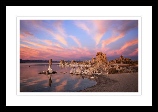
Nov 28, 2018 14:08:29 #
Linda From Maine wrote:
Thank you. The reason I asked is because of the of... (show quote)
Understood. Although I often boost saturation in specific colors on some images, I do tend to try to avoid the high level saturation you speak of. Interestingly enough, I've actually toned down a few colors in this image. This was one of the best "aspen glow" sunsets I've ever experienced. It was like being wrapped in orange/pink/purple light.
I'll probably be able to adjust a bit better once my printer is repaired.
Ive left the art festival circuit this past year, but at the time there were photographers who tended in both directions. Very high saturation shots were becoming a bit more prevalent (possibly due to the emergence of metal prints). Public reaction varies, of course. Like we photographers, some consumers like high color saturation, some do not.