Mono Lake - first mock up
Nov 28, 2018 13:20:28 #
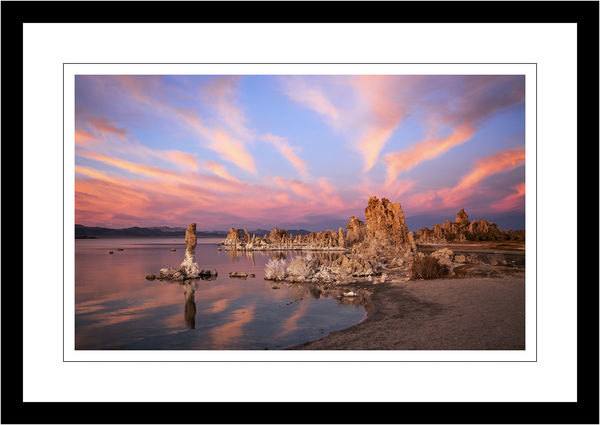
I've shot at Mono Lake south tufas a number of times, but never have I had an eastern sky at sunset to rival this one. This is the first mock up; simulated framing, some initial processing. Comments and suggestions welcome.
Nov 28, 2018 13:38:52 #

Hi Jim! Is this for a specific client? If no, for what purpose?
Nov 28, 2018 13:41:57 #
Linda From Maine wrote:
Hi Jim! Is this for a specific client? If no, for what purpose?
No, not for any specific person. May offer it for sale once I'm satisfied with the final version.
Purpose: to hang on a wall in house or office.
(Would it be more appropriate for me to post this in critique section to get initial reactions?)
Nov 28, 2018 13:54:26 #
Photographer Jim wrote:
Thank you. The reason I asked is because of the oft-discussed "saturation issue" No, not for any specific person. May offer it for sale once I'm satisfied with the final version. Purpose: to hang on a wall in house or office.
 And in follow-ups, marketability - what is popular currently.
 I find your photo to be very striking, particularly the cloud patterns, but the colors on my uncalibrated Chromebook are a little overpowering. Obviously this is a personal preference observation, but also speaks to the challenge of when - if ever - one should adjust reality.
If you have the time, I'd love to hear your experience with public perceptions and expectations as they've developed over the years (it's hard to find black velvet Elvis art anymore!).
Nov 28, 2018 14:08:29 #
Linda From Maine wrote:
Thank you. The reason I asked is because of the of... (show quote)
Understood. Although I often boost saturation in specific colors on some images, I do tend to try to avoid the high level saturation you speak of. Interestingly enough, I've actually toned down a few colors in this image. This was one of the best "aspen glow" sunsets I've ever experienced. It was like being wrapped in orange/pink/purple light.
I'll probably be able to adjust a bit better once my printer is repaired.
Ive left the art festival circuit this past year, but at the time there were photographers who tended in both directions. Very high saturation shots were becoming a bit more prevalent (possibly due to the emergence of metal prints). Public reaction varies, of course. Like we photographers, some consumers like high color saturation, some do not.
Nov 28, 2018 14:13:49 #
Photographer Jim wrote:
Thanks so much. A couple of years ago MinnieV posted a photo to FYC taken at Niagara Falls. She asked how to deal with the "unrealistic" light and color that was, in fact, very real.Understood. Although I often boost saturation in ... (show quote)
Nov 28, 2018 14:30:15 #

Sometimes we have to lie to tell the truth. I agree with Linda; the color (Safari, MacBook Pro 2018) seems unbelievably saturated. I appreciate your problem, though. I wonder if keeping the glow effects, say on the sand and the pillars, and ratcheting back the clouds and sky just a bit might work for you.
Fantastic catch, btw. Congratulations.
Fantastic catch, btw. Congratulations.
Nov 28, 2018 14:50:24 #

I can see why the others think it's a bit too ramped up, but I can also see why you'd want to keep the ambient tint and strong colouring. I think part of the problem may be the contrast that the bluer parts of the sky create. There's strong colouring and strong contrast colour-wise. One possibility might be to tint-shift blue towards purple a smidge, which would ease the contrast a bit while helping the sky to merge into the ambient purple. Haven't tried it so that may be a load of tosh  .
.
.Nov 28, 2018 14:51:26 #
artBob wrote:
Sometimes we have to lie to tell the truth. I agree with Linda; the color (Safari, MacBook Pro 2018) seems unbelievably saturated. I appreciate your problem, though. I wonder if keeping the glow effects, say on the sand and the pillars, and ratcheting back the clouds and sky just a bit might work for you.
Fantastic catch, btw. Congratulations.
Fantastic catch, btw. Congratulations.
Thanks Bob. On my large iMac, calibrated screen, the saturation is not as pronounced as your and Linda's reaction. I'm not sure if that is due to the differences in computers or personal preferences. Unfortunately, my printer is on the blink right now, so I can't see it on paper. I will pay attention to the saturation as I work up the final rendition.
Nov 28, 2018 14:54:06 #
On my Dell monitor it doesn't look over-saturated; it looks quite colorful but totally believable.
For the record I'm not a fan of the over saturated look, at all.
I've many sunset photos that look just that bright.
Beautiful photo by the way...
For the record I'm not a fan of the over saturated look, at all.
I've many sunset photos that look just that bright.
Beautiful photo by the way...
Nov 28, 2018 14:54:53 #
R.G. wrote:
I can see why the others think it's a bit too ramp... (show quote)
I think you may be on the right track here. Toning down to blue a bit, rather than the orange/red/pink may balance things a bit more. I'll keep that in mind as I proceed. Thanks for the comments.
Nov 28, 2018 22:25:29 #
IDguy
Loc: Idaho
People who don’t live out west or in the mountains often think our colors aren’t real. Mono Lake is at 6,500 ft., in an arid area (no haze), and far from pollution sources.
(I know Linda knows that...the opeartive word is FROM.)
(I know Linda knows that...the opeartive word is FROM.)
Nov 29, 2018 06:28:24 #

I am an ANTI FRAME guy. Your beautiful open space photo is jailed by a double black frame.. Yuck.
Suggestion: Gallery [mirrored edge] Wrap and mount on hardboard. I then use 3/4 blocks from Ebay to stand out from wall. I use on one resize.
https://www.breathingcolor.com/blog/how-to-create-a-mirrored-edge-for-a-gallery-wrap/?utm_campaign=youtube&utm_source=description&utm_medium=youtube&utm_term=14-04-photoshop-mirror-edge
https://www.youtube.com/watch?v=ELJRb6jJgzY&t=187s
Nov 29, 2018 07:05:07 #

What a great sky. I am somewhat hypersensitive to photos that strike me as over saturated, and contrary to many of the comments so far, this one didn't push that button. I think that the reason for that could be that I keep my monitor brightness at 50%, or there about, having learned that that gave me the best indication of what the print will look like on paper, and in my case mostly with B/W. Years ago I read that Canon colors needed to be corrected with a little nudge in color balance towards cyan, and I did agree that that slight adjustment made the difference, at least using the early 60D, but I kept that in mind through a succession of Canon bodies, and the bulk of my work was done using the 5D!! with the 24-105. I think the slight cyan shift is valid with that body as well, but Im no kind of expert about it. Anyway, you know you are living right when you get that kind of sky for that kind of landscape. Really a nice shot. Im sure that once you get your printer going you will get the feedback you need.
Nov 29, 2018 09:05:39 #
If you want to reply, then register here. Registration is free and your account is created instantly, so you can post right away.