Splendor Along The Path 2
Feb 17, 2019 20:35:05 #
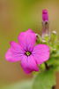
I love the pale greens and lavender in the first shot. Shot #2 has my eye drawn to the white rose -- no offense but I would omit/replace the white rose. Shot #3 doesn't do anything for me. All shots look nice and crisp. 
Feb 17, 2019 21:01:51 #
Pysanka Artist wrote:
I love the pale greens and lavender in the first shot. Shot #2 has my eye drawn to the white rose -- no offense but I would omit/replace the white rose. Shot #3 doesn't do anything for me. All shots look nice and crisp.
Thanks for commenting Linda!

Feb 17, 2019 23:55:04 #
Feb 18, 2019 00:48:49 #
Einreb92 wrote:
Very nice collection.
Thanks for stopping by and commenting Einreb92! Much appreciated! It's always nice to see a new visitor!
Feb 18, 2019 05:48:17 #
Snap Shot wrote:
Comment Welcomed!
Bill, I have to go with number three after viewing the DDLs. Another excellent set showing off your PP capability.
Greg
Feb 18, 2019 06:50:40 #
CLF wrote:
Bill, I have to go with number three after viewing the DDLs. Another excellent set showing off your PP capability.
Greg
Greg
Thanks so much Greg! I'm glad you voted and I love your kind reply!
Feb 18, 2019 22:41:28 #

Feb 18, 2019 23:53:33 #
If you want to reply, then register here. Registration is free and your account is created instantly, so you can post right away.