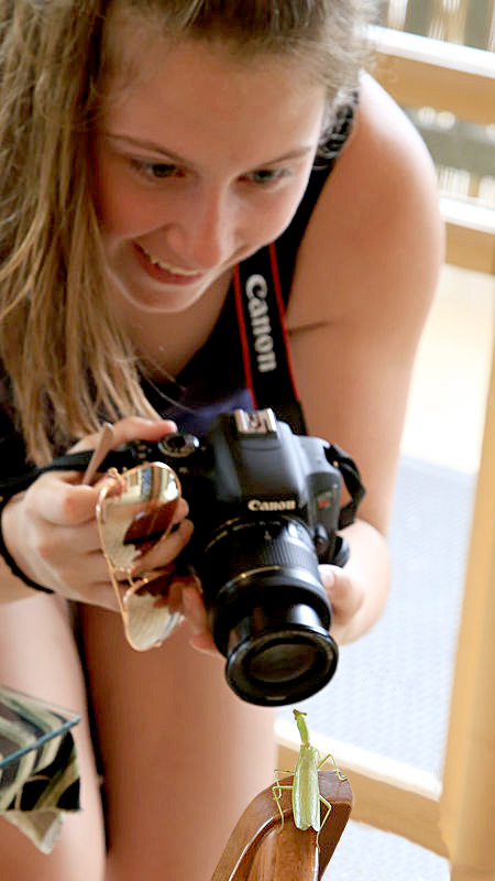
Help ! Where would you crop ?
Feb 13, 2019 12:00:10 #

Feb 13, 2019 12:42:14 #

Interesting but it doesn't look as though she's pointing the lens at the insect.
Greg Huntsinger wrote:
To crop or not. I like the expression on her face.
Feb 13, 2019 12:57:59 #
Greg Huntsinger
Loc: Battle Ground WA.
This is one of those hurry up and get the shot before its to late . Sorry for not getting the whole head in the photo
Feb 13, 2019 13:22:54 #

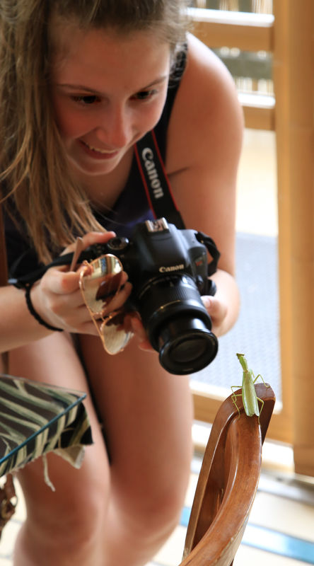
Second one by far (in my opinion). Unless you're shooting just for an insect mag or something similar. The expression on the young lady's face is priceless and adds so much to the photo. Can't lose that.
ron
ron
Feb 13, 2019 15:44:24 #

I would go with #2 . . . but I wish the camera was pointing at the preying mantis. I would probably do some PP to accomplish this, something like this.
Feb 13, 2019 15:56:01 #

There are as many crops as there are interests. My interest is the sudden discovery and joyfull quick shot of an insect indoors. So, I straightened the image, kept all the girl's face, included as much of the right as needed to set the scene, and brought up the bottom to make a good circular composition. Some sharpening and burning of the eyes completed my interpretation.
Feb 13, 2019 16:37:03 #

# 2 Gets my vote - BUT- with a little more cropping to the right and lower portion - just at the edge of her arm and down to just below the P.M. - getting rid of the door/window frame - then add a bit more green to the subject.
IMHO
Harvey
IMHO
Harvey
BrHawkeye wrote:
#2 for sure.
Feb 13, 2019 18:48:19 #

Feb 13, 2019 19:17:28 #

My first take was, yes, crop it because I could envision a nice diagonal line running from her face to the mantis. But then, as I scrolled down and saw it cropped it didn't have the same impact as the top image. I think that's because in the cropped image all that out of focus skin in the background is confusing where in the top image it's clear that you're looking at her legs and part of a plant.
I love the look of excitement and youthful joy on her face. Nice shot.
I love the look of excitement and youthful joy on her face. Nice shot.
Feb 13, 2019 21:37:58 #
HS
Loc: Wanaque, NJ
HS joined Jan. 26, 2019
Post 19 loc: Wanaque, NJ
Great story: pretty young lady discovers praying mantis.
I PREFER 2nd photo. However would suggest tightening up: crop to her left shoulder, lose the bottom up to slightly below the mantis, and cropin to lose the bracelet. Concentrates on the story.
Post 19 loc: Wanaque, NJ
Great story: pretty young lady discovers praying mantis.
I PREFER 2nd photo. However would suggest tightening up: crop to her left shoulder, lose the bottom up to slightly below the mantis, and cropin to lose the bracelet. Concentrates on the story.
Feb 14, 2019 11:33:58 #
billbarcus
Loc: IPNW
I wouldn't crop anything ... #1 tells the Whole Story. More DOF would have been nice though, especially focused on that intent fixation of the girl's eyes. In my HO, her eyes are the story.
Feb 14, 2019 12:03:43 #
cascom
Loc: Redmond
I like the first crop suggestion but enlarging the image brings attention to the brand name that is out-of-focus. Have you tried to sharpen the image?
If you want to reply, then register here. Registration is free and your account is created instantly, so you can post right away.