Need constructive criticism
Feb 7, 2019 07:50:02 #
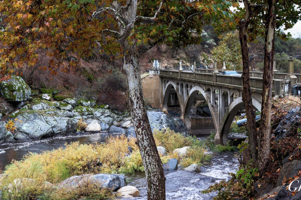
The tree on the left is distracting to my eye. If I were facing this scene, I would make an attempt to catch the bridge with nothing between me and the lovely bridge, like walking down the hill and shooting more up, or walking in front of the trees that are showing, or even zooming in between the two trees. Framing an object sometimes works, but the trees become objects themselves instead of a light framing at both sides.
Next two are pleasing compositions, but you might consider bringing more mid-tones out for better details, especially the bridge. I like how you have used leading lines in both of these images.
Next two are pleasing compositions, but you might consider bringing more mid-tones out for better details, especially the bridge. I like how you have used leading lines in both of these images.
Feb 7, 2019 07:56:49 #
Feb 7, 2019 08:52:59 #
Generally, I like all the pics. The first one with the trees and bridge, looks a bit oversaturated. The closest tree, in the middle, distracts me because it is right in the middle. Would a different shooting position have made it a more compelling shot? Would it be possible (maybe with dodge and burn) to bring out some of the details of the covered bridge interior? That black maw is too big and black.
In all, nice work. Keep shooting and sharing.
In all, nice work. Keep shooting and sharing.
Feb 7, 2019 09:05:40 #
Ghost45 wrote:
Looking for comments from the professionals on improvement
Yes, the B&W images are really good. Especially the composition of the photo of the covered bridge. When you get bored, see if you can bring out some detail from inside the bridge where it now is 100% black.
I would think that a skilled photoshop person could remove that ugly light blue drain pipe under the bridge on the 1st photo.
Feb 7, 2019 09:25:03 #
On the first image I would remove the foreground tree splitting the image. Makes the image much better.
Feb 7, 2019 09:47:45 #
Longshadow wrote:
They appear to be level to me, looking at some of the beams in the bridge, and the left side of the larger building in the last. The approach beams to the bridge are on an angle forward, so that is probably what is throwing it off for you.
I really like the photo of the covered bridge but some of it looks tilted or crooked. I agree with you Longshadow, the vertical beams under the roof being vertical but to me the roof, crown under the roof is either tilted or crooked, looks the right eave is slightly higher than the left eave in the photo....and the approach rails (horizontal) on the left near the road seems to be tilted inward. Hard to tell from that angle, maybe just my perspective. Any lens correction used? But then again it just might be a crooked bridge after all this time...

Feb 7, 2019 10:28:17 #
Bazbo
Loc: Lisboa, Portugal
Ghost45 wrote:
Looking for comments from the professionals on improvement
First of all, you have a very good eye for composition.
Image 1: Its hard to know exactly what the subject is. The trees are in focus and the bridge is not out of focus enough for it to genuinely blend into the background. When you have a very strong background element like the bridge, throw the aperture wide as it will go so that the background will be more out of focus. The same would be true if you are photographing the bridge and you want your foreground to be out of ficus. If your intent is to have both in sharp focus, then use a tripod and stop down. BTW, I know exactly where this bridge is--I have photographed it myself. It brought back some fond memories even though I ended up in the river hen I tried my hand.
Image 2: Nice composition but I would like to see more detail in the shadow areas.
Image 3: Another nice composition. As another poster said, the image needs to be leveled. Also, there is an element on the left edge of the frame (a fence maybe?) which I find a little distracting. I would either crop it out or "content-aware fill" it away.
I hope this helps.
Feb 7, 2019 10:36:02 #

I am not a professional Ghost, but I have been shooting since the early 70s and I can tell you that these are excellent, especially #1.
Feb 7, 2019 10:52:00 #
Feb 7, 2019 11:19:34 #

Feb 7, 2019 11:27:06 #
Your shots are good images. On the first one get rid of the two signs and the car and if you can move to the left and get the whole bridge in the screen and trees to the right. The two B&W ones are a bit dark you might lighten them a bit. On the bridge you might back up just a bit and get more lead lines with the road and walk. Don Z.
Feb 7, 2019 12:18:33 #
Longshadow wrote:
The first looks surreal.
Love the two B&W shots.
Love the two B&W shots.
I also think the first shot is too busy. What's the subject or is it just the mass of colors. Perhaps if it were shot from between the two trees some of the foreground would go away.
Feb 7, 2019 14:18:46 #
First one. Is it picture of a tree or a bridge. The bridge is certainly more interesting. Always (almost) fill the frame with the important object.
Feb 7, 2019 15:24:11 #
Feb 7, 2019 16:19:27 #

Great captures - # 1 is one I would do some PP on - that yellow sign would go as well as either burning the reflection on the drain pipe or cloning out - the car and other metal signs could also use some burning to eliminate/cut their reflection.
#2 nothing could be done to improve this image as no mater what angle one would shoot it those angled beams used for supports throughout the structure will always look "off" to some people
#3 great image - the fence on the left could come further down to the corner or be cut out completely.
JMHO
Harvey
If you want to reply, then register here. Registration is free and your account is created instantly, so you can post right away.