Need constructive criticism
Feb 6, 2019 12:23:16 #
Looking for comments from the professionals on improvement
Feb 6, 2019 12:34:58 #

I fear you may reduce the good feedback you might otherwise receive by limiting your request to "professionals." There are many outstanding nature and landscape photographers here who do not make their living in photography, but can (and do!) write books on the subject...
Feb 6, 2019 12:39:19 #

Feb 6, 2019 12:41:21 #
tommystrat wrote:
I fear you may reduce the good feedback you might otherwise receive by limiting your request to "professionals." There are many outstanding nature and landscape photographers here who do not make their living in photography, but can (and do!) write books on the subject...
ditto
Feb 6, 2019 12:44:56 #
Feb 6, 2019 12:49:28 #

Feb 6, 2019 13:03:20 #

Ghost45 wrote:
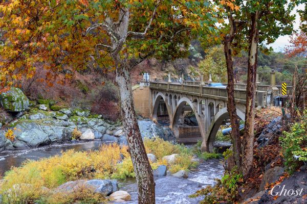
The first image color is beautiful but I find the trees as a visual disturbance as my eye wants to go up the trees.Looking for comments from the professionals on improvement
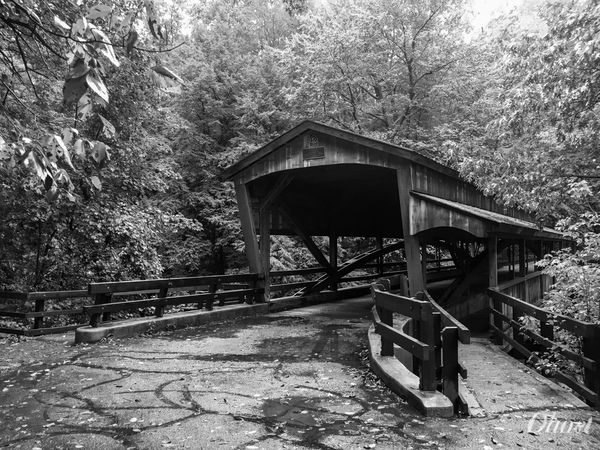
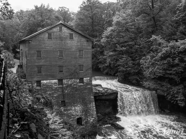
The second and third image in Black and white are lovely except they need to be adjusted for level. Both images appear tilted to the left.So, it makes one feel that the structures are tilted.
Feb 6, 2019 13:04:34 #

Each is well composed and has great tonal range. The first is so oversaturated that a fine scene looks juiced up, as for a travel brochure or some other commercial venture aimed low. Perhaps backing off the saturation until you exaggerate just a bit?
Feb 6, 2019 13:11:11 #
PixelStan77 wrote:
The first image color is beautiful but I find the trees as a visual disturbance as my eye wants to go up the trees.
The second and third image in Black and white are lovely except they need to be adjusted for level. Both images appear tilted to the left.So, it makes one feel that the structures are tilted.
The second and third image in Black and white are lovely except they need to be adjusted for level. Both images appear tilted to the left.So, it makes one feel that the structures are tilted.
They appear to be level to me, looking at some of the beams in the bridge, and the left side of the larger building in the last. The approach beams to the bridge are on an angle forward, so that is probably what is throwing it off for you.
Feb 6, 2019 13:45:33 #
Feb 6, 2019 21:13:54 #

Ghost45 wrote:
Looking for comments from the professionals on improvement
I'm drawn to the mill and waterfall simply due to the subject matter. All in all a nice composition, but a longer shutter speed would have enhanced the waterfall. And perhaps try to get some separation of the tone values in post production if possible. Just my thoughts. Best wishes.
Feb 6, 2019 21:35:45 #
Photobum wrote:
I'm drawn to the mill and waterfall simply due to the subject matter. All in all a nice composition, but a longer shutter speed would have enhanced the waterfall. And perhaps try to get some separation of the tone values in post production if possible. Just my thoughts. Best wishes.
Thank you
Feb 7, 2019 01:49:54 #
For me .. in the first .. I find the distraction of the blurred car .. the yellow caution sign ...the corrugated drain and the mounted lights and speaker mounted by the tree ... I would remove them for a 100% Landscape look ..
Over enhancement on some of the trees and a washed out look on the rocks and areas between the trees and river ..
The second picture .., a slight straightening to the right and a slight lightening of the inside of the shadow area in the bridge ..
On the third .. a little faster shutter speed .. for the water and straighten out to the right the horizontal and
The wood slats on the building beg for detail .. to be brought out ..I would detail that area /..
I will private message you the changes I believe will make your already good shots ..great shots ...The first shot will be a challenge as it has been post edited a lot ...
Thnx for asking and posting .., that takes courage on this site ...
Feb 7, 2019 06:17:26 #

Ghost45 wrote:
Looking for comments from the professionals on improvement
Nice set.
Feb 7, 2019 06:43:37 #

If you want to reply, then register here. Registration is free and your account is created instantly, so you can post right away.