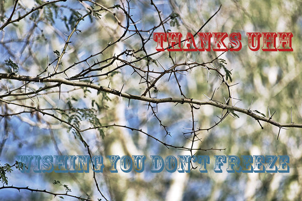
Is This Worth Keeping?
Jan 29, 2019 08:05:32 #
StanMac
Loc: Tennessee
If you’re drawn to it, keep it. Just don’t get too close - those thorns look mighty sharp!
Stan
Stan
Jan 29, 2019 09:09:07 #
olemikey
Loc: 6 mile creek, Spacecoast Florida
I do stuff like that too, I thought it was just me!!!! Sometime the beauty of the simplest things shines through in a busy world.
Jan 29, 2019 09:15:35 #
When I look at this image my first question is "What is the subject?" I am not sure what that is. As has already been said, if it is an image that appeals to you then keep it. If it were mine I would try bringing down the background highlights a bit and maybe even a crop to highlight the thorny branches more.
Jan 29, 2019 09:41:52 #
gvarner
Loc: Central Oregon Coast
No place for the eye to land or come back to, i.e. no definitive subject. It’s an appealing abstract though. Maybe try B&W?
Jan 29, 2019 10:17:35 #

Words have been already taken away from my mouth! It is your shot and if it pleases you that to me is what is important. Can the image be improved? Yes, it can if you decide to keep it.
This is a version with a simple Curves adjustment lifting the contrast somewhat.
By the way, assign a color profile to your image. I suggest sRGB.
This is a version with a simple Curves adjustment lifting the contrast somewhat.
By the way, assign a color profile to your image. I suggest sRGB.

Jan 29, 2019 10:25:14 #

camerapapi wrote:
Words have been already taken away from my mouth! It is your shot and if it pleases you that to me is what is important. Can the image be improved? Yes, it can if you decide to keep it.
This is a version with a simple Curves adjustment lifting the contrast somewhat.
By the way, assign a color profile to your image. I suggest sRGB.
This is a version with a simple Curves adjustment lifting the contrast somewhat.
By the way, assign a color profile to your image. I suggest sRGB.
I already redid it based on comments about cropping out the bad bokeh and highlighting the branches in the foreground. I tried B&W but didn’t like it.
What I do like is the color profile you suggested.
Thank you. I like it better. I don’t know that I’ll ever print it, but it’s been a learning experience from all the suggestions, especially about the bokeh.
Jan 29, 2019 10:44:45 #

First, I never "throw" any shots away. I may not develop them, but I keep them. One never knows when a shot might have appeal years from now.
I like this image. It's the type of semi-abstract image that I really like. If you're wanting to sell pictures, it might be a hard sell, as unfortunately it's going to appeal to a few (as you can see from the comments here). I like the soft colours and the beautiful tangle of branches. That's the type of scene I see out my window, and I love it.
I like this image. It's the type of semi-abstract image that I really like. If you're wanting to sell pictures, it might be a hard sell, as unfortunately it's going to appeal to a few (as you can see from the comments here). I like the soft colours and the beautiful tangle of branches. That's the type of scene I see out my window, and I love it.
Jan 29, 2019 10:53:57 #

That is very subjective. If you like it and it gives you pleasure and positive feelings when viewing, then keep it.
It looks a little soft and I don't see a "focus of attention" or specific point of interest.
It looks a little soft and I don't see a "focus of attention" or specific point of interest.
Jan 29, 2019 11:01:00 #
It's an interesting photo. If you like it my advice would be to satisfy yourself and keep it. Perhaps the circumstances behind why you took it are reason enough. I have a lot of photos that would most assuredly evoke a ho hum response from others but I've retained them because they help me remember the circumstances.
Jan 29, 2019 11:09:41 #
This is perfect to make a card. Put in a little more thought and execution of course.
Print it out and send it to someone. I use a pixma pro 100 and send out cards all the time. Gives me an excuse to work on ps. I can also re contextualize a lot of the photos I like but are not gallery material. It is fun and you can put in as much or as little work as you want.
Print it out and send it to someone. I use a pixma pro 100 and send out cards all the time. Gives me an excuse to work on ps. I can also re contextualize a lot of the photos I like but are not gallery material. It is fun and you can put in as much or as little work as you want.
Jan 29, 2019 11:11:16 #

Kind of a thorny subject, do we create images that we like or are we out to please others? My 2 cents; I agree with Linda. I like the soft background against the sharp thorns. Only wish (maybe) that the thorns were just a tad darker to stand out even more as a counterpoint.
Jan 29, 2019 12:47:32 #

speters wrote:
I can't really see it, but that is not what matters, YOU are drawn to it, so you like it, and THAT's what matters! So I say, KEEP IT!
I hear you. Everyone is afraid to pull the trigger. Always looking for group authorization. By the time you get finished with the process it is no longer your interpretation but someone else's.
Jan 29, 2019 17:57:30 #
bertloomis
Loc: Fort Worth, Texas
It might be. Depends on how much you like it. I probably would not keep it.
mcmama wrote:
I can’t decide. I’m drawn to it, but I’m not sure I’ve done all I can to make it worth keeping.
Any comments/suggestions/critiques you may have are welcomed.
Thanks,
Dana
Any comments/suggestions/critiques you may have are welcomed.
Thanks,
Dana
Jan 29, 2019 17:59:25 #
bertloomis
Loc: Fort Worth, Texas
I like this one.
Fred Harwood wrote:
Letting PSE do its thing, then employing adjust layer/equalize slider to about 30% gives this.
Does this help?
Does this help?
Jan 29, 2019 18:55:11 #

If you want to reply, then register here. Registration is free and your account is created instantly, so you can post right away.