Experimental photography
Jan 19, 2019 08:52:08 #

Jan 19, 2019 09:35:54 #
Jan 19, 2019 10:06:07 #
Like #1 best but it might depend on where I was going to hang or display it.
Jan 19, 2019 10:18:06 #
That'll teach you to put an image out that isn't perfectly level!LOL
Your question is really hard to answer because in different contexts each image has it's merits. I think all of them are nice images, even the one with the slanting table.
Your question is really hard to answer because in different contexts each image has it's merits. I think all of them are nice images, even the one with the slanting table.
Jan 19, 2019 10:22:38 #
Jan 19, 2019 11:03:52 #
The 1st one is my favorite, really dramatic effect - really grabbed my attention! I agree with what others have said about the need to level the table top.
Jan 19, 2019 11:14:25 #
Personally, I like them all, and depending on the purpose any of them could be used. I would recommend that you tilt the camera so the table is straight
on all of them. Mike
on all of them. Mike
Jan 19, 2019 11:45:00 #
No 1 truly captured my eye. They are all wonderful and based individual perception. No 3 was my next one I was drawn to.
Jan 19, 2019 11:55:39 #
Jan 19, 2019 12:11:44 #
AirWalter
Loc: Tipp City, Ohio
dnbjb1 wrote:
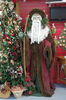
Four different interpretations of the same photograph. Which one is best?
Hard to chose between 1 and 2, but if I had to pick only one it would be #1 because of the oval in #2.
Jan 19, 2019 13:33:18 #
The best one is the one YOU like the best. My favorite is #2 after leveling, and then #1. It's fun to play around in PS for sure.
Jan 19, 2019 13:39:50 #

dnbjb1 wrote:
Four different interpretations of the same photograph. Which one is best?
I think 2 is best for the subject.
Jan 19, 2019 14:30:11 #
Jan 19, 2019 15:33:53 #
dnbjb1
Loc: Madison, Ms.
artBob wrote:
"Best" is impossible to say, except for ... (show quote)
Very observant constructive critique. I will work on the subject using your advice. Thanks for the suggestions. David
Jan 19, 2019 17:21:55 #
Disregarding the slight angle, which is easily fixed in PS, my favorite is #3 for its very real look, then #4 for the contrast, number 1 for the "WOW" factor then #4 (which I would have just cropped to the oval and not included the corners).
Overall, very nice work.
Overall, very nice work.
If you want to reply, then register here. Registration is free and your account is created instantly, so you can post right away.