Lightroom Tips, Tricks and Techniques #12, The difference between the Vibrance and Saturation sliders.
Aug 20, 2012 11:39:18 #

After a hiatus of about 4 weeks for vacation, visitors and honey-do lists, Im back with some new ideas for using Lightroom. I hope you will enjoy them and find them useful.
Confused as to when to use the Vibrance or the Saturation slider in the Basic Panel of the Develop Module? They both work on the saturation of colors in an image but do so in subtly different ways.
The saturation control is a blunt instrument and adds saturation to all colors equally across the board. In other words, colors that are already highly saturated may become oversaturated and colors that started out at a low saturation level will only be brought up to a middle level. Since it affects all colors, skin tones can be adversely affected.
The Vibrance control, however works differentially. It affects less saturated colors more than those that are already highly saturated. This helps keep already saturated colors from being over saturated and tends to even things out. Most importantly, vibrance has less of an effect on Caucasian skin tones which are mostly in the orange and red range.
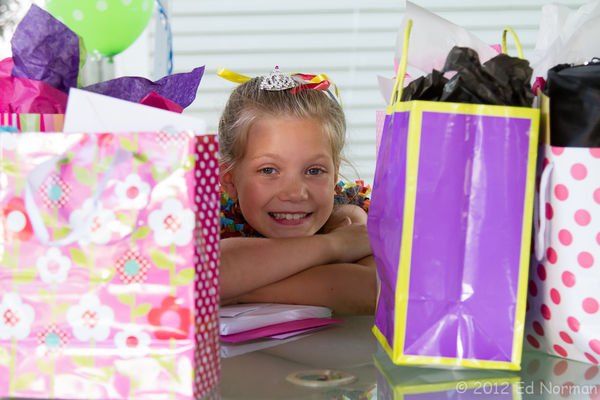
The first picture is the RAW photo with no adjustments to color. Most of the colors are of a lower saturation with the exception of the ribbons in her hair and on either side of her face.
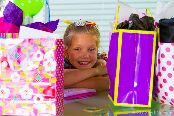
The second has the Vibrance slider set to 100. One would normally not apply that much vibrance, but Ive done it to make the differences much more apparent. Note the skin tones, while affected, arent off that much, and the colors of the ribbons have been increased in saturation but they are not blocked. The purples, which were of low saturation, have been brought up quite high, but again, not off the chart.
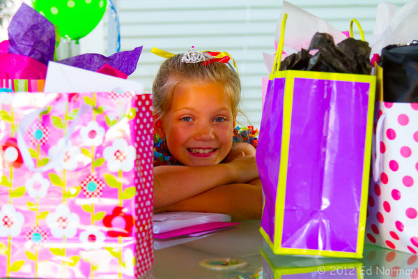
The third has the Saturation slider at 100. Look at the skin tones! Yuk! The ribbons are off the chart (remember, they were highly saturated to start with). The purples are less saturated than in the vibrance example. Remember, the Saturation slider adds exactly the same amount to all the colors, so, since the purples were less saturated to start, they only came up to about mid level.
All of these effects can be further fine tuned in the HSL panel which will be the subject of one of my future posts. I hope this helps you understand the how, when and why of using vibrance vs saturation.
If you have suggestions for future Tips, Tricks and Techniques in LR get in touch by PM and I will include them and give you credit for submitting them. Previous posts in the series are at:
http://www.uglyhedgehog.com/t-45586-1.html
http://www.uglyhedgehog.com/t-45714-1.html
http://www.uglyhedgehog.com/t-45979-1.html
http://www.uglyhedgehog.com/t-47032-1.html
http://www.uglyhedgehog.com/t-48027-1.html
http://www.uglyhedgehog.com/t-49006-1.html
http://www.uglyhedgehog.com/t-49346-1.html
Confused as to when to use the Vibrance or the Saturation slider in the Basic Panel of the Develop Module? They both work on the saturation of colors in an image but do so in subtly different ways.
The saturation control is a blunt instrument and adds saturation to all colors equally across the board. In other words, colors that are already highly saturated may become oversaturated and colors that started out at a low saturation level will only be brought up to a middle level. Since it affects all colors, skin tones can be adversely affected.
The Vibrance control, however works differentially. It affects less saturated colors more than those that are already highly saturated. This helps keep already saturated colors from being over saturated and tends to even things out. Most importantly, vibrance has less of an effect on Caucasian skin tones which are mostly in the orange and red range.
The first picture is the RAW photo with no adjustments to color. Most of the colors are of a lower saturation with the exception of the ribbons in her hair and on either side of her face.
The second has the Vibrance slider set to 100. One would normally not apply that much vibrance, but Ive done it to make the differences much more apparent. Note the skin tones, while affected, arent off that much, and the colors of the ribbons have been increased in saturation but they are not blocked. The purples, which were of low saturation, have been brought up quite high, but again, not off the chart.
The third has the Saturation slider at 100. Look at the skin tones! Yuk! The ribbons are off the chart (remember, they were highly saturated to start with). The purples are less saturated than in the vibrance example. Remember, the Saturation slider adds exactly the same amount to all the colors, so, since the purples were less saturated to start, they only came up to about mid level.
All of these effects can be further fine tuned in the HSL panel which will be the subject of one of my future posts. I hope this helps you understand the how, when and why of using vibrance vs saturation.
If you have suggestions for future Tips, Tricks and Techniques in LR get in touch by PM and I will include them and give you credit for submitting them. Previous posts in the series are at:
http://www.uglyhedgehog.com/t-45586-1.html
http://www.uglyhedgehog.com/t-45714-1.html
http://www.uglyhedgehog.com/t-45979-1.html
http://www.uglyhedgehog.com/t-47032-1.html
http://www.uglyhedgehog.com/t-48027-1.html
http://www.uglyhedgehog.com/t-49006-1.html
http://www.uglyhedgehog.com/t-49346-1.html
This is the basic photo with no adjustments made to color.
In this version, I've set the Vibration slider at 100, the max.
Here it is with Saturation set at 100.
Aug 21, 2012 07:35:23 #
Aug 21, 2012 07:35:29 #

Thank you so much for all your Lightroom instructions. I've printed them all off so I can work through them. I've used iPhoto till recently, but am finding Lightroom does so much more. It just means so much more to learn and understand.
Thanks again.
Thanks again.
Aug 21, 2012 10:33:45 #

Thanks birdpix! I recently got LR 4.1 and am in the process of learning how to use it. Your tutorials are very helpful and couldn't have come at a better time. :thumbup:
Aug 21, 2012 10:34:19 #

Man, I was hoping you would continue your tutorials. Read them faithfully.
Aug 21, 2012 12:59:11 #
Lucian
Loc: From Wales, living in Ohio
I just read basically the same thing in my latest NAPP Photoshop magazine that came in last week. They also had an article talking exactly about what you just mentioned, what a coincidence.
Aug 21, 2012 13:15:03 #

It's good to see the affect of vibrance at 100. I've been stingy with it and might rethink this now that I know it's not nearly as nasty as too much saturation.
Aug 21, 2012 13:42:24 #
Lucian wrote:
I just read basically the same thing in my latest NAPP Photoshop magazine that came in last week. They also had an article talking exactly about what you just mentioned, what a coincidence.
And it truly is a coincidence, since I don't read that Magazine!
Aug 21, 2012 13:48:42 #
les_stockton wrote:
It's good to see the affect of vibrance at 100. I've been stingy with it and might rethink this now that I know it's not nearly as nasty as too much saturation.
It is so much more helpfull when you have skin tones to deal with. Even if it overdoes them a little you can go in and adjust them with the targeted selection tool on the Saturation slider in the HSL panel. Alternately, you could use the adjustment brush and reduce the saturation only on the face if you had other, non skin tone, areas you wanted to preserve.
Aug 21, 2012 14:03:51 #
Lucian
Loc: From Wales, living in Ohio
you could make a layer mask as well and just reduce or totally paint out the effect once you are happy with the rest of the image area.
Aug 21, 2012 21:23:03 #
Thank you all for your kind words. I appreciate the feedback. Remember, if there is a topic you want covered, let me know.
Aug 22, 2012 16:01:38 #
Lucian wrote:
you could make a layer mask as well and just reduce or totally paint out the effect once you are happy with the rest of the image area.
LR doesn't use layers, you need to go to Photoshop or Elements to do that.
Aug 22, 2012 16:34:13 #
birdpix wrote:
After a hiatus of about 4 weeks for vacation, visitors and honey-do lists, Im back with some new ideas for using Lightroom. I hope you will enjoy them and find them useful.
Thanks. I always found those two confusing. Good explanation. :thumbup:
If you want to reply, then register here. Registration is free and your account is created instantly, so you can post right away.