Broken Hill...Which Do You Prefer
Dec 15, 2018 10:49:51 #
Thank you, everyone, for your comments, opinions, and suggestions....trying to improve and learn more...onward and upward.
Dec 15, 2018 12:25:20 #

With a bit of juggling you can have a middle-of-the-road look and at the same time still keep the strong colours. It's a balancing act.
-
-
Dec 15, 2018 12:32:57 #
R.G. wrote:
With a bit of juggling you can have a middle-of-the-road look and at the same time still keep the strong colours. It's a balancing act.
-
-
I like this one....a winner for me...thank you!
Dec 15, 2018 12:53:39 #
deanfl wrote:
I like this one....a winner for me...thank you!
You're welcome. Where colour strength is concerned I found I had to fine tune my ability to tell the difference between vivid and garish, or where contrast is concerned, the difference between vivid and harsh.
Dec 16, 2018 09:27:58 #

Although I prefer pastel colors I have to admit that No.1 looks to me better.
Dec 16, 2018 12:17:35 #

#2 seems to show more detail, don't know if that is a worthy criteria tho.
Dec 16, 2018 12:22:24 #
Took these two images in to PS Express on the iPad and ran the 'enhance' pre-set. No muchly differences emerged. So there is not seemingly 'extra' detail to be had. Good shots.
Dec 16, 2018 13:07:08 #
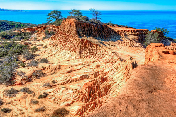
I went to school at UCSD, just down the road from Torrey Pines and the Orange sandstone in #1 is not extremely over saturated. It’s really Orange. What bothers ,e is the blue in the ocean and sky. If you are using Lightroom ( or many other PP apps) you can turn down the saturation in the aqua and blue tones, and maybe the orange and yellow tones just a tiny bit, and I think that would help. The oranges are too understated in #2 and the blues still bother me. Just my suggestions. Nice composition. jak
Dec 16, 2018 15:51:58 #

I am going with #2. The colors and tones at least for me feel more realistic. Many people are becoming in love with too much saturation. You can see it happen not only here on the Hog but on the internet in general. But after all is said and done you have to make momma happy. 
Dec 16, 2018 19:16:26 #

Was #1 actually the way it came out of the camera? Do you have settings in the camera changed to increase saturation? To me, that photo is just unnatural in its garishness and I have trouble accepting it as the way it really looked. I prefer #2.
Dec 16, 2018 20:12:57 #
larryepage
Loc: North Texas area
deanfl wrote:
This is Broken Hill, located at Torrey Pines State Reserve, San Diego, California. The first photo is my original...I was a little concerned that it seemed a little too saturated....the 2nd is less intense....my wife likes #1. I prefer #1 as well. I have learned from previous posts that sometimes many people don’t always agree with me. Which do you prefer?
I am partial to landscapes that "don't look natural," if that's how they really appeared (or close to it). The unusual or unexpected is much more interesting to me, as long as it is not faked. That said, exaggerated color can be a very intriguing way to create abstract images. So...I prefer #1.
Dec 17, 2018 01:32:16 #
Dec 17, 2018 18:30:54 #
Dec 17, 2018 20:37:21 #
Dec 23, 2018 20:38:26 #

deanfl wrote:
This is Broken Hill, located at Torrey Pines State Reserve, San Diego, California. The first photo is my original...I was a little concerned that it seemed a little too saturated....the 2nd is less intense....my wife likes #1. I prefer #1 as well. I have learned from previous posts that sometimes many people don’t always agree with me. Which do you prefer?
I prefer number 2 because it looks more like what I suspect it looks like in person; the first one looks a little overdone. Maybe that's the engineer in me (not an artist). The best one is the one that you like though.
If you want to reply, then register here. Registration is free and your account is created instantly, so you can post right away.