Broken Hill...Which Do You Prefer
Dec 15, 2018 06:23:33 #
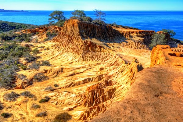
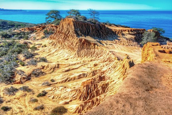
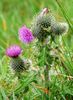
This is Broken Hill, located at Torrey Pines State Reserve, San Diego, California. The first photo is my original...I was a little concerned that it seemed a little too saturated....the 2nd is less intense....my wife likes #1. I prefer #1 as well. I have learned from previous posts that sometimes many people don’t always agree with me. Which do you prefer?
Dec 15, 2018 06:32:58 #

I prefer #2, but remember each viewer sees differently and it depends also on the ambient lighting and device. There is no right or rong. This is s beautiful scene well captured.
Dec 15, 2018 06:41:18 #

Dec 15, 2018 06:51:36 #

deanfl wrote:
This is Broken Hill, located at Torrey Pines State Reserve, San Diego, California. The first photo is my original...I was a little concerned that it seemed a little too saturated....the 2nd is less intense....my wife likes #1. I prefer #1 as well. I have learned from previous posts that sometimes many people don’t always agree with me. Which do you prefer?
Dean, I am with you and your wife, I like the color in number one.

Greg
Dec 15, 2018 07:02:56 #

Dec 15, 2018 07:25:45 #

I agree with UTMike, #1 does not look natural. However, #2 appears a little washed out. I would prefer something in the middle.
Dec 15, 2018 07:38:02 #

Some people don't mind the ramped up look and others prefer a more natural look. I'm with Mike and Fred in that I'd prefer something in the middle.
Usually when the saturation's ramped up the problem is that it starts to look a bit garish, and when that's the problem it's usually the warmer colours that are the problem - in particular yellow, followed closely by orange. Most times if you subdue yellow and orange the ramped up look starts to look more acceptable, even to people who normally prefer a natural look.
I did a quick edit on your shot where I tint-shifted yellow towards orange a bit, darkened and desaturated yellow a bit, then desaturated orange to a lesser extent. To my eye the result is subtly different but more acceptable (i.e. less garish). I can post the edit if you like so you can compare.
Dec 15, 2018 07:46:12 #
R.G. wrote:
Some people don't mind the ramped up look and othe... (show quote)
Thank you for your detailed response...yes, please post your version...I’ll call it #3, the Goldilocks version 🙂🙂
Dec 15, 2018 07:51:34 #
It probably needs a side-by-side comparison to see the differences properly. It should still satisfy the saturation afficionados.
-
-
Dec 15, 2018 08:03:19 #
R.G. wrote:
It probably needs a side-by-side comparison to see the differences properly. It should still satisfy the saturation afficionados.
-
-
Thanks, R.G., I agree your version has sufficient impact to please most people.
Dec 15, 2018 08:10:39 #

I like #2 of the opening two because I can see the details of the rock formation better. I think it's a very interesting subject and I enjoyed examining closely, as well as stepping back for the overview.
I do enjoy strong colors (for example, my red mountain here), just not for this particular photo, even with R.G.'s tweak.
I do enjoy strong colors (for example, my red mountain here), just not for this particular photo, even with R.G.'s tweak.
Dec 15, 2018 08:48:42 #

I’ll go with the second one because the first seems a little overdone. But, hey, it’s your photo, so go with what you like.
Dec 15, 2018 09:01:52 #

deanfl wrote:
This is Broken Hill, located at Torrey Pines State Reserve, San Diego, California. The first photo is my original...I was a little concerned that it seemed a little too saturated....the 2nd is less intense....my wife likes #1. I prefer #1 as well. I have learned from previous posts that sometimes many people don’t always agree with me. Which do you prefer?
I like the contrast in 1 better.
Dec 15, 2018 09:09:17 #
Just Fred wrote:
I agree with UTMike, #1 does not look natural. However, #2 appears a little washed out. I would prefer something in the middle.
I'm with Fred - something in the middle would probably be perfect.
Dec 15, 2018 10:21:12 #

wham121736 wrote:
I prefer #2, but remember each viewer sees differently and it depends also on the ambient lighting and device. There is no right or rong. This is s beautiful scene well captured.
If you want to reply, then register here. Registration is free and your account is created instantly, so you can post right away.