Color or B&W?
Dec 16, 2018 11:05:58 #

nimbushopper wrote:
I like them both but prefer the color version. Great composition!
Thanks for selecting one Nimbushopper.

Dec 16, 2018 11:28:22 #
IMHO the color is preferable. I usually am partial to B&W but the colors in this are very nice
Dec 16, 2018 11:36:53 #

I prefer the color I think the vivid colors really pop.
Bmac wrote:
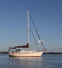
Photographed at Sagamore Hill in Oyster Bay NY https://www.nps.gov/sahi/index.htm
ISO 200 - 38mm - f/7.1 - 1/200 sec.
Critique, comments and suggestions always welcomed. Thanks
Select download for additional resolution.
ISO 200 - 38mm - f/7.1 - 1/200 sec.
Critique, comments and suggestions always welcomed. Thanks
Select download for additional resolution.
Dec 16, 2018 12:01:11 #

Dec 16, 2018 12:05:10 #
B&W is my choice. The color shot has certain qualities but for me the B&W does it best.
Dec 16, 2018 12:28:39 #

Bmac wrote:
Thanks Bob....I would have figured you for the B&W in this one.
I know...crazy...but I'm not crazy about the sepia with this shot, and I don't see enough range from black blacks, to white whites...(and that's just my opinion...which means absolutely nothing!!!)...I do like your revised post!!
Dec 16, 2018 12:33:55 #

Bmac wrote:
Photographed at Sagamore Hill in Oyster Bay NY https://www.nps.gov/sahi/index.htm
ISO 200 - 38mm - f/7.1 - 1/200 sec.
Critique, comments and suggestions always welcomed. Thanks
Select download for additional resolution.
ISO 200 - 38mm - f/7.1 - 1/200 sec.
Critique, comments and suggestions always welcomed. Thanks
Select download for additional resolution.
Nice shot and I prefer the color.
Dec 16, 2018 13:08:33 #
Dec 16, 2018 13:41:32 #
nature nut wrote:
The black and white looks a lot like Sepia. Which I like the older look. A bit more contrast I would think and darker on rest.
Thanks for commenting Nature Nut.
Dec 16, 2018 13:43:37 #
Bison Bud wrote:
I generally prefer color over B/W. However, this ... (show quote)
Thanks for your detailed comments Bison Bud which are all valid points. You might like the color version edit on this page.
Dec 16, 2018 13:45:03 #
rdemarco52 wrote:
Color.
DragonsLady wrote:
Color best. It drew me in while the sepia just sort of faded like a long forgotten dream.
Thank you both for looking and opining.
Dec 16, 2018 14:14:35 #
Dec 16, 2018 15:28:37 #

I go with the color version in these two images.Now if it was a true b&w i probably would have picked the b&w.
Dec 16, 2018 15:30:57 #
Bmac, In this case I prefer the color rendition as it better reflects the fall colors, but I think the green rushes and cattails are far too bright considering the mostly grey fall colors on the trees in the far background. As I recall, hopefully correctly the cattails and most salt water front plants had some greenish grey winter foliage and were a dull grey.
Dec 16, 2018 16:36:03 #
If you want to reply, then register here. Registration is free and your account is created instantly, so you can post right away.