Color or B&W?
Dec 15, 2018 11:41:29 #

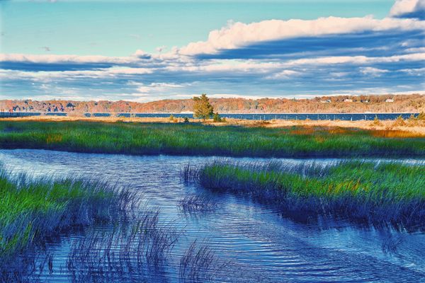
Photographed at Sagamore Hill in Oyster Bay NY https://www.nps.gov/sahi/index.htm
ISO 200 - 38mm - f/7.1 - 1/200 sec.
Critique, comments and suggestions always welcomed. Thanks
Select download for additional resolution.
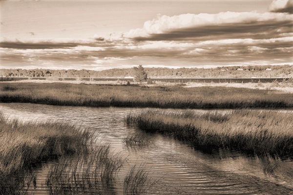
ISO 200 - 38mm - f/7.1 - 1/200 sec.
Critique, comments and suggestions always welcomed. Thanks
Select download for additional resolution.
Dec 15, 2018 11:44:16 #

Bmac wrote:
I vote for the color. Has more impact to my eyes.Photographed at Sagamore Hill in Oyster Bay NY https://www.nps.gov/sahi/index.htm
ISO 200 - 38mm - f/7.1 - 1/200 sec.
Critique, comments and suggestions always welcomed. Thanks
Select download for additional resolution.
ISO 200 - 38mm - f/7.1 - 1/200 sec.
Critique, comments and suggestions always welcomed. Thanks
Select download for additional resolution.
Dec 15, 2018 11:46:44 #
PixelStan77 wrote:
I vote for the color. Has more impact to my eyes.
Thanks for commenting Pixel. If you would like to critique the photos feel free to do so.
Dec 15, 2018 11:55:40 #
ricardo7
Loc: Washington, DC - Santiago, Chile
The black and white has a nice level of sophistication and subtlety. The color picture is quite garish. I would say stick with the black and white.
Dec 15, 2018 12:00:11 #

I usually pick black & white for some photo's but the color of the blue water and the green grass looks too good to pass up.
Dec 15, 2018 12:07:27 #

Bmac wrote:
Photographed at Sagamore Hill in Oyster Bay NY https://www.nps.gov/sahi/index.htm
ISO 200 - 38mm - f/7.1 - 1/200 sec.
Critique, comments and suggestions always welcomed. Thanks
Select download for additional resolution.
ISO 200 - 38mm - f/7.1 - 1/200 sec.
Critique, comments and suggestions always welcomed. Thanks
Select download for additional resolution.
Hi, Bmac,
I am partial to your monochrome version... it’s emphasis on well-handled tonality is what grabs me.
To my eye a crucial compositional component is that solitary tree that just barely,,,but noticeably...breaks the horizon. It ties together - but also emphasizes - the delineation of earthly and sky tones.
Really well done!
Dave
Dec 15, 2018 12:18:47 #

A subjective question. Ok. I like b/w treatment of landscapes, so my nod goes to your second one. Nice composition in the landscape!
Dec 15, 2018 12:23:45 #

I too like black and white (monochrome). I convert many of my seashore pictures to them and print both the color and BW versions. I always end up framing the BW ones.
I like your B&W version. The color one is too garish, as another poster mentioned, for my taste.
I like your B&W version. The color one is too garish, as another poster mentioned, for my taste.
Dec 15, 2018 12:26:42 #
Dec 15, 2018 12:29:15 #

Color but please desaturate it , the colors are unreal
Dec 15, 2018 12:31:21 #
Ron Dial
Loc: Cuenca, Ecuador
Just a quick note on B&W. Green grass equates to 18% gray (the same as a gray card for exposure). You can use the grass to adjust the exposure of your B&W image.
Dec 15, 2018 12:36:07 #
Color but please desaturate it , the colors are unreal
Dec 15, 2018 12:38:08 #
I like your B&W treatment better. The color looks overcooked to me.
Dec 15, 2018 12:38:08 #

To be honest I find the color to be overcooked. I prefer the mono but would have not personally gone towards sepia with it. I am more a fan of deep blacks & contrast. But all this is part of the enjoyment of photography. There’s as many views as photographers. Nevertheless, it’s a fine image in my view. My compliments.
Dec 15, 2018 12:55:24 #
If you want to reply, then register here. Registration is free and your account is created instantly, so you can post right away.