Which photo for the contest?
Jul 20, 2018 02:21:47 #

Jul 20, 2018 04:11:39 #
Paul Moshay
Loc: Los Angeles, CA
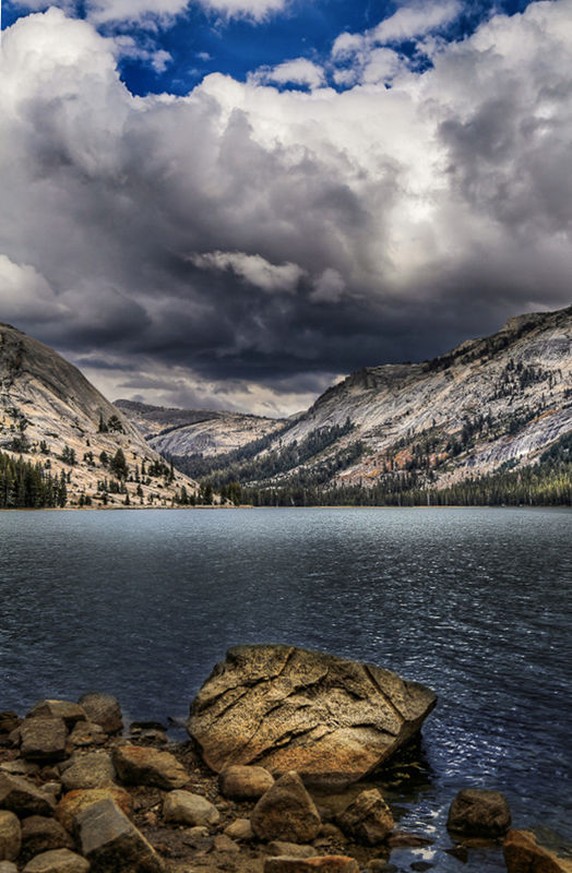
Since you asked, I would submit #1. It has a very dramatic look and great composition and the colors are good.
Jul 20, 2018 04:40:32 #

BrentHarder wrote:
I have my idea which of these two photos I would like to submit into our local city photo contest, but if I am overwhelmingly wrong please let me know.
Which do you prefer?
Thanks in advance.
Which do you prefer?
Thanks in advance.
One
Jul 20, 2018 09:26:57 #
Jul 20, 2018 09:54:39 #

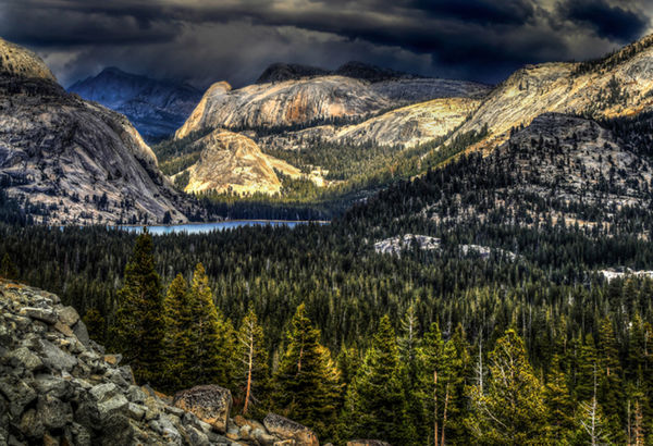
Hard to pick between them but a slight edge goes to #1 but I would first desaturate the sky colors - too intense and overpowering. Also, is it just me or does the lakeline in #2 lean slightly to the left?
Jul 20, 2018 11:53:11 #
Jul 20, 2018 12:58:45 #

One Rude Dawg wrote:
As usual they are both great, but in my humble opinion, number 1 without question. Number 1 is just outstanding, one of those wall hangers you could look at for hours. 

Jul 20, 2018 12:59:29 #

Jul 20, 2018 14:18:18 #

I'm doing one massive reply to everyone again.......Thanks everyone for your input on these two photos. Every one of you had comments that I have been digesting. Your comments have been helpful in my decision and your suggestions all have merit.
For image #1 I purposely cropped it the way I did. I think the rule of thirds works best in this one and that is why there is so much sky showing. I tried cropping it other ways but always came back to this one. I felt it was more dramatic this way.
In Photo #2 I goofed up and had a black line on the left edge that I overlooked......also as several of you have mentioned, my horizon line is off, so I fixed that. The rock out in the lake is distracting and now it is cloned out.
My preference is to submit a print of #1 for the contest. I know several of you have mentioned that it is over processed. I can see why you say that and understand where you are coming from. Personally, I hate overcooked HDR images which I would put in the same category. I did have #1 printed up and now it is framed and ready for the contest.
I don't have any horizontal images of these two photos, sorry.
I'm attaching the revised image of #2 with those three changes.
Thanks so very much for all of your thoughts and comments. I respect each of your opinions very much.
Jul 20, 2018 17:18:01 #

Brent they both have a lot going for them, If it been me I probably would chose #1. Wish you the BEST, let me know how it comes out, you can PM if wish. Bob
Jul 21, 2018 11:34:45 #
Transbuff1985 wrote:
Brent they both have a lot going for them, If it been me I probably would chose #1. Wish you the BEST, let me know how it comes out, you can PM if wish. Bob
Bob, I did choose #1. September 16th I will know the outcome of this contest.
Jul 21, 2018 17:55:18 #
BrentHarder wrote:
Bob, I did choose #1. September 16th I will know the outcome of this contest.
Thanks Brent
Jul 21, 2018 18:09:56 #
I STOP TO SHOOT
Loc: By the No. CA Sea
BrentHarder wrote:
I have my idea which of these two photos I would like to submit into our local city photo contest, but if I am overwhelmingly wrong please let me know.
Which do you prefer?
Thanks in advance.
Which do you prefer?
Thanks in advance.
Brent: I like #1 because it shows the total scenery, sky is very dramatic cannot decide if it is too much I really like them both but I think #1 more because it shows lots of the surrounding area... That is at a first glance....
Jul 21, 2018 22:38:13 #

looks like we are not helping you much, Brent. But here is my 2 cents. Yes, they are both beautiful, but #1 is by far the more unique of the two. Its hard to know about photo contests...one set of judges will give entirely different results than another. But to stand out in the crowd always seems a good approach to me.
Jul 21, 2018 22:56:24 #
Paul Moshay
Loc: Los Angeles, CA
This is my feeling about #1 I feel it makes the mountain the subject not the clouds. Paul
If you want to reply, then register here. Registration is free and your account is created instantly, so you can post right away.