What do you like? A,B, or C
Jul 9, 2018 12:51:53 #

Jul 9, 2018 13:08:33 #
Jul 9, 2018 13:27:55 #
Jul 9, 2018 13:35:58 #
Jul 9, 2018 14:02:48 #

Jul 9, 2018 14:03:21 #
Jul 9, 2018 14:30:59 #
Hamltnblue
Loc: Springfield PA
B and C appear to be from the same program. They both have green blotches added throughout.
Jul 9, 2018 14:43:42 #
Angel Star Photography
Loc: Tacoma, WA
jonjacobik wrote:
Thank you everyone. You helped me with a decision... (show quote)
I like this one the most. However, given the previous three that were presented, the one that will be chosen as the best will almost always be dependent upon the recipient's or the customer's tastes and perceptions. What may be preferred by one may not be by another and, likewise, what you find desirable may not be by someone else. I think it comes down to what artistic perspective you wish to present and who your intended audience will be. I see the previous three as artistic touches to a photograph. As for my preferences, I struggled with which one I really liked. I was leaning towards A, C, and then B, but seeing the orignal cemented my decision that D, the original, would have been the one if given the choice.
As for D, nice composition with one caveat. It would be better if the branch wasn't coming out of the bird's head but, understandably, moving around to recompose may not have been an option.
Jul 9, 2018 14:55:06 #

Jul 9, 2018 15:34:26 #

I prefer A - seems like the most natural color. B and C - too much blue and the sky is blown out. Young eagles are not blue.
Jul 9, 2018 20:34:37 #
Jul 10, 2018 06:09:17 #
Jul 10, 2018 10:09:56 #

I prefer "A." Better exposure, colors seem more natural and a lot less purple and green CA than 2 and 3. If you used 2, I'd take a bit or yellow out - foliage would look better. Just my $.02
Jul 10, 2018 11:29:05 #
jonjacobik
Loc: Quincy, MA
The results surprised me. if I counted right:
A - 12.5
B - 5
C - 14.5
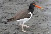
B was the source for A and C. B's washed out sky was at fault and ruining a good shot, but is representative of my most challenging frustration, photographing on cloudy days is great for bringing out the details of an egrets feathering, but awful for colorless skies.
Topaz one click presets remarkably improved the appeal.
My preference is photo I did using just PS working with just raw file and a few minor adjustments (page 2).
Thanks everyone.
A - 12.5
B - 5
C - 14.5
B was the source for A and C. B's washed out sky was at fault and ruining a good shot, but is representative of my most challenging frustration, photographing on cloudy days is great for bringing out the details of an egrets feathering, but awful for colorless skies.
Topaz one click presets remarkably improved the appeal.
My preference is photo I did using just PS working with just raw file and a few minor adjustments (page 2).
Thanks everyone.
Jul 10, 2018 22:59:59 #

If you want to reply, then register here. Registration is free and your account is created instantly, so you can post right away.