Help With Pelicans
May 18, 2018 00:46:45 #
rdrechsler
Loc: Channel Islands Harbor, CA
It's so hard to judge your own work. I have to pick only ONE of these images for a competition. Can I get some votes, comments or tell me to stop bothering you...LOL. Seriously, thank you for your opinions. They are always so invaluable. Just checking I noticed that all these images look sharp in the Download, while soft in the thumbnails.
BTW...These were all shot with the Nikon 200-500mm, f/5.6 lens. I'm liking this lens better by the day.
BTW...These were all shot with the Nikon 200-500mm, f/5.6 lens. I'm liking this lens better by the day.
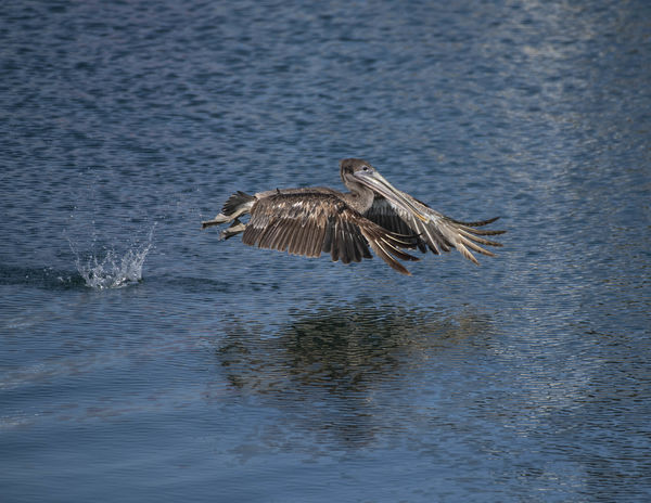
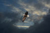
Pelican 1
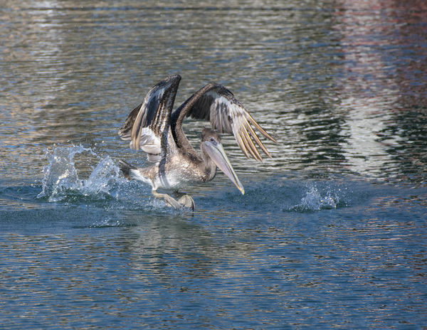
(Download)
Pelican 2
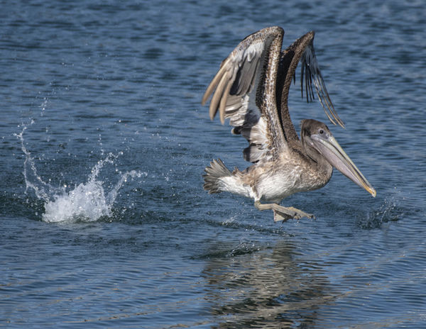
(Download)
Pelican 3
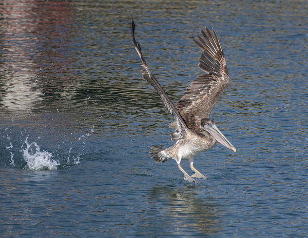
(Download)
Pelican 4
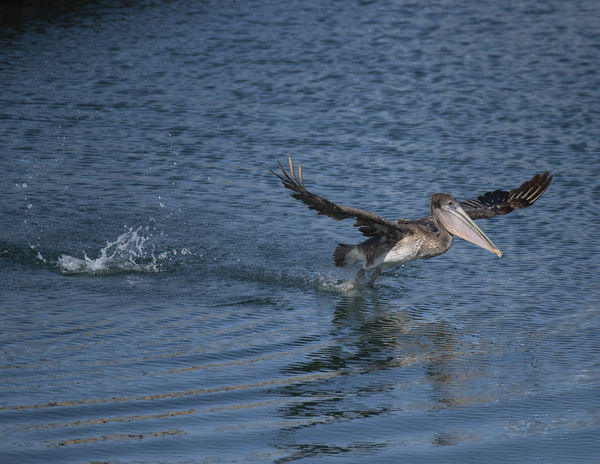
(Download)
Pelican 5
(Download)
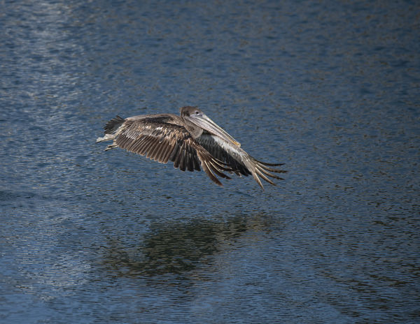
Pelican 6
(Download)
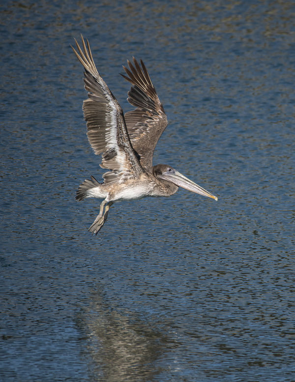
Pelican 7
(Download)
May 18, 2018 01:47:17 #

May 18, 2018 01:56:38 #
rdrechsler
Loc: Channel Islands Harbor, CA
vicksart wrote:
6 or 7.
Thanks for taking the time Vicki. Was your decision based more on the technical quality of the image or the aesthetics?
May 18, 2018 02:31:04 #
2 or 7
2 because i like the little plop of water behind him
7 because i like his wings spread out
1 the reflections at the top are distracting
3 again reflections, and you can't see his closer wing clearly
4 you can't see the whole bird, and there is a little triangle of darkness on upper left
5 his beak doesn't stand out love the unusual shape of his wngs, though
6 he's just kind of a blob, can't really see the beak or wings
May 18, 2018 03:20:03 #
rdrechsler
Loc: Channel Islands Harbor, CA
Diocletian wrote:
2 or 7
2 because i like the little plop of water behind him
7 because i like his wings spread out
2 because i like the little plop of water behind him
7 because i like his wings spread out
Excellent critique and very educational. Thank you so much.
May 19, 2018 00:03:00 #
2, 3, & 4 share a problem. They are flying into the frame and have no where to go. Maybe a re-crop?
the bird is a little "bunched-up" on 6.
All in all, I like 7 the best. He opens up in all his glory. (maybe just a tiny bit more crop top and bottom, but keeping the reflection)
the bird is a little "bunched-up" on 6.
All in all, I like 7 the best. He opens up in all his glory. (maybe just a tiny bit more crop top and bottom, but keeping the reflection)
May 19, 2018 03:48:31 #
rdrechsler
Loc: Channel Islands Harbor, CA
fredtoo wrote:
2, 3, & 4 share a problem. They are flying into the frame and have no where to go. Maybe a re-crop?
the bird is a little "bunched-up" on 6.
All in all, I like 7 the best. He opens up in all his glory. (maybe just a tiny bit more crop top and bottom, but keeping the reflection)
the bird is a little "bunched-up" on 6.
All in all, I like 7 the best. He opens up in all his glory. (maybe just a tiny bit more crop top and bottom, but keeping the reflection)
Thanks for the thoughtful comments Fred. I’m leaning towards #7 myself. It’s also the clearest of the set. A recrop is easy.
May 19, 2018 08:03:56 #

I like the last one with the light under his wings. In the others I find it distracting that he is flying into the side of the picture, and I am not sure what the splashes are - I don't think they contribute to the image, at least to me.
May 19, 2018 09:48:53 #
May 19, 2018 10:01:26 #

May 19, 2018 10:10:32 #

rdrechsler wrote:
It's so hard to judge your own work. I have to pick only ONE of these images for a competition. Can I get some votes, comments or tell me to stop bothering you...LOL. Seriously, thank you for your opinions. They are always so invaluable. Just checking I noticed that all these images look sharp in the Download, while soft in the thumbnails.
BTW...These were all shot with the Nikon 200-500mm, f/5.6 lens. I'm liking this lens better by the day.
BTW...These were all shot with the Nikon 200-500mm, f/5.6 lens. I'm liking this lens better by the day.
i prefer shot no. 7..it's the sharpest and i like the composition .
May 19, 2018 12:42:55 #
rdrechsler wrote:
It's so hard to judge your own work. I have to pick only ONE of these images for a competition. Can I get some votes, comments or tell me to stop bothering you...LOL. Seriously, thank you for your opinions. They are always so invaluable. Just checking I noticed that all these images look sharp in the Download, while soft in the thumbnails.
BTW...These were all shot with the Nikon 200-500mm, f/5.6 lens. I'm liking this lens better by the day.
BTW...These were all shot with the Nikon 200-500mm, f/5.6 lens. I'm liking this lens better by the day.
Pelicans are my most favorite birds to watch. As such, I like No.7 the best. For my taste, it is sharp and provide the best contrast between the subject and the background. If I were editing this image, I would change the crop slightly. I would provide a little more space in front of the bird giving it a place to fly into and reduce a little bit of the space below the bird. For me, the partial reflection doesn't help add impact to the bird.
It still a very nice image.
Mike

May 19, 2018 14:08:16 #
No. 1 cropped on left just before splash and about 1/3 way from bottom edge to bird. No. 2-4, as mentioned, have bird flying out of frame. No. 5, 6, I don’t like view of bird. As for 7, I don’t think portrait orientation is good choice. No. 7 is nice but conventional view while No. 1 is more dramatic. They all look pretty sharp with good color.
May 19, 2018 14:13:21 #

rdrechsler wrote:
It's so hard to judge your own work. I have to pick only ONE of these images for a competition. Can I get some votes, comments or tell me to stop bothering you...LOL. Seriously, thank you for your opinions. They are always so invaluable. Just checking I noticed that all these images look sharp in the Download, while soft in the thumbnails.
BTW...These were all shot with the Nikon 200-500mm, f/5.6 lens. I'm liking this lens better by the day.
BTW...These were all shot with the Nikon 200-500mm, f/5.6 lens. I'm liking this lens better by the day.
I like them all but judge might prefer 1 for composition.
May 19, 2018 18:16:26 #
If you want to reply, then register here. Registration is free and your account is created instantly, so you can post right away.