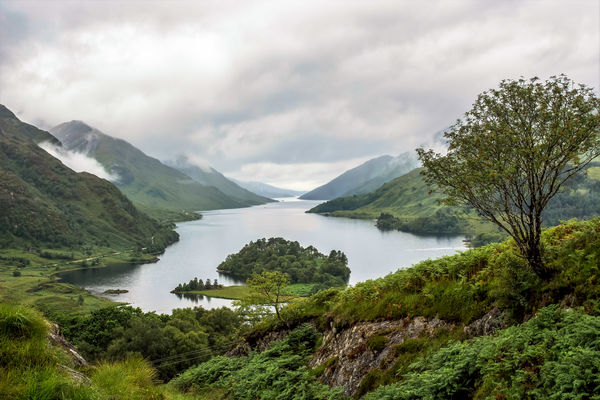
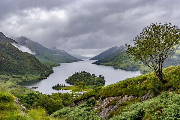
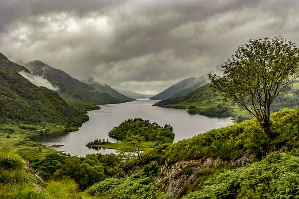
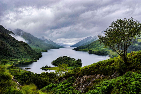
Loch Shiel from Glenfinnan.
Aug 23, 2016 11:07:41 #
rborud
Loc: Minnesota
R.G. wrote:
Delving into my plentiful supply of misty, louring shots, I thought this might be a good candidate for some editing (it's a two-shot merge as described in other threads).
(Link to DNG under the JPG).
-
(Link to DNG under the JPG).
-
R.G.
My like of Scotland has increased. Here is my take on your fine image.
RBorud

Aug 23, 2016 11:08:47 #

Cotondog wrote:
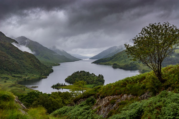
You gave us a beautiful image to start with R.G. I just cloned out the wires, applied a de-hazing filter to your photo, and tweaked the contrast in the land areas. Hope you like the result.
Thank you Cotondog. You've brought out detail from the foreground to the distant horizon. Nice work.
Aug 23, 2016 11:11:43 #
johneccles wrote:
Here is my effort to improve your already excellent photograph.
I increased the contrast slightly, adjusted highlight to bring out the cloud, applied some sharpening and clarity.
Then I incresed the vibrance slightly to improve colour and finally removed the wires.
Thankyou for allowing me to play with your beautiful photograph.
I increased the contrast slightly, adjusted highlight to bring out the cloud, applied some sharpening and clarity.
Then I incresed the vibrance slightly to improve colour and finally removed the wires.
Thankyou for allowing me to play with your beautiful photograph.
You're welcome John, and thanks for the compliment. Isn't it amazing how much detail can come out of clouds just with a bit of darkening and contrast.
Aug 23, 2016 11:13:13 #

R.G. wrote:
Delving into my plentiful supply of misty, louring shots, I thought this might be a good candidate for some editing (it's a two-shot merge as described in other threads).
(Link to DNG under the JPG).
-
(Link to DNG under the JPG).
-
Other versions...

Aug 23, 2016 11:16:10 #
lloydl2 wrote:
RG thanks for posting this beautiful image for us ... (show quote)
Thank you Lloyd. Glad you enjoyed. Your tactic of going with the mistiness has payed off. Good use of light to draw the eye into the shot.
Aug 23, 2016 11:20:09 #
rborud wrote:
R.G.
My like of Scotland has increased. Here is my take on your fine image.
RBorud
My like of Scotland has increased. Here is my take on your fine image.
RBorud
I'm glad the mist and overcast skies aren't putting you off, RB. We do get some fine weather sometimes - honest
 . There's so much going on in the shot that brightening it is a worthy alternative.
Aug 23, 2016 11:22:54 #
joer wrote:
Other versions...
Hi Joer. Thanks for joining in. You brought out lots of detail and colour in #2, but I'd have to say that the mistier #1 is my favourite.
Aug 23, 2016 12:35:58 #

R.G. wrote:
Delving into my plentiful supply of misty, louring shots, I thought this might be a good candidate for some editing (it's a two-shot merge as described in other threads).
(Link to DNG under the JPG).
-
(Link to DNG under the JPG).
-
Thanks for the shot to play with, R.G. I tried for something different as there are so many good images.

Aug 23, 2016 12:40:29 #
Shakey wrote:
Thanks for the shot to play with, R.G. I tried for something different as there are so many good images.
You're welcome, Shakey. Purple mist is indeed a possibility in this part of the world, and the download draws me in.
Aug 23, 2016 14:51:26 #
R.G. wrote:
Delving into my plentiful supply of misty, louring shots, I thought this might be a good candidate for some editing (it's a two-shot merge as described in other threads).
(Link to DNG under the JPG).
-
(Link to DNG under the JPG).
-
Well, I made it but am leaving to go work right after uploading these two images. They are both from your provided dng file. One of them is as you shot it and the other I changed the WB to cloudy. Both are rendered using PS, first using ACR and then did some fine tuning and such, mostly all in selective mode using a brush where I saw fit to make some changes.
Also note that I changed the WB and post processed that image completely separately from the first, as two separate and different entities. In other words, I did not do the 'original' and then just go in and merely change the WB.
Take a look and see what you think. I honestly believe your two shot merges are excellent for these type of misty images. Thanks for the opportunity to play and practice - much appreciated, Ron.
Best Regards,
Tom
Download both so they are side by side, and then click back and forth to see the difference and compare!
Aug 23, 2016 15:17:31 #
trc wrote:
Well, I made it but am leaving to go work right af... (show quote)
Hi Tom. I see you've done it again with those trees in the middle. They really stand out almost like a 3D look. Well, I've flicked back and forth between the two and I'd have to say my preference is for the first one because it's nearer to the colours that I remember. #2 looks more like a rainy evening scene. I'd say you pulled both edits off, and to do that convincingly you need to have solid data in the file so that it can stand up to that sort of pushing and pulling. It looks like the detail's there if you want to bring it out, or you can just leave it with a soft look, and the colouring can stand up to being manipulated.
My usual approach to white balance (and tint) is to go with what the camera gives me except for some fairly small nudges from time to time. Or perhaps shift parts of an image using an adjustments brush. I can't remember ever thinking that the camera had got WB or tint seriously wrong.
Thanks for sharing your experiment. Both edits have their merits.
Aug 23, 2016 18:39:17 #

Great location and photo. I'm afraid I always lean to the dark and melancholy side, that's me. I really like all the photos and their post processing.
Aug 23, 2016 19:36:03 #

R.G. wrote:
Delving into my plentiful supply of misty, louring shots, I thought this might be a good candidate for some editing (it's a two-shot merge as described in other threads).
(Link to DNG under the JPG).
-
(Link to DNG under the JPG).
-
Here's my go R.G. Started in Lightroom with my usual adjustments then took it into photoshop to remove the power lines. Added a levels layer and a gradient on the clouds.
Thanks for letting us play.
Alan.
Aug 24, 2016 12:11:43 #
roadking11 wrote:
..... I'm afraid I always lean to the dark and melancholy side.....
Nicely executed, Roadking, and thanks for the compliment. It's just as well we don't all wait for sunny days to go shooting.
Aug 24, 2016 12:14:47 #
AlMac wrote:
Here's my go R.G. Started in Lightroom with my usual adjustments then took it into photoshop to remove the power lines. Added a levels layer and a gradient on the clouds.
Thanks for letting us play.
Alan.
Thanks for letting us play.
Alan.
You're welcome, Al, and thanks for posting your totally believable interpretation.
If you want to reply, then register here. Registration is free and your account is created instantly, so you can post right away.