Check out Printers and Color Printing Forum section of our forum.
Liz
Aug 19, 2016 16:20:46 #

Aug 19, 2016 16:24:16 #

Wrong forum to post this kind of stuff and request.
Please click on 'all sections' and learn the board.
Please click on 'all sections' and learn the board.
Aug 20, 2016 07:15:29 #

Check out Film Photography section of our forum.
Aug 20, 2016 07:50:06 #
Rongnongno wrote:
Wrong forum to post this kind of stuff and request.
Please click on 'all sections' and learn the board.
Please click on 'all sections' and learn the board.
Wrongy, please explain exactly what is wrong with posting that pic here and requesting??? Where do you think it belongs?
SS
Aug 20, 2016 08:30:14 #
SharpShooter wrote:
Wrongy, please explain exactly what is wrong with posting that pic here and requesting??? Where do you think it belongs?
SS
SS
Where it now. This was initially posted in 'photo analysis'.
'Oh!'
Aug 20, 2016 10:25:28 #

Rongnongno wrote:
Where it now. This was initially posted in 'photo analysis'.
'Oh!'
'Oh!'
Can't you see how ridiculous your initial posts look once the threads are moved?
All you needed to do was to quietly report it to Admin without publicly embarrassing the OP.
Or is it that you just you can't help behaving like a jerk? You seem to crave the attention.
Think about someone other than yourself for a change!
Aug 20, 2016 10:54:56 #

Amen in the last reply!
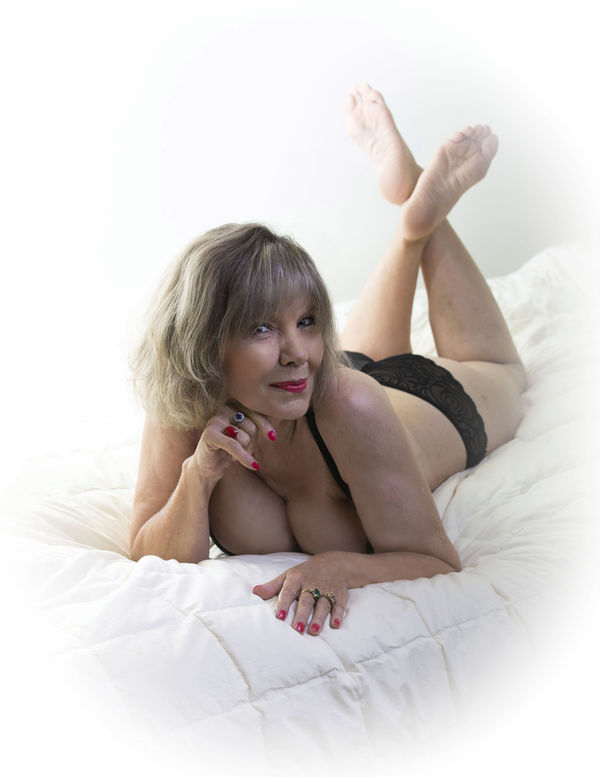
On the picture, Love the shadow blending. good job.
On the picture, Love the shadow blending. good job.
Check out The Dynamics of Photographic Lighting section of our forum.
Aug 20, 2016 13:07:33 #

Benttree wrote:
I am new in here, do like get creative critics on to the image.
Nice lighting and post.Here are a couple of improvements you might consider:
The pose, together with a short lens (<80mm, I'd guess) make her body look foreshortened. It makes her head disproportionately large compared to her body. Generally, with a short lens, or even a longer one, it is well to ensure that no limbs are pointing directly toward the camera. With a longer lens, there may be a good reason, but not with a "normal" lens. (Of course you may want to do so for artistic expression--even a fisheye.)
Second. The basic lighting is good, however even in the highkey areas, you probably want to keep at least a hint of the edge of the limbs. Liz's right shoulder is good for this, but her right leg and even her foot are just a little over lighted.
This is, of course, my humble opinion and YMMV.
Aug 20, 2016 14:59:31 #
romanticf16
Loc: Commerce Twp, MI
[quote=Reinaldokool]Nice lighting and post.Here are a couple of improvements you might consider:
The pose, together with a short lens (<80mm, I'd guess) make her body look foreshortened. It makes her head disproportionately large compared to her body. Generally, with a short lens, or even a longer one, it is well to ensure that no limbs are pointing directly toward the camera. With a longer lens, there may be a good reason, but not with a "normal" lens. (Of course you may want to do so for artistic expression--even a fisheye.)
Second. The basic lighting is good, however even in the highkey areas, you probably want to keep at least a hint of the edge of the limbs. Liz's right shoulder is good for this, but her right leg and even her foot are just a little over lighted.end quote].
I agree on the distortion from a short lens comment. On lighting- the brightest item is her feet. This distracts from the subject, which is her face. The lighting should illuminate her from head and fade to the feet. There is an obvious lack of fill on her body. IMHO
Aug 20, 2016 17:15:54 #
Rongnongno wrote:
Wrong forum to post this kind of stuff and request.
Please click on 'all sections' and learn the board.
Please click on 'all sections' and learn the board.
You need to change your name to >>>>> Does not play well others.
Aug 20, 2016 18:04:31 #
Check out Photo Critique Section section of our forum.
Aug 20, 2016 19:34:25 #

Not withstanding the brouhaha above...I like it. Fine composition. And her smile is mischievous...delightful.
Aug 20, 2016 19:34:25 #
Not withstanding the brouhaha above...I like it. Fine composition. And her smile is mischievous...delightful.
Aug 20, 2016 20:03:31 #

Aug 20, 2016 23:49:42 #

selmslie wrote:
Can't you see how ridiculous your initial posts look once the threads are moved?
All you needed to do was to quietly report it to Admin without publicly embarrassing the OP.
Or is it that you just you can't help behaving like a jerk? You seem to crave the attention.
Think about someone other than yourself for a change!
All you needed to do was to quietly report it to Admin without publicly embarrassing the OP.
Or is it that you just you can't help behaving like a jerk? You seem to crave the attention.
Think about someone other than yourself for a change!
Well said.
If you want to reply, then register here. Registration is free and your account is created instantly, so you can post right away.
Check out Digital Artistry section of our forum.