Eilean Donan dark side for PP.
Apr 17, 2016 09:47:32 #

buddah17 wrote:
Oops... Don't think THIS is what you had in mind. But it was fun exploring..
(Will use less HDR filter "next time!" I work an image..)
(Will use less HDR filter "next time!" I work an image..)
Yikes lol. It's fair to say you might have overdone the HDR a touch, Buddah. Definitely one for pushing the envelope :-) .
Apr 17, 2016 10:04:39 #
R.G. wrote:
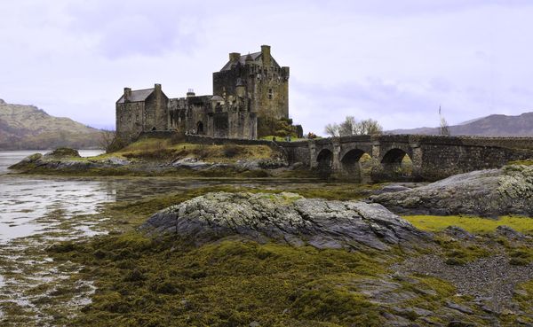
I've posted an edited version of this elsewhere and it was suggested that there was unexplored potential in it. I was pretty much out of ideas to take it forward so I've put it up for editing to see what ideas others come up with for it.
I'll post a link to a DNG version under the JPG.
-
I'll post a link to a DNG version under the JPG.
-
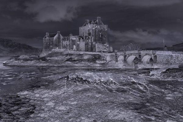
R.G. (Ron, I think? - I'm terrible with names most the time),
First, let me thank you for the opportunity to freely render your image of this Magnificent Castle. Having been there, as you know, I was trying to come up with something differentand tried to promote a mysterious, yet noble image. It is far different than others posted, so I guess I was 'going out on a limb' on this one.
I used Photoshop from your DNG image and then also used a little Silver EFEX Pro and then back to Photoshop. All in All, I have 13 layers trying to get just the right mix and blends to make it an honorable, but different image. Thanks very much, once again, for the challenging exercise.
Best Regards,
Tom
P.S. Look at the download for best viewing. Thanks.
Apr 17, 2016 10:15:02 #
trc wrote:
.....First, let me thank you for the opportunity to freely render your image of this Magnificent Castle. Having been there, as you know, I was trying to come up with something differentand tried to promote a mysterious, yet noble image. It is far different than others posted, so I guess I was 'going out on a limb' on this one.......
You're welcome, Tom. This looks like a negative, and a bit spooky to boot, so full marks for the "mysterious" bit, and it does seem to be standing clear and proud. Your experimenting has paid off handsomely.
Apr 17, 2016 10:28:38 #
R.G. wrote:
You're welcome, Tom. This looks like a negative, and a bit spooky to boot, so full marks for the "mysterious" bit, and it does seem to be standing clear and proud. Your experimenting has paid off handsomely.
Thank you R.G.
Tom
Apr 17, 2016 10:51:53 #
I very much liked your edit that was posted in another area. :thumbup: :thumbup: :thumbup:
Now for my post I cheated a bunch. I could get it as good as you did R.G. so I took your edited version and made a one shot HDR using Aurora and got this. What do you think?
Jim
Now for my post I cheated a bunch. I could get it as good as you did R.G. so I took your edited version and made a one shot HDR using Aurora and got this. What do you think?
Jim

Apr 17, 2016 11:55:16 #

Apr 17, 2016 12:08:38 #
Jim-Pops wrote:
I very much liked your edit that was posted in another area. :thumbup: :thumbup: :thumbup:
Now for my post I cheated a bunch. I could get it as good as you did R.G. so I took your edited version and made a one shot HDR using Aurora and got this. What do you think?
Jim
Now for my post I cheated a bunch. I could get it as good as you did R.G. so I took your edited version and made a one shot HDR using Aurora and got this. What do you think?
Jim
I must admit I've never seen HDR processing as the finishing touch to an edit. It's always been a starting point for me :-) . But it does seem to have made the colours and details a bit more solid. The sky's gone a little bit grainy, but that's probably just the jpegging. Thanks for contributing, Jim-Pops.
Apr 17, 2016 12:14:20 #
SoHillGuy wrote:
Edits in CS5 ACR, Adjustment win Viveza 2, and PE8.
Thanks for contributing, Gaylord. You've given the colours a fair bit of punch, and the edit has an airy feel to it.
Apr 17, 2016 13:06:53 #

Shakey wrote:
Thanks for the opportunity to work on your image, R.G.
Had fun with GIMP. :D
Had fun with GIMP. :D
:thumbup: :thumbup: :thumbup:
Apr 17, 2016 15:38:47 #
R.G. wrote:
Thanks for contributing, Gaylord. You've given the colours a fair bit of punch, and the edit has an airy feel to it.
I also had extended the right side of the photo as you view it. I thought you might have noticed the extension of the bridge, etc.
Apr 17, 2016 16:39:36 #

This was an interesting image to work with - I remember down loading it and trying several techniques.
If I remember right you also posted shots from the other side of the bridge.
If I remember right you also posted shots from the other side of the bridge.
R.G. wrote:
I've posted an edited version of this elsewhere and it was suggested that there was unexplored potential in it. I was pretty much out of ideas to take it forward so I've put it up for editing to see what ideas others come up with for it.
I'll post a link to a DNG version under the JPG.
-
I'll post a link to a DNG version under the JPG.
-
Apr 17, 2016 16:45:54 #

R.G. wrote:
I've posted an edited version of this elsewhere and it was suggested that there was unexplored potential in it. I was pretty much out of ideas to take it forward so I've put it up for editing to see what ideas others come up with for it.
I'll post a link to a DNG version under the JPG.
-
I'll post a link to a DNG version under the JPG.
-
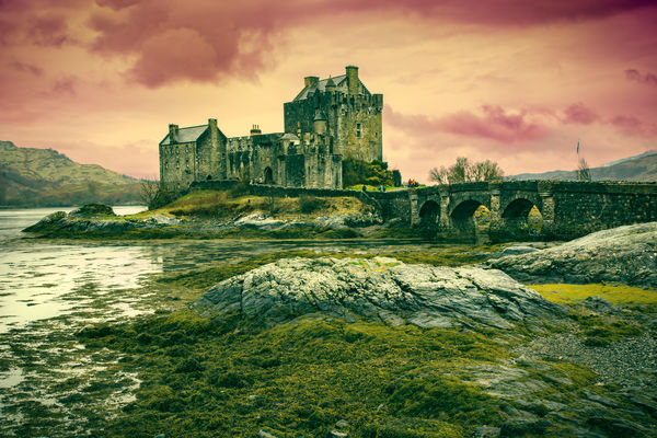
Here's my effort R.G.
Started out in Lightroom, but I am having an issue with the brush tool trying to paint out the mask in the gradient tool, so I had to send it to Photoshop to work on the sky and finish off.
Played about with split toning to get the general effect, with a bit local dodging and burning. Tried Viveza 2 (Nic Collection) to finish it off and liked the effect but when I made the image small the wrong bits stood out, so I reduced the opacity of the layer to about 25%.
I've always found that reducing the size of image (as if it is far away) gives you a better idea of what the finished image will look like. I've found many issues with my work by doing this that are not as obvious when working full size.
By the way, I also like the effect that Linda From Maine produced - nice work Linda.
Apr 18, 2016 11:06:23 #
SoHillGuy wrote:
I also had extended the right side of the photo as you view it. I thought you might have noticed the extension of the bridge, etc.
Clean over my head lol. It's to your credit that I didn't notice. If it hadn't been so well done I probably would have noticed. As it is it looks totally natural. And it probably explains the airy feel that I mentioned 8-) .
Apr 18, 2016 11:08:59 #
Harvey wrote:
This was an interesting image to work with - I remember down loading it and trying several techniques.
If I remember right you also posted shots from the other side of the bridge.
If I remember right you also posted shots from the other side of the bridge.
Glad you enjoyed, Harvey. Do you fancy posting any of your edits?
Yes, you're right - I posted a prettified version taken from the other side.
http://www.uglyhedgehog.com/t-381648-1.html
Apr 18, 2016 11:19:02 #
AlMac wrote:
Here's my effort R.G. br br Started out in Lightr... (show quote)
You're right - a smaller, condensed version does show up stuff that full screen hides. Having said that, it's a while since I had anything printed, so I tend to see the full screen version as the final one.
Thanks for contributing and thanks for your comments, Al. And a big :thumbup: for your comment about Linda's edit.
If you want to reply, then register here. Registration is free and your account is created instantly, so you can post right away.