Check out The Dynamics of Photographic Lighting section of our forum.
Black and White processing tips - will you share your favorite?
Feb 10, 2016 12:21:18 #
Feb 10, 2016 13:00:53 #

Feb 10, 2016 13:01:53 #

Linda From Maine wrote:
Im hoping we can consolidate the pp advise from Thinking in Black & White thread to this one, and learn even more along the way!
Please add your favorite b&w pp tip to this thread.
Thanks so much.
Please add your favorite b&w pp tip to this thread.
Thanks so much.
Since each monitor and printer can be different, the first thing I recommend is that you prepare a b/w stepchart in your editing software, such as Photoshop, using 0% black thru 100% black (or 255-255-255 thru 0-0-0 in RGB) in 5 or 10% increments. Make a print of the step chart with your home printer and/or commercial printer. Then check the reflection density of each step and prepare a line graph comparing reflection density vs %black (or RGB value).
Using this graph, determine the density values you want to use for each "zone". For me, using Photoshop and a commercial printer, I found the following (RD = Reflection Density):
Zone I (RD 1.8+); 95% black
Zone II (RD 1.6); 90% black
Zone III (RD 1.3); 80% black
Zone IV (RD 1.0); 72% black
Zone V (RD 0.7); 53% black
Zone VI (RD 0.4); 36% black
Zone VII (RD 0.2); 22% black
Zone VIII (RD 0.1); 14% black
Zone IX (RD 0.0); 0% black.
Then, when you want to be certain that a certain area is in Zone V, adjust the tone to 53% black in the editing program, and so on for each desired Zone.
Check out Bridge Camera Show Case section of our forum.
Feb 10, 2016 13:07:18 #
Terrific, thanks so much!
jackm1943 wrote:
Since each monitor and printer can be different, t... (show quote)
Feb 10, 2016 13:11:44 #

Linda From Maine wrote:
Im hoping we can consolidate the pp advise from Thinking in Black & White thread to this one, and learn even more along the way!
Please add your favorite b&w pp tip to this thread.
Thanks so much.
Please add your favorite b&w pp tip to this thread.
Thanks so much.
My best tip has been shared many times over in this thread as well as the one that has reached 25 pages so far. Understand the Zones concept but most importantly work and work and work on this critical technical component until it sticks and becomes second nature. I'm still doing the work! This is an image I did a few years ago while I spent the entire day just concentrating on technical elements. I revisit it from time to time so I thought I would share it.
Feb 10, 2016 13:37:45 #
wowbmw wrote:
My best tip has been shared many times over in this thread as well as the one that has reached 25 pages so far. Understand the Zones concept but most importantly work and work and work on this critical technical component until it sticks and becomes second nature. I'm still doing the work! This is an image I did a few years ago while I spent the entire day just concentrating on technical elements. I revisit it from time to time so I thought I would share it.
Thank you for the terrific info, bmw, and perfect visual aid :)
Feb 10, 2016 17:18:54 #

Linda From Maine wrote:
Im hoping we can consolidate the pp advise from Thinking in Black & White thread to this one, and learn even more along the way!
Please add your favorite b&w pp tip to this thread.
Thanks so much.
Please add your favorite b&w pp tip to this thread.
Thanks so much.
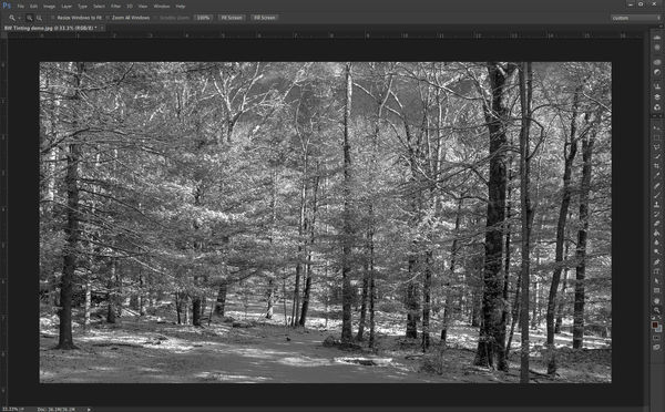
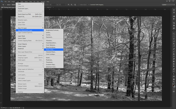
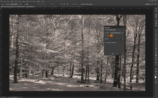
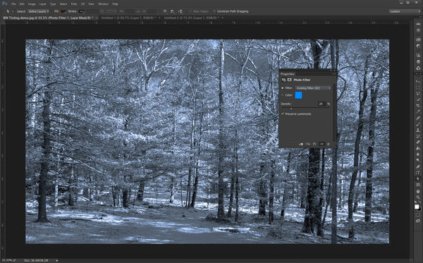
Linda asked if I would explain how I tint a black and white photo in Adobe Photoshop so, here goes. The first image (screen-1) shows an image in black and white of a cold winter morning. In un-tinted gray scale in could use a personality boost. It could use a bit of a tint to give help put some life into it. In Photoshop there is a fairly quick and easy way to do that. Start by going to Layer in the programs header, then go down to New Adjustment Layer. Selecting this will bring up a new drop down menu from which you select Photo Filter (See screen-2)
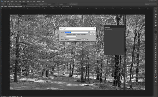
You will now see UI window for your new layer along with a properties window (screen 3). You can name your new filter in the UI window, Photo Filter 1 seems to work just fine.  After you click Okay the properties window will activate (screen-4) and will always open with a warming filter which just isnt appropriate for a winter scene so, click on the arrows which will display different options you can use. For this I chose a cooling filter #82 (Screen-5). Normally I feel that tinting should be subtle and not over power the image (its a bit heavy here so it will display in the screen shot). That is all there is to it other than flattening the image and saving the file. Which I will assume you know how to do, if youre using Photoshop.
Check out Film Photography section of our forum.
Feb 10, 2016 18:51:20 #
Rich1939 wrote:
Linda asked if I would explain how I tint a black and white photo in Adobe Photoshop so, here goes...
Thank you so much for taking the time to do this, Rich. After you posted info in the other thread, I discovered that PS Elements has similar; I'd just not tried it yet :) Another great tip for our toolbox!
Feb 23, 2016 12:30:37 #

Linda From Maine wrote:
I do a lot of B&W, so whenever I find a subject that is a likely candidate--thinking mostly in terms of the range of contrast--I give it a go. Often I bracket, with the idea in mind of using HDR (Nik) software to PP. Here's an example where I found that the end results both pleased me.Im hoping we can consolidate the pp advise from Thinking in Black & White thread to this one, and learn even more along the way!
Please add your favorite b&w pp tip to this thread.
Thanks so much.
Please add your favorite b&w pp tip to this thread.
Thanks so much.


Feb 23, 2016 12:47:48 #

Feb 23, 2016 13:57:02 #
rdgreenwood wrote:
I do a lot of B&W, so whenever I find a subject that is a likely candidate--thinking mostly in terms of the range of contrast--I give it a go. Often I bracket, with the idea in mind of using HDR (Nik) software to PP. Here's an example where I found that the end results both pleased me.
Thank you very much, RD! I have to admit it's hard to ignore the color of those clouds :)
Check out Drone Video and Photography Forum section of our forum.
Feb 23, 2016 14:46:07 #
Linda From Maine wrote:
Oh, I agree. What really fascinated me about the two versions is that they evoke totally different reactions. They are as different as two images could be in their impression.Thank you very much, RD! I have to admit it's hard to ignore the color of those clouds :)
Feb 23, 2016 15:06:06 #
rdgreenwood wrote:
Oh, I agree. What really fascinated me about the two versions is that they evoke totally different reactions. They are as different as two images could be in their impression.
Excellent point! Thanks for mentioning that (my brain has been fuzzy lately :) ).
Feb 23, 2016 15:37:47 #
wowbmw wrote:
That is the most incredible image I've seen in a long, long time. It's wonderful!My best tip has been shared many times over in this thread as well as the one that has reached 25 pages so far. Understand the Zones concept but most importantly work and work and work on this critical technical component until it sticks and becomes second nature. I'm still doing the work! This is an image I did a few years ago while I spent the entire day just concentrating on technical elements. I revisit it from time to time so I thought I would share it.
Feb 23, 2016 15:41:52 #
jackm1943 wrote:
Jack, In all due respect, if I ever get to a point in my photography where I so little trust my gut and eye and so desperately cling to charts and mathematics, please come and take my beloved D800E. I admire photographers who go at their photography as if it's an equation to be solved; but I prefer to go at it as if it's a lover to be wooed. Bless you and your perseverance.Since each monitor and printer can be different, t... (show quote)
If you want to reply, then register here. Registration is free and your account is created instantly, so you can post right away.