Check out Photo Critique Section section of our forum.
Black and White processing tips - will you share your favorite?
Feb 9, 2016 17:31:19 #

Im hoping we can consolidate the pp advise from Thinking in Black & White thread to this one, and learn even more along the way!
Please add your favorite b&w pp tip to this thread.
Thanks so much.
Please add your favorite b&w pp tip to this thread.
Thanks so much.
Feb 9, 2016 17:49:27 #

Linda From Maine wrote:
Im hoping we can consolidate the pp advise from ... (show quote)
My favorite tip is actually two, but they work hand in hand.
Pre-visualization and Correct placement of the key tone(s). This requires one to know, thoroughly, how their camera works.
Correct placement of the key tone to determine exposure. Though not a post processing tip, this step is essential and the foundation for any post processing to take place.
The key tone is the light value that is most important to the final image. In black and white film, this is the darker values, Zone I and II. In color, digital included, it is the higher values, Zone VII and VIII.
Correctly determining the portion of the scene to be photographed and placing that portion of the scene in the appropriate Zone, allows the rest of the image to be processed such that the remaining values fall into their appropriate Zones.
--Bob
Feb 9, 2016 18:01:27 #
The use of colored filters in pp can change your image dramatically. Even the free Picasa (by Google), offers a b&w option with colored filters. PS Elements has color sliders available, as well as pre-sets.
Below is the original image, brilliant blue sky. #1 is a one-click red filter in Nik Silver Efex, and #2 is a one-click blue filter.
See the video below for more information:
http://www.youtube.com/watch?v=nsn-yH4zQgU&list=PLp5lYDsQi4gn2FUrR_ztLc7jPs8yPejUI&index=5
Below is the original image, brilliant blue sky. #1 is a one-click red filter in Nik Silver Efex, and #2 is a one-click blue filter.
See the video below for more information:
http://www.youtube.com/watch?v=nsn-yH4zQgU&list=PLp5lYDsQi4gn2FUrR_ztLc7jPs8yPejUI&index=5

Check out Black and White Photography section of our forum.
Feb 9, 2016 18:21:52 #

Tip 1 If the image is not to your satisfaction in color then do not consider conversion to mono as a rescue. Bad in equals bad out.
Tip 2 Before conversion ask why? Across the Hog it appears a good 50% of images are converted because one can and NOT because one should. Often a rather vain attempt to be considered a serious snapper or worse artistic.
Tip 3 Learn by experiment not via books videos or lectures by a self proclaimed expert. Those who can do those who cannot teach. Just shoot pictures.
Tip 4 Have a brief look and get to understand the zonal system used by Ansell Adams and ensure all your shots have some true black and true white in them.
Tip 5 Recognize the difference between grain and noise and learn to use grain to enhance certain pictures.
Tip 6 Many conversions need different conversion techniques to bring out the best in various parts of the image. So make an image for the sky the building and the foreground and with layer masks combine the three images.
Tip 7 do not look upon Silver Efex or Topaz as a one click fix it shop. Its just the beginning of the conversion process.
Feb 9, 2016 18:51:22 #
In this one, we'll try to turn what looks like an ordinary shot into a shot that looks as if it were illuminated by a full moon.
I said the shot looks like an ordinary shot, but it helps if the shot fulfills some prerequisites. First, the background has to be large (relative to the subject), dark and relatively plain. The subject has to stand out from that background. Finally, there ought to be a few other pieces bits in the photo that might pick up some of this faux moonlight, and reveal some detail.
The first photo is the ordinary photo that will be the subject of the conversion. Our subject is a neighborhood denizen who doesn't know me, so it will not allow me to approach very closely. The cat stayed back, as I pursued. Fortunately, this bright cat stopped in front of a weathered, redwood fence. Also, there was a fat redwood tree in the shot, with some foliage in front. Perfect for catching that faux moonlight.
You want the subject to pop, so it helps to err on the overexposed side. I had a 50mm lens opened to f/2.5, using ISO 50, on a full frame camera. The cat popped. I didn't do too much to that photo, in post, other than season to taste, and sharpen. I wanted the cat to contrast with the fence.
That first photo is, clearly, a daytime shot. To convert it to a black and white, moonlit photo, I had to use some type of conversion that darkened it, considerably. I used the Nik Silver Efex Pro 2 converter.
I don't always use the same preset. Two different photos might require two different presets to achieve the same result. For the moonlit shots, I will first try the Full Spectrum preset. If that doesn't work, I might try Low Key 1. (Usually, Low Key 2 is too dark.)
One of those two might work, immediately, but if it doesn't, I'll choose whichever is better. (I might try one or two others, first. There are several that darken, nicely.) For the cat shot, I believe I used Low Key 1.
I may have to tweak some of the settings. The ones that usually do the magic, for the moonlit shots, are Soft Contrast and Dynamic Brightness. I actually find that these controls get a lot of use for my ordinary, non-moonlit shots. This is where you fine tune the brightness on the little bits of the other objects, where you want the moonlight to be caught. In the cat shot, I'm talking about the edges of the bark, and the foliage.
The Structure controls are also very important, but don't overdo it. In the Nik Collection, "Structure" means just about the same thing that "Clarity" means, in Lightroom. As you increase, it adds definition, but it can also add noise. That's why I caution against overuse.
I usually like the grains settings to be 500, and very soft. I almost never bother selecting a film type.
For this shot, I really wanted the cat to stand out. The cat is predominantly yellow. I selected Silver Efex Pro's yellow filter, and tweaked to taste. Here is where it helps to know how colored filters work, in black and white. Imagine the color wheel. (I can't remember all the colors on the wheel, but Roy G. Biv told me everything I need to know.) Whatever color filter you choose, that color will tend to be converted to white, or close to white. The color on the opposite side of the color wheel will be converted to black, or close to black. Since the cat was yellow, a yellow filter will tend to brighten that cat, while turning blues darker.
Two more things, and these are probably the most important, for moonlit shots.
First, moonlight looks blue. Select a blue toner, but don't overdo it. You want the toner to suggest blue, without actually looking blue.
Second, add some type of vignette. I prefer the more subtle ones, like Lens Rolloff 1 or 2.
I'll add another, recent example. The third shot is a turkey vulture on a shore. The deep, blue water provided the dark, unobtrusive background, and the dried grasses provided the bits to catch the faux moonlight. The conversion was with Full Spectrum, with no alterations. I chose a bluish toner -- it was probably one of the Selenium ones, with a Lens Rolloff 1. This one fell into place in one minute.


Feb 9, 2016 19:20:52 #

Linda From Maine wrote:
Im hoping we can consolidate the pp advise from Thinking in Black & White thread to this one, and learn even more along the way!
Please add your favorite b&w pp tip to this thread.
Thanks so much.
Please add your favorite b&w pp tip to this thread.
Thanks so much.
Many of us use LR and PS for post processing and LR does a fine job converting to B&W. However, I've found that if you plan to refine your images in PS, it's best to do the conversion in PS rather than LR. That way you still have all of the color info there to work with.
Feb 9, 2016 19:44:09 #

Linda From Maine wrote:
Im hoping we can consolidate the pp advise from Thinking in Black & White thread to this one, and learn even more along the way!
Please add your favorite b&w pp tip to this thread.
Thanks so much.
Please add your favorite b&w pp tip to this thread.
Thanks so much.
I am not sure my tips will help anybody and some of em may not even be good ideas, but here goes-
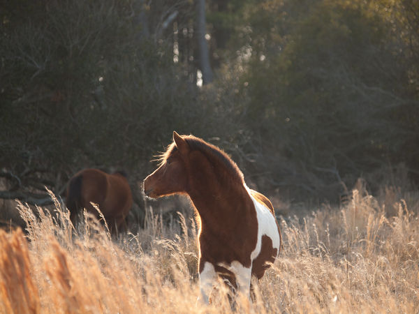
1. Do not let yourself become so mesmerized by wonderful light and color that you forget what monochrome can do with it. Sometimes that great backlight, those dramatic skies and beams are just what you need and will be more impactful in monochrome. So try your best loved dramatic images in monochrome too. Sample below.
2. Camera Raw (whether in LR or PS) has a powerful conversion tool in the HSL sliders that will leave you with fewer artifacts to deal with later. I try it before I break out Silver Efex or Tonality or the others, just to see.
3. When I use a plug in I use it on a layer in PS (same for any layer program). If I'm converting in the plug in I often go back and make a decent but rather bland monochrome layer between the color layer and the plugin layer to blend with or steal from if I need to.
4. I don't do toning till the end when I've got everything else situated. The plugins have great toning tools and so does PS.
5. Enlarge your image and look for trouble like noise and artifacts at 100% as soon as you convert, so you don't waste a lot of work time and find bad surprises later. It is easier to dump a conversion earlier rather than later.
Backlit wild horse
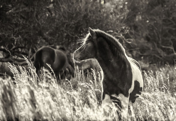
same shot cropped and converted
Check out Traditional Street and Architectural Photography section of our forum.
Feb 9, 2016 20:54:08 #
Anvil wrote:
In this one, we'll try to turn what looks like an ordinary shot into a shot that looks as if it were illuminated by a full moon.
If you feel it improves them then that's fine they are your images.
Feb 9, 2016 21:07:45 #
minniev wrote:
I am not sure my tips will help anybody and some o... (show quote)
min this lovely shot has all the drama you need in color with a bit more processing. The BW has suddenly become very busy and consequently you have lost the movement and grace in the animal. The beautiful swaying grass has converted particularly badly. You obviously were not wearing your thinking in BW headgear lol.
Its a conversion cos one can not because mono makes it better. Have a feeling the color shot could be stunning.
The tip to multi layer with images processed in a different is a very good one. Makes the difference between men and boys when it comes to the final image.
Are you a user of the different film types in Silver Efex?
Feb 9, 2016 21:24:27 #
Billyspad wrote:
min this lovely shot has all the drama you need in... (show quote)
Well, we all like different stuff don't we? Yes, there is a nice color version of the horse that is fully processed, didn't add it since it wasn't the point.
Yes, I use film types in Silver Efex but also Analog Efex, though if the latter I usually do a B&W conversion before going into Analog. Tonality Pro also has interesting film emulations.
Thanks for sharing your opinions.
Feb 9, 2016 21:30:23 #
Bob, Billy, Anvil, Erik and Minnie - thank you so much for your time and terrific information!
And to reiterate -
This thread assumes that the photographer has chosen b&w - for whatever reason - and wishes to add to his or her pp toolbox. We are not critiquing the photos used as examples here; please respect the intent of the topic. You may wish to visit the 25-page "Thinking in Black and White." There are dozens of images there worthy of your constructive criticism.
Check out Traditional Street and Architectural Photography section of our forum.
Feb 9, 2016 21:38:58 #
Billyspad wrote:
If you feel it improves them then that's fine they are your images.
I took the cat shot specifically for the earlier thread -- Thinking in black and white. The shot was fully intended to be black and white.
One might also ask why go through that whole faux moonlight exercise. I enjoy playing with light, whether it is in post processing, or in the taking of the photograph, itself. If I am using flashes, I will often try to make a shot appear as something it is not, such as taking a "moonlight" shot while sitting in the midday sun, with a cloudless sky. Those illusions are interesting, to me.
While the cat shot was intended to be a black and white shot, I thought my attempt at faux moonlight made it more interesting than other types of black and white conversion.
Feb 9, 2016 23:54:35 #
Anvil wrote:
I took the cat shot specifically for the earlier t... (show quote)
I share your love of using PP to create illusions and create the lighting conditions I want.
Your faux moonlight look is very interesting and your instructions explaining the process well written.
Thank you for a rather pleasant conversation and greetings from a rather windy South Seas.
Feb 10, 2016 00:10:36 #
minniev wrote:
Well, we all like different stuff don't we? Yes, there is a nice color version of the horse that is fully processed, didn't add it since it wasn't the point.
Yes, I use film types in Silver Efex but also Analog Efex, though if the latter I usually do a B&W conversion before going into Analog. Tonality Pro also has interesting film emulations.
Thanks for sharing your opinions.
Yes, I use film types in Silver Efex but also Analog Efex, though if the latter I usually do a B&W conversion before going into Analog. Tonality Pro also has interesting film emulations.
Thanks for sharing your opinions.
Would be interesting to see your colour version sometime and know which you prefer BW or colour?
You really should write a tutorial about the use of film types and different processes on different layers with layer masking to merge them. I have a feeling it would open up all sorts of possibilities to many Hogs.
That was words of truth and reason not merely opinion!
Keep safe Billy
Feb 10, 2016 00:20:25 #
Billyspad wrote:
Would be interesting to see your colour version sometime and know which you prefer BW or colour?
You really should write a tutorial about the use of film types and different processes on different layers with layer masking to merge them. I have a feeling it would open up all sorts of possibilities to many Hogs.
That was words of truth and reason not merely opinion!
Keep safe Billy
You really should write a tutorial about the use of film types and different processes on different layers with layer masking to merge them. I have a feeling it would open up all sorts of possibilities to many Hogs.
That was words of truth and reason not merely opinion!
Keep safe Billy
I'm not sure I'd be very good at writing tutorials, I don't even follow them very well. I may drive Dave Chinn to distraction as he tries to coach me through his!
The main ingredient is to keep a monochrome copy without a lot of hard processing stowed underneath whatever other monochrome processing layers you're generating (which could be multiple too, for me). That way you can mask in more or less of it to mitigate problems that are happening on the more heavily processed layer, or just to reduce the impact of the "heavy" effect on some part of the image. It's like an insurance policy against the plug in doing more than you want to some pieces of the image. It isn't at all a foreign concept, most of us maintain a base layer like that in our color images, but if you convert in the plugin you have to make your own insurance.
If you want to reply, then register here. Registration is free and your account is created instantly, so you can post right away.