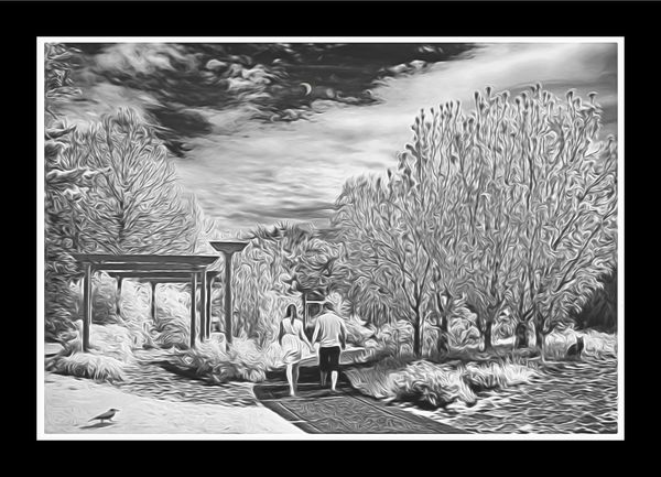
Couple, Washington Park
Jan 24, 2016 21:56:12 #
jim hill
Loc: Springfield, IL
Could have backed off on the Topaz. I don't know. Haven't learned how far to go with this stuff. I don't think it should have been any further?
Jan 24, 2016 23:35:19 #
Well, I like it. The effect seems to be most predominant in the right places...at least to me. :wink:
Jan 25, 2016 07:24:54 #

jim hill wrote:
Could have backed off on the Topaz. I don't know. Haven't learned how far to go with this stuff. I don't think it should have been any further?
hi, Jim,
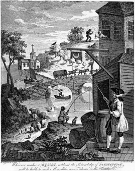
The one striking distraction to my eye is that set of receding "Shinto-shrine-like" structure that seems to recede too quickly and drop too quickly...and contains a number of perspective inconsistencies that are reminiscent of Hogarth's famous image based on innumerable perspective impossibilities. ...or was that your intent? If so, it is well done!
Dave
Hogarth's Confounded Perspectives
Jan 25, 2016 09:12:41 #
jim hill
Loc: Springfield, IL
Uuglypher wrote:
hi, Jim,
The one striking distraction to my eye is that set of receding "Shinto-shrine-like" structure that seems to recede too quickly and drop too quickly...and contains a number of perspective inconsistencies that are reminiscent of Hogarth's famous image based on innumerable perspective impossibilities. ...or was that your intent? If so, it is well done!
Dave
I think you are referring to the portcullis on the left side. That's what the park people call this structure. It's perspective is as it was at moment of exposure.
Being compared to William Hogart is quite a treat.
Thanks for your kindly remarks. Much appreciated.
Jan 25, 2016 09:30:39 #
jim hill wrote:
I think you are referring to the portcullis on the left side. That's what the park people call this structure. It's perspective is as it was at moment of exposure.
Being compared to William Hogart is quite a treat.
Thanks for your kindly remarks. Much appreciated.
Being compared to William Hogart is quite a treat.
Thanks for your kindly remarks. Much appreciated.
Jim,
Looking closely at the "portcullis"(which is not, in fact, a portcullis) do you see what I mean about the inherent anomalies of perspective in the structure? it's design also is reminiscent of some of Escher's architectural impossibilities.
Very perplexing!
The illusory anomalous perspectives are fascinating.
Dave
Jan 25, 2016 10:47:26 #
jim hill
Loc: Springfield, IL
Uuglypher wrote:
Jim,
Looking closely at the "portcullis"(which is not, in fact, a portcullis) do you see what I mean about the inherent anomalies of perspective in the structure? it's design also is reminiscent of some of Escher's architectural impossibilities.
Very perplexing!
The illusory anomalous perspectives are fascinating.
Dave
Another artist's comparison to this piece. That was not my intent. I was simply trying Topaz Glow which I thought I wasted a lot of money on when I purchased it. I guess for this piece it's alright? Alice, the critic whom I trust implicitly, thinks it detracts from the original which took first place in the Washington Park Photo Contest back in 2014.
The contest is now defunct as the park district decided to cancel the contest when a lot of complaints were filed about the judges who were hired to do the job. I had no complaints.
Jan 25, 2016 11:40:05 #
jim hill wrote:
Could have backed off on the Topaz. I don't know. Haven't learned how far to go with this stuff. I don't think it should have been any further?
Very nice. I would not want the Topaz effect applied anymore aggressively, as the elements within the image would then become too difficult to recognize, the image too confusing and too cumbersome to read. Perhaps you could have backed off, but that's really a thing of personal taste. I think it works just fine as presented here.
Say, were the cat and bird in the original image, or did you cleverly paste them in afterwards? Just curious. You're certainly not shy about compositing, jim!
Jan 25, 2016 11:57:20 #
jim hill
Loc: Springfield, IL
rook2c4 wrote:
Very nice. I would not want the Topaz effect applied anymore aggressively, as the elements within the image would then become too difficult to recognize, the image too confusing and too cumbersome to read. Perhaps you could have backed off, but that's really a thing of personal taste. I think it works just fine as presented here.
Say, were the cat and bird in the original image, or did you cleverly paste them in afterwards? Just curious. You're certainly not shy about compositing, jim!
Say, were the cat and bird in the original image, or did you cleverly paste them in afterwards? Just curious. You're certainly not shy about compositing, jim!
I have often thought they seemed out of place. But necessary to the balance of the composition. As this one was done as one of my first attempts at adding something to the piece that was't originally there it does seem slightly out of kilter. The bird more than the cat. But I was so tickled with myself at being able to get the cat in that I had to try the crow. Still, it's one of my favorite photographs. The bird could have been a little smaller but it was a very large crow.
Thanks for your analysis, rook. Much appreciated.
Jan 25, 2016 17:29:18 #
jim hill
Loc: Springfield, IL
Uuglypher wrote:
Jim,
Looking closely at the "portcullis"(which is not, in fact, a portcullis) do you see what I mean about the inherent anomalies of perspective in the structure? it's design also is reminiscent of some of Escher's architectural impossibilities.
Very perplexing!
The illusory anomalous perspectives are fascinating.
Dave
Looking closely at the "portcullis"(which is not, in fact, a portcullis) do you see what I mean about the inherent anomalies of perspective in the structure? it's design also is reminiscent of some of Escher's architectural impossibilities.
Very perplexing!
The illusory anomalous perspectives are fascinating.
Dave
Dave,
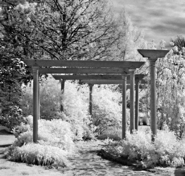
Here is a section of the original. Maybe it was the treatment by Glow that cause the anomaly. I'm at a loss to see what you were talking about in this area of the photograph.
Do you still detect the problem to which you were referring? There are five sections to this structure, plus the tall pole to it's right nearest the camera.
Jan 25, 2016 19:47:15 #
jim hill wrote:
Could have backed off on the Topaz. I don't know. Haven't learned how far to go with this stuff. I don't think it should have been any further?
This image is quite striking in download. I would not have gone any further with the effect and might even back off a bit if that can be done. (not familiar with Topaz).
Jan 26, 2016 10:13:43 #
jim hill
Loc: Springfield, IL
ebrunner wrote:
This image is quite striking in download. I would not have gone any further with the effect and might even back off a bit if that can be done. (not familiar with Topaz).
Thanks Erich, A pprreciate your comments and your point is proably correct. It's too lafte to change this one but I will do it again with the original.
Thanks millions for your input.
Jan 26, 2016 10:53:59 #
jim hill wrote:
Dave,
Here is a section of the original. Maybe it was the treatment by Glow that cause the anomaly. I'm at a loss to see what you were talking about in this area of the photograph.
Do you still detect the problem to which you were referring? There are five sections to this structure, plus the tall pole to it's right nearest the camera.
I appreciate your showing the Pre-Glow image, that did, indeed, confound appreciation of the structure!
The support poles in the "Glow" version you originally posted appeared, as #s 1,2,and3, in regression from front to back.
nInnthe original version is is clear that those same poles regress in the order of 2, 1, 3!
There are thus no perspective anomalies in this, the original... yet one more reason for my antipathy for the so-called "artistic" filters! The degree to which the filter you used significantly changed the structural aspects of the detail in your image is, to my mind and eye, a rediculous effect to sell as a putative artistic augmentation.
Best regards,
Dave
Jan 26, 2016 11:57:28 #
jim hill
Loc: Springfield, IL
Uuglypher wrote:
I appreciate your showing the Pre-Glow image, that... (show quote)
I thought I would give it a whirl. No accounting for taste. I think a few others like it.
Besides that, I have no idea what the hell you are talking about. And who gives a rats ass whether it's 1-2-3 or 3-2-1?
Regards,
Jim
Jan 26, 2016 15:13:49 #

jim hill wrote:
Could have backed off on the Topaz. I don't know. Haven't learned how far to go with this stuff. I don't think it should have been any further?
I looked at this one several times before commenting. I like the image itself a lot, and the cat and bird are part of what I like most about it (I am a big fan of the small characters that creep into your compositions at just the right places).
I struggle with the Topaz effect this time, though, I have always had a problem with that particular filter that makes all the squiggles, so it is probably just me. I like some of it such as the sky parts, but when the squiggles get too involved I kinda get crosseyed looking at it.
Would it be a lot of trouble to show the version before the squiggles? If it is, don't do it, I'm just curious as always.
Jan 26, 2016 15:32:37 #
jim hill
Loc: Springfield, IL
minniev wrote:
I looked at this one several times before commenti... (show quote)
Hi Judy,
Your wish is my command - now to try to find it again.
Be a small while and thanks for asking.
Jim
If you want to reply, then register here. Registration is free and your account is created instantly, so you can post right away.