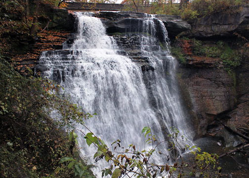
Post production waterfall
Oct 14, 2011 07:30:29 #

Oct 14, 2011 12:23:29 #

Oct 14, 2011 12:25:48 #
I have had a bad habit of overdoing some of my shots too! This is overdone IMHO!
Check out Panorama section of our forum.
Oct 14, 2011 12:57:24 #

Lavolpebxr wrote:
Heres a shot of before and after. Opinions?
I really like the original. The colors in the second did nothing for me. Great pictire. A longer exposure time could give you an interesting effect.
Oct 14, 2011 13:43:13 #
I like the water fall in the first pic and the background in the 2nd pic . A slower shutter speed would have better picked up the colors in the background but it also made the water fall milky. I think you were some what between a rock and a hard spot.
Oct 14, 2011 19:24:16 #

Lavolpebxr wrote:
Tilde,
Believe it or not, I was going for blue. Missed by a mile I guess, lol
Believe it or not, I was going for blue. Missed by a mile I guess, lol
I have to agree with everyone. The photo shows up magenta, red etc. Not very appealing. I took a shot at trying to fix it. I also changed the orientation of the falls and did a small crop.
Oct 14, 2011 19:28:12 #

au2panner wrote:
Is this what you were looking for?
100% better. The first one looked like your white balance was WAY off!
Check out Digital Artistry section of our forum.
Oct 15, 2011 09:28:57 #
Fstop12 wrote:
I have to agree with everyone. The photo shows up magenta, red etc. Not very appealing. I took a shot at trying to fix it. I also changed the orientation of the falls and did a small crop.
Lavolpebxr wrote:
Tilde,
Believe it or not, I was going for blue. Missed by a mile I guess, lol
Believe it or not, I was going for blue. Missed by a mile I guess, lol
I have to agree with everyone. The photo shows up magenta, red etc. Not very appealing. I took a shot at trying to fix it. I also changed the orientation of the falls and did a small crop.
That's a great tool changing the orientation. It actually gives a better perspective. Good job.
Oct 15, 2011 21:05:36 #
I'm a big fan of "beefing up" colors, but #2 is way too much, even for me. I like what au2panner did in their #2, but I think I would have toned that down a tad, too.
I don't know about the changing orientation that fstop12 did, but the crop certainly took out a chunk of debris that it didn't need. IMHO.
I don't know about the changing orientation that fstop12 did, but the crop certainly took out a chunk of debris that it didn't need. IMHO.
Jul 21, 2012 18:09:24 #
Lavolpebxr wrote:
Tilde,
Believe it or not, I was going for blue. Missed by a mile I guess, lol
Believe it or not, I was going for blue. Missed by a mile I guess, lol
That must be a real pain in the a---, being colour blind.
If you want to reply, then register here. Registration is free and your account is created instantly, so you can post right away.
Check out Drone Video and Photography Forum section of our forum.