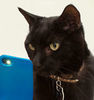
Can you tell me what you think about this photo?
Mar 20, 2012 13:27:34 #
With your permission, a different variation. No cropping. Your thoughts?
P.S., it looks a little pinker here than it did on my system. Not sure if this is UHH's rendering or what.
P.S., it looks a little pinker here than it did on my system. Not sure if this is UHH's rendering or what.

Mar 20, 2012 13:37:06 #

Jeanhdl wrote:
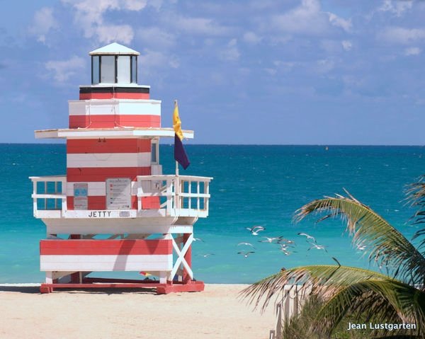
Be honest, trying to figure out which one I want to put on Canvas and give my daughter for her birthday. I think I like this one, but any opinions would be great. thanks. I like this one because there are no people and I think the birds add a nice touch. But what do you think of the palm on the right side?
I like the perspective with the palm because it gives the photo depth. I will often shoot something in front of the main part of the frame just for perspective.
I don't know if this happened because of the upload or not but the photo doesn't appear sharp to me. Perhaps your focal point was way in the distance and the house just seems slightly out of focus.
In future, one thing that might help in a situation like this is a high aperture as in f/10 to keep everything in focus, foreground and background.
As I say I like the perspective and I agree with the shadow.
That is a bit distracting.
Keep shooting. Nice job and good luck
Mar 20, 2012 15:53:06 #

[quote=Jeanhdl]
Thank you. I appreciate it...[/quote
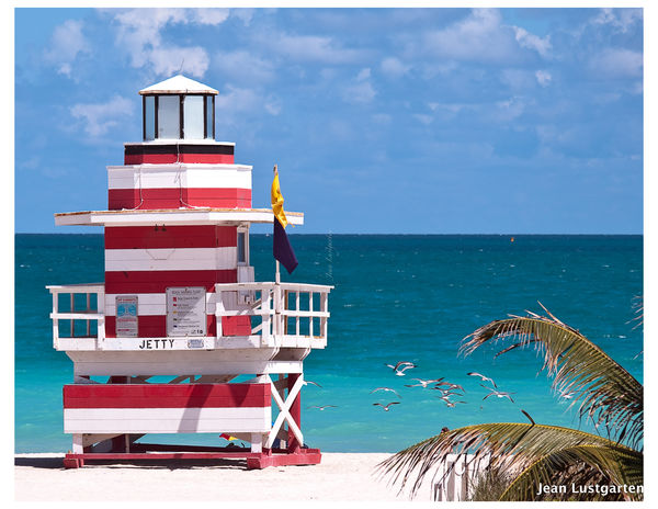
For your consideration, I took out the shadow, brightened up the water and sky a bit, and increased the saturation a little. I love the photo.
photogrl57 wrote:
Something else you might think about before puttin... (show quote)
Thank you. I appreciate it...[/quote
For your consideration, I took out the shadow, brightened up the water and sky a bit, and increased the saturation a little. I love the photo.
A few minor changes
Mar 20, 2012 16:14:06 #
[quote=aammatj][quote=Jeanhdl]
Thank you. I appreciate it...[/quote
For your consideration, I took out the shadow, brightened up the water and sky a bit, and increased the saturation a little. I love the photo.[/quote]
I really like it as well... nice improvements. Keep shooting.
photogrl57 wrote:
Something else you might think about before puttin... (show quote)
Thank you. I appreciate it...[/quote
For your consideration, I took out the shadow, brightened up the water and sky a bit, and increased the saturation a little. I love the photo.[/quote]
I really like it as well... nice improvements. Keep shooting.
Mar 20, 2012 16:31:33 #
I would also clone out the top of the beach dwellers head in the palm. Maybe tap the contrast one bump. Nice photo none the less....
Mar 20, 2012 16:40:34 #
Mar 20, 2012 16:50:54 #
aammatj wrote:
For your consideration, I took out the shadow, brightened up the water and sky a bit, and increased the saturation a little. I love the photo.
Very nice job. OK, I wasn't there, maybe it didn't look like that at all. But this is probably would it SHOULD have looked like. :)
Mar 20, 2012 19:45:30 #
AS someone said, "Increase the canvas size". Then use "Content-aware to increase the photo onto the larger canvas. Then you will have that wrap around effect.
Mar 20, 2012 19:46:51 #

Thanks all! Yes the weather here is beautiful, but like a lot of the States, it is warm and mild. So here is the shot I have worked on. I am using a new program, so bear with me. Let me know what you think of this>
Thanks again!
Thanks again!
Mar 20, 2012 19:53:10 #
Jeanhdl wrote:
Thanks all! Yes the weather here is beautiful, but like a lot of the States, it is warm and mild. So here is the shot I have worked on. I am using a new program, so bear with me. Let me know what you think of this>
Thanks again!
Thanks again!
Mar 20, 2012 20:33:07 #
Jeanhdl wrote:
Jeanhdl wrote:
Thanks all! Yes the weather here is beautiful, but like a lot of the States, it is warm and mild. So here is the shot I have worked on. I am using a new program, so bear with me. Let me know what you think of this>
Thanks again!
Thanks again!
Looks GGGRRREEEAAATTT!!!
Mar 20, 2012 22:07:48 #

Jeanhdl wrote:
Be honest, trying to figure out which one I want to put on Canvas and give my daughter for her birthday. I think I like this one, but any opinions would be great. thanks. I like this one because there are no people and I think the birds add a nice touch. But what do you think of the palm on the right side?
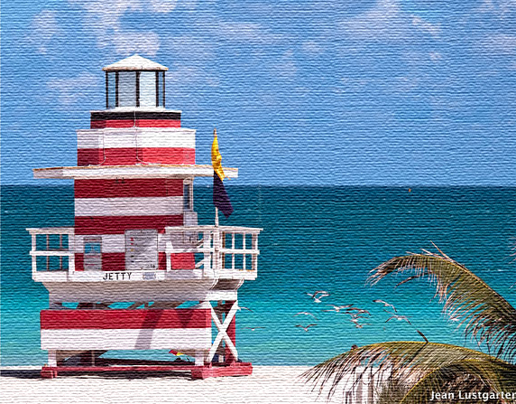
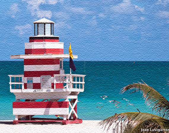
I have viewed all of the posts in this tread, looked at your wonderful image. . .and I have concluded that this image is not well suited for canvas. I think it would look better done on 140 lb Arches cold press watercolor paper. More in keeping with the subject matter as well.
I have taken your image and applied a canvas texture, and then with a coldpress watercolor texture. With the canvas, you tend to loose the birds more so than with the watercolor look. To me, the key to canvas with photos (I have done a number), is that the image needs to not just look like a photo on canvas. I think people need to be fooled at first glance, if you will, into thinking what they are looking at is a painting on a canvas. Not a photo on canvas.
Because of the subject matter and the colors here, I think it would look tons better printed on the above noted watercolor paper. And, if done right, people will be certain that they are looking at a very fine watercolor.
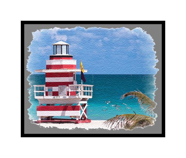
I have included a third image, showing how one could deckle the edge of the watercolor, float the image, and double matt up near the image. It is rough, but I think the idea comes through.
Whatever you end up doing, I am certain that your daughter will love it.
Canvas Texture
Watetcolor Paper Texture
Deckled and Floated
Mar 20, 2012 22:31:48 #
Mar 20, 2012 22:51:55 #

Jeanhdl wrote:
Jeanhdl wrote:
Thanks all! Yes the weather here is beautiful, but like a lot of the States, it is warm and mild. So here is the shot I have worked on. I am using a new program, so bear with me. Let me know what you think of this>
Thanks again!
Thanks again!
That looks great ... well done :)
Mar 20, 2012 23:47:36 #
MtnMan wrote:
Here's an example...probably overdone.
MtnMan wrote:
Yes, this is much better. But I suspect the clouds could be better and maybe a bit of saturation would help the red and the water.
There's a little too much pink tone but the sky is great. That's the main thing that I was missing was the brighter sky. Of course, the original looked good too except for the towel. :thumbup:
If you want to reply, then register here. Registration is free and your account is created instantly, so you can post right away.