Can you tell me what you think about this photo?
Mar 19, 2012 21:18:14 #

Jeanhdl wrote:
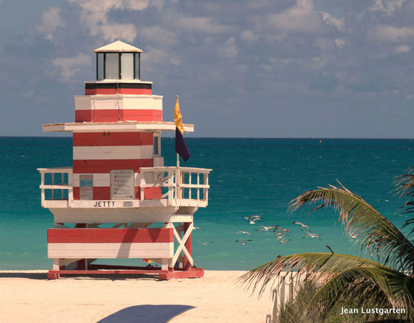
Be honest, trying to figure out which one I want to put on Canvas and give my daughter for her birthday. I think I like this one, but any opinions would be great. thanks. I like this one because there are no people and I think the birds add a nice touch. But what do you think of the palm on the right side?
Looks like a dark blue towel. I agree it needs cloned out and then you will have a great picture. Thanks for sharing.
Mar 19, 2012 21:44:51 #

Something else you might think about before putting it to canvas .. is brightening the colors just a tiny bit.
I don't know what editing software you have but in photoshop .. go to the filters menu/sharpen/unsharpen mask .. set the amount to 20, the radius to 5 and the threshold to 0 ...
It won't sharpen it but it will make the colors stand out just a tiny bit more especially in the structure.
In elements .. enhance menu/unsharpen mask ...same settings.
Here is an example to show you the difference.
original
brightened a tiny bit
Mar 19, 2012 22:03:29 #

photogrl57 wrote:
Something else you might think about before puttin... (show quote)
Thank you. I appreciate it...
Mar 19, 2012 22:24:15 #

Yes. Much.
Jeanhdl wrote:
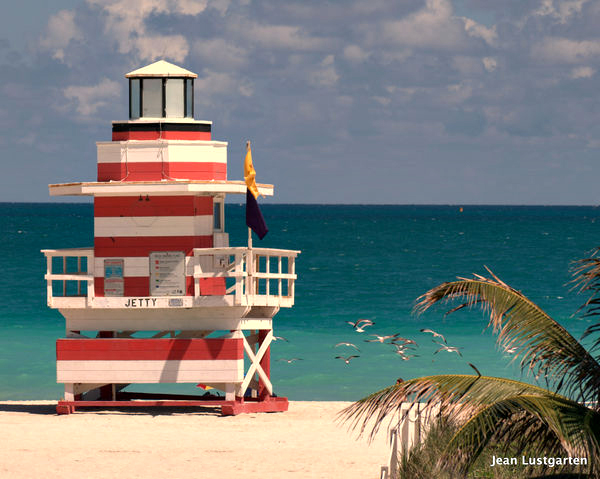
Ok, here we go, do you guys like this better?
Jeanhdl wrote:
I mean good points! All of them. Will work at it and put it up again......... Sometimes when I get Canvas work done they print the whole image and use only white around the edges. Then I float the in a frame. Thanks everyone!
Ok, here we go, do you guys like this better?
Mar 20, 2012 08:26:55 #

If you are going to canvas wrap make sure you can view what the wrap takes in viewing justg the front because lokking at your pic it is going to put the lifeguard hut right on the left edge of the canvas. Then you can decide if you can live with it. I did a flower wrap through Ritzpic and it showed up well and what I liked about the wrap, you could follow the picture around the corner without a problem and it came out great.
Mar 20, 2012 08:32:24 #
A final(?) thought on either 1 or 2. At least on my monitor the lifeguard stand seems to be floating. I'd make sure there was enough tone and texture to the foreground to anchor the stand to the beach.
Would love to see the final painting.
Would love to see the final painting.
Mar 20, 2012 08:36:14 #

Compositon and subject are interesting.
This picture would have really profited from a polarizing filter. The clouds and red of the shack would pop, the tree would be more green, and the water would be more attractive.
If you post using "(store original)" some will help you simulate those effects.
And as noted the spurious shadow has to go.
Jeanhdl wrote:
Be honest, trying to figure out which one I want to put on Canvas and give my daughter for her birthday. I think I like this one, but any opinions would be great. thanks. I like this one because there are no people and I think the birds add a nice touch. But what do you think of the palm on the right side?
Mar 20, 2012 08:38:17 #
Yes, this is much better. But I suspect the clouds could be better and maybe a bit of saturation would help the red and the water.
photogrl57 wrote:
Something else you might think about before puttin... (show quote)
Mar 20, 2012 08:39:09 #
I think the wrap may eat into the beach shack and the final print may not be as you envision. I would enhance the colors on the shack, clone out the towel and play around with the hue in the sky. You may want to frame it instead of wrap it. Check with the printer beforehand to get their view.
Mar 20, 2012 10:51:41 #

MT Shooter wrote:
If you are doing a canvas wrap, you need to take into account the wrap part that will eat into your photo leaving precious room around the beach shack.
You can extend all the sides of the image in Photoshop, and some other editors, in the image menu and selecting "canvas" and add the required amount all around.
Mar 20, 2012 11:14:10 #
sinatraman wrote:
i think the palm tree is neccesary to locate the photo in a tropical enviornment. otherwise the lighthouse could be located on the great lakes. the tree adds flavor. the shadow doesn't
It also creates depth
Mar 20, 2012 11:24:48 #
Here's an example...probably overdone.
MtnMan wrote:
Yes, this is much better. But I suspect the clouds could be better and maybe a bit of saturation would help the red and the water.

Mar 20, 2012 11:29:27 #
photomom25
Loc: chippewa lake
I think the first one is better theres a little more green in there but not enough to take away from the picture it makes it look a little tropical with the water and the jetty and what looks like birds sitting on the water , I think it all works together!
Mar 20, 2012 11:31:34 #
Fussing with it helped me realize the issue. It is underexposed.
This usually happens with snow or beach shots. They can be confusing because the scene looks so bright you think you need to set your EV down. You need to do just the opposite. The reason is that your camera meter assumes everything is gray and so adjusts the exposure to, in the immortal words of Captain Picard, "Make it so".
Most cameras have a snow/beach scene setting that will up the EV for you...somewhere between +1 and +2.
MtnMan wrote:
Here's an example...probably overdone.
MtnMan wrote:
Yes, this is much better. But I suspect the clouds could be better and maybe a bit of saturation would help the red and the water.
Mar 20, 2012 12:55:24 #
If you want to reply, then register here. Registration is free and your account is created instantly, so you can post right away.