Your valued opinion
Feb 28, 2014 11:50:12 #
GrfxLady wrote:
Couldn't resist. I love designing book covers in Photoshop. i used two Topaz filters to bring the color and detail out, took out the hedge, cropped the right side to make it more of a standard book size (10x8). I thought the cloudy sky was a bit too busy for a title, so I used a nice script in white that stands out against the green. So this is how it could look.
WOW! Excellent job!
Feb 28, 2014 11:51:17 #
SonyA580 wrote:
OK. I took the hedge out. I'd have to agree it looks better.
I think it looks Photoshopped.
Feb 28, 2014 13:24:02 #

Feb 28, 2014 16:08:02 #

GrfxLady wrote:
Couldn't resist. I love designing book covers in Photoshop. i used two Topaz filters to bring the color and detail out, took out the hedge, cropped the right side to make it more of a standard book size (10x8). I thought the cloudy sky was a bit too busy for a title, so I used a nice script in white that stands out against the green. So this is how it could look.
beautiful job GrfxLady
Feb 28, 2014 17:42:40 #

DanRobinson wrote:
1. Is the picture shown the same ratio as the book? (about 3:2)
2. What is the title and where do the type elements go?
The left edge is a little busy, but if you shorten the width, that can be the spine.
2. What is the title and where do the type elements go?
The left edge is a little busy, but if you shorten the width, that can be the spine.
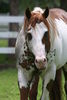
Oh My gosh, I love the cover... My horse wears a dress! Too funny!
Feb 28, 2014 22:46:39 #

GrfxLady wrote:
Couldn't resist. I love designing book covers in Photoshop. i used two Topaz filters to bring the color and detail out, took out the hedge, cropped the right side to make it more of a standard book size (10x8). I thought the cloudy sky was a bit too busy for a title, so I used a nice script in white that stands out against the green. So this is how it could look.
Terrific job! :thumbup: But I'd also add Heirloom Tomato's autosharpening. Maybe you did, but it seems like I can see a difference between the two in that regard.
Mar 1, 2014 04:33:51 #
SonyA580 wrote:
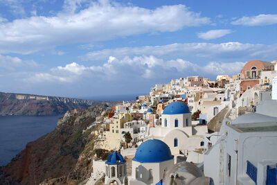
I'm doing a small book on pictures from Italy and am considering this shot for the book cover. I like the composition but some have said it's too busy. What do you think? Feel free to make any changes at all and, thanks for your input.
At first glance, the picture does not, (to me,) convey Italy. Looking further down i saw the title of the book with the pic in it. Now, it conveyed the theme. Yes. I would have used that picture with the title of the book had it been mine. Nice job and NO, i don't think it is to busy.
Rich
Mar 1, 2014 10:44:56 #

Mar 1, 2014 17:05:25 #
GrfxLady,
WOW! That is a pro job if I have ever seen one. If you don't do this for a living ....., you should.
Thank you,
Ron
WOW! That is a pro job if I have ever seen one. If you don't do this for a living ....., you should.
Thank you,
Ron
If you want to reply, then register here. Registration is free and your account is created instantly, so you can post right away.