Your valued opinion
Feb 27, 2014 11:39:03 #
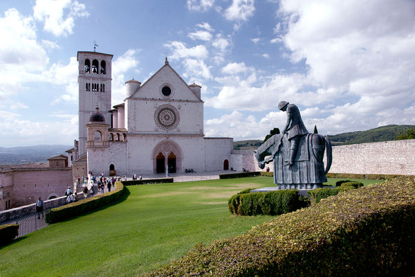
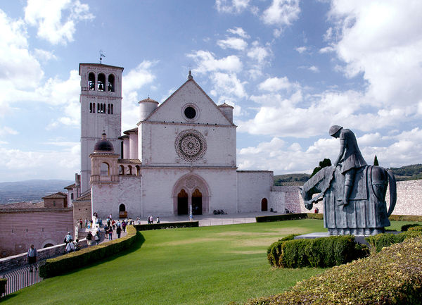
I'm doing a small book on pictures from Italy and am considering this shot for the book cover. I like the composition but some have said it's too busy. What do you think? Feel free to make any changes at all and, thanks for your input.
Feb 27, 2014 11:47:09 #
For the cover I'd pick the photo that best represents your trip. If it's this one then use it. I don't think it's too busy - it's a very nice shot.
Feb 27, 2014 11:49:26 #
SonyA580 wrote:
I'm doing a small book on pictures from Italy and am considering this shot for the book cover. I like the composition but some have said it's too busy. What do you think? Feel free to make any changes at all and, thanks for your input.
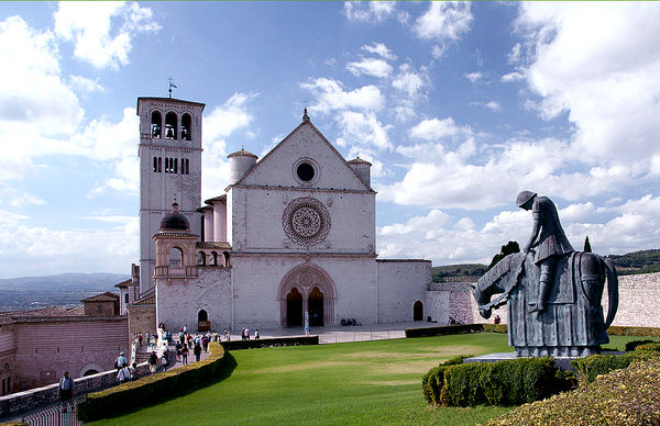
I tried a simple crop of the photo eliminating some of the foreground which is not needed.
Feb 27, 2014 12:00:09 #
I don't think it's too busy but have you considered removing some of the foreground? Here's a crop that takes some of it away. I adjusted levels slightly to make whites a little whiter and blacks a little more darker, and autosharpened.
Feb 27, 2014 12:00:51 #
I like your photo just the way it is. Is it busy? Sure it is, so what? You like it? Use it. It's your statement, not ours.
I like your crop better because it leads the viewer to the building, suggesting more depth.
I like your crop better because it leads the viewer to the building, suggesting more depth.
Feb 27, 2014 12:37:06 #
SonyA580 wrote:
I'm doing a small book on pictures from Italy and am considering this shot for the book cover. I like the composition but some have said it's too busy. What do you think? Feel free to make any changes at all and, thanks for your input.
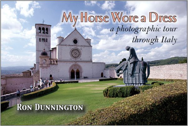
1. Is the picture shown the same ratio as the book? (about 3:2)
2. What is the title and where do the type elements go?
The left edge is a little busy, but if you shorten the width, that can be the spine.
Feb 27, 2014 13:27:57 #
You and Regis had the exact same idea! The hedge is a problem and I've considered Photo Shopping it out. Thanks for all of the comments!
Feb 27, 2014 13:58:46 #
Before I would put any comment. I would need to know what kind of book or the theme it is going be. If you are going to be a primarily tour type book showing the architecture, a photo book covering you travels, a random shot type book. You would want to chose a picture that draw a potential client into you book.
Feb 27, 2014 14:01:07 #
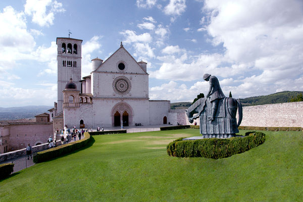
OK. I took the hedge out. I'd have to agree it looks better.
Feb 27, 2014 16:53:22 #
SonyA580 wrote:
OK. I took the hedge out. I'd have to agree it looks better.
I was startled by this, then realized why. The statue and hedge look like they are flying above the grass, because there is no shadow. The hedge below the horse needs to have dark shadow on the right like the other hedges do, to ground it.
Your version leaves plenty of room for text, though, that's nice! i think this would make a good book cover.
Feb 27, 2014 17:52:12 #
Good eye! I probably would have never noticed but, now that you mention it, it's as plain as day. Back to work!
Feb 27, 2014 18:00:38 #
I think I like it just the way it is...It might be a little busy but the hedge draws you in and it and the wall frame the horseman and takes your eye around to the church, background scenery and down the path all around...if it is your best image and well represents your travels than it will make a good cover
Feb 27, 2014 23:36:45 #
Feb 28, 2014 06:04:33 #
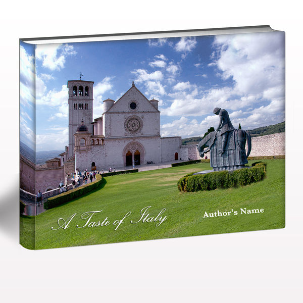
Couldn't resist. I love designing book covers in Photoshop. i used two Topaz filters to bring the color and detail out, took out the hedge, cropped the right side to make it more of a standard book size (10x8). I thought the cloudy sky was a bit too busy for a title, so I used a nice script in white that stands out against the green. So this is how it could look.
Feb 28, 2014 11:49:42 #
SonyA580 wrote:
I'm doing a small book on pictures from Italy and am considering this shot for the book cover. I like the composition but some have said it's too busy. What do you think? Feel free to make any changes at all and, thanks for your input.
What size is your book? This would be good for a book that is wider than it is tall but not for a standard size book that is taller than wide. BTW I like the photo and good luck with your endeavor.
If you want to reply, then register here. Registration is free and your account is created instantly, so you can post right away.
