Color or Monochrome? (Landscape)
Jan 22, 2014 12:12:43 #

CrispColors wrote:
Definitely B&W for me. I see more of a story with the
sky/clouds.
sky/clouds.
Appreciate you commenting CrispColors. 8-)
Jan 22, 2014 12:13:16 #

Very nices images. I agree with those who believe it works either way, but I think the b&w version could be even better if the contrast was increased just a tad, especially in the sky.
Jan 22, 2014 13:13:32 #

I far prefer the black and white because I keep looking at the orange in the color version, but in the b&w I look at the entire offering. The color version is nice, too, but not as strong as the b&w to me.
Jan 22, 2014 13:16:28 #
djtravels wrote:
I agree with Phil, to a point. The interesting sky makes me lean towards color. Guess I just like a warm feeling. :wink:
Warm feelings are good, thanks for commenting DJ. 8-)
Jan 22, 2014 13:27:08 #

Jan 22, 2014 13:42:55 #
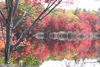
Bmac wrote:
Does this photograph have more appeal in a color or monochrome rendition?
Photographed at the Jones Beach State Park boat basin, New York, during the winter. Settings: ISO 100, 18mm, f/11, 1/60 of a second. Late afternoon light.
Select download for full resolution. Critique, comments and suggestions welcomed. Thanks. 8-)
Photographed at the Jones Beach State Park boat basin, New York, during the winter. Settings: ISO 100, 18mm, f/11, 1/60 of a second. Late afternoon light.
Select download for full resolution. Critique, comments and suggestions welcomed. Thanks. 8-)
b/w
Jan 22, 2014 14:06:03 #
Bmac wrote:
Does this photograph have more appeal in a color or monochrome rendition?
Photographed at the Jones Beach State Park boat basin, New York, during the winter. Settings: ISO 100, 18mm, f/11, 1/60 of a second. Late afternoon light.
Select download for full resolution. Critique, comments and suggestions welcomed. Thanks. 8-)
Photographed at the Jones Beach State Park boat basin, New York, during the winter. Settings: ISO 100, 18mm, f/11, 1/60 of a second. Late afternoon light.
Select download for full resolution. Critique, comments and suggestions welcomed. Thanks. 8-)
More dramatic in B&W. Love the way you caught the Jones Beach water tower.
Jan 22, 2014 14:26:49 #
PierreH wrote:
Both are really well done, but, the color is outstanding, especially in download. Pierre
Thanks for the compliment Pierre. 8-)
Jan 22, 2014 14:31:00 #

Jan 22, 2014 14:46:29 #
Heirloom Tomato wrote:
The thing that really sold me on the b&w is the full range of tones and the beautiful light tips in the grasses. It seems more uniformly orange in the color version, but more expressively toned in b&w. They are both very good, though! The sky and water is gorgeous.
Thanks again HT. :D
Jan 22, 2014 14:47:53 #
SunnyDee wrote:
I like the one in color.
jeanbug35 wrote:
Color for me.
Thank you both for viewing and voicing your selection. Two more for color. 8-)
Jan 22, 2014 15:24:21 #

Bmac wrote:
Does this photograph have more appeal in a color or monochrome rendition?
Photographed at the Jones Beach State Park boat basin, New York, during the winter. Settings: ISO 100, 18mm, f/11, 1/60 of a second. Late afternoon light.
Select download for full resolution. Critique, comments and suggestions welcomed. Thanks. 8-)
Photographed at the Jones Beach State Park boat basin, New York, during the winter. Settings: ISO 100, 18mm, f/11, 1/60 of a second. Late afternoon light.
Select download for full resolution. Critique, comments and suggestions welcomed. Thanks. 8-)
Both are great in their own right .I vote for both.
Rich
Jan 22, 2014 16:11:00 #
Treepusher wrote:
My vote goes to the color shot, Bmac. The warm earth tones add to the feel of the photo. The B/W is, by contrast, cold and unappealing (and not that it's a bad shot, it just lacks the warmth of the color version).
Thanks for commenting Randy, I'm feeling a bit cold myself after shoveling snow. :-D
Jan 22, 2014 16:11:14 #

Bmac wrote:
Thanks Wahawk. I haven't been converting too many of my photographs to monochrome but thought this one looked good. 8-)
I keep looking at these and think that with a little increase in contrast and saturation, they both could also be turned in some very nice tone-mapped images!! If you want I could try to show what I am thinking about them.
Jan 22, 2014 16:17:55 #
Wahawk wrote:
I keep looking at these and think that with a little increase in contrast and saturation, they both could also be turned in some very nice tone-mapped images!! If you want I could try to show what I am thinking about them.
Sure Wahawk go for it! And thanks for asking first, not everyone does. :D
If you want to reply, then register here. Registration is free and your account is created instantly, so you can post right away.