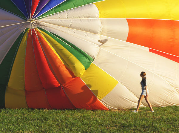
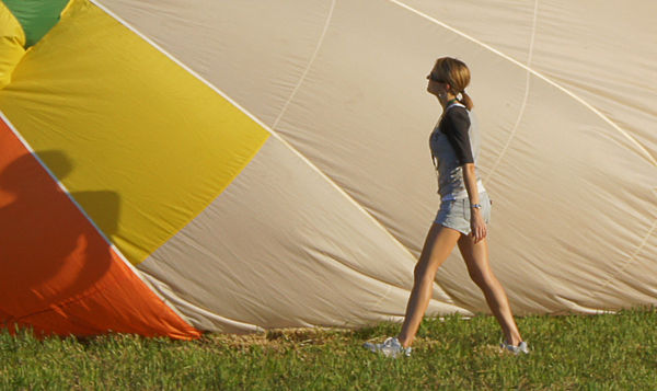
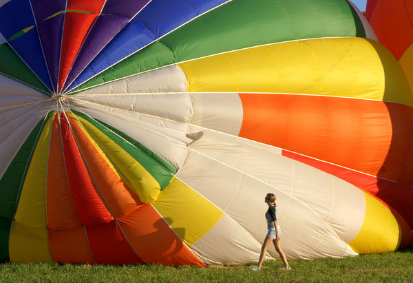
Balloonfest Which one do you like better?
Jan 19, 2012 12:12:49 #
Jan 19, 2012 12:19:12 #
Jan 19, 2012 12:25:37 #
Jan 19, 2012 12:49:16 #
I like the photo. For fun I played with cropping the image with a thirds grid so the girl's head is at the lower right intersection and head of the balloon is at the upper left intersection completely eliminating the other balloon. Getting in closer you see more detail of the girl and that she is looking at the head of the balloon. I think that it also gives the viewer more of the size perspective between the girl and the huge balloon.
Jan 19, 2012 12:54:52 #
I tend to like #1 better and the reason is there is more grass. By adding the depth to the grass, it makes the woman look shorter, thus making the balloons look bigger. OK, that's just my opinion. We all see it different.
Jan 19, 2012 13:08:52 #
senad55verizon.net wrote:
Let me see what I can do. Lol.How about a human interest crop?
Any better?
Jan 19, 2012 13:22:48 #

tainkc wrote:
Any better?
senad55verizon.net wrote:
Let me see what I can do. Lol.How about a human interest crop?
Any better?
Well, now it's about the girl. The scale of the balloons is gone. senad55verizon.net's crop leaves something of that scale.
Today's E-mail from Digital Photography School had the following item:
http://www.digital-photography-school.com/the-one-question-you-should-ask-yourself-before-taking-any-picture
and it's entirely apropos here. You took those shots because the balloons impressed you with their size and color. The girl was incidental, but provided human scale.
So... when it comes to cropping, what are you trying to convey? And, by the way, the same photo can be cropped to convey different things, there's no law that says there is only one possible interpretation. (I expect to be stomped on by some purists for making that statement, but what the hell.)
Jan 19, 2012 13:38:13 #
jim hill
Loc: Springfield, IL
I assume that by allowing download you are also allowing us to work with the image. It is a great image and more interesting than the usual sky full of balloons one usually sees.
I simply did a little cropping and added a little contrast.
Great seeing!
Please excuse my misspelling in the title.
Jim Hill
I simply did a little cropping and added a little contrast.
Great seeing!
Please excuse my misspelling in the title.
Jim Hill
Baloon & Woman
Jan 19, 2012 13:44:17 #

I like #1. The colors stand out more, but I would crop the bottom just a bit.
Larry
Larry
Jan 19, 2012 14:09:24 #
jim hill wrote:
No problem.I assume that by allowing download you are also allowing us to work with the image. It is a great image and more interesting than the usual sky full of balloons one usually sees.
I simply did a little cropping and added a little contrast.
Great seeing!
Please excuse my misspelling in the title.
Jim Hill
I simply did a little cropping and added a little contrast.
Great seeing!
Please excuse my misspelling in the title.
Jim Hill
Jan 19, 2012 14:11:21 #
Jan 19, 2012 14:18:09 #
senad55verizon.net
Loc: Milford, NJ
tainkc wrote:
Any better?
senad55verizon.net wrote:
Let me see what I can do. Lol.How about a human interest crop?
Any better?
Anybody can have an opinion about that, but it's no longer a balloon festival. [all that ripstop nylon is a spinnaker, isn't it?
Jan 19, 2012 17:17:41 #
Jan 19, 2012 18:22:28 #
I think the girl is a big part of the pic. W/O her you wouldn't recognize the enormity of the balloons. Remember the rule of 3rds is not carved in stone and I like the way you have her positioned in the middle. In one way initally she does pull your eyes towards her but then you get the perspective of how large the balloons are. 1 or 2 take your pick, I'd have a hard time making a choice but I know I wouldn't crop them---Just my opinion...........
Jan 19, 2012 19:58:04 #

If you want to reply, then register here. Registration is free and your account is created instantly, so you can post right away.