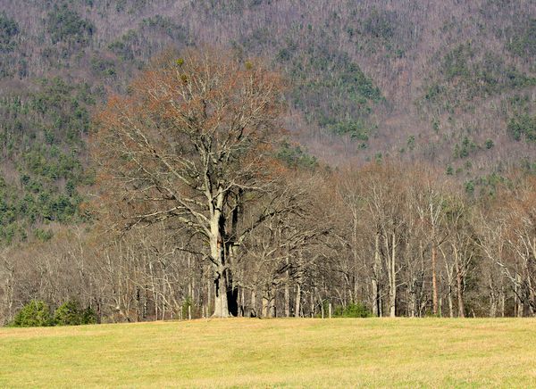
Cannot see the mountain for the tree
Dec 19, 2013 14:51:48 #

dbmase wrote:
Yes I am very new to photo shop Please fill free to help. If you want to adjust the photo and explain the finished product that would be great. Thanks Dave
Did this last night and it's turned out very similar to Minniev's.
Basically, if you want the tree to stand out, you need to boost the red, because that's predominantly the colour of the leaves. However, the background hillside is vividly purple (i.e. red/blue), and if you don't want that dominating the scene, you have to tone down the blue. Also, the vegetation colour (green) needs boosting, but the grass is close to being too vivid, so I upped green and toned down yellow.
I played with colour and tint sliders and the White Balance setting (small increase in temp) to nudge things in the desired direction without pushing it so far it loses all naturalness. I also upped the saturation quite a bit.
To make the trees stand out more, I tried contrast and also raising the black point, and of the two I found that raising the black point a little (about 10%) worked best. I didn't try Clarity or Vibrance, because they were in another PP suite.
-
Dec 19, 2013 15:05:55 #
PS - As noted elsewhere, bare or nearly-bare trees are a bit on the transparent side, so it's difficult to make them stand out. Whatever is in the background becomes a very significant factor, so it's worth bearing that in mind when choosing the scene and composing.
In your pic, the colour of the hillside is very striking, and that actually goes against your attempt to capture the main subject (the big tree). It also doesn't help that red won't stand out much against purple. However, you did end up with a very colourful shot that does a reasonable job of portraying the post-fall trees. There are probably other things that would make the trees stand out a bit more, but the circumstances of the original shot are against you, and I suspect that most things that you could try are going to make the shot look over-PPed.
In your pic, the colour of the hillside is very striking, and that actually goes against your attempt to capture the main subject (the big tree). It also doesn't help that red won't stand out much against purple. However, you did end up with a very colourful shot that does a reasonable job of portraying the post-fall trees. There are probably other things that would make the trees stand out a bit more, but the circumstances of the original shot are against you, and I suspect that most things that you could try are going to make the shot look over-PPed.
Dec 19, 2013 17:05:10 #
dbmase
Loc: knoxville Tn.
Thanks to all but jc56 is correct, not a good pic to start with. And the focal point is not in sharp focus thanks Nightski. I am thankful to all but sometimes you get a once in a life time photo that might not be perfect but its not a sin to help it out with a little photo shop. So I am going to keep working on the good and the bad. Thanks minniev that helped a lot the picture looks better than I thought it could. Thanks, Dave
Dec 19, 2013 18:35:18 #

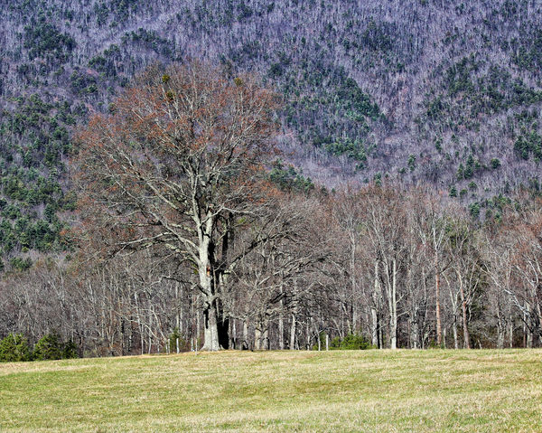
dbmase, I sometimes think people are too easy to dismiss their good photos, and I certainly wouldn't dismiss this one. Like a few others, I have cropped out some forest, to put your main tree off-center. What I loved most about this photo, however, was the patterns that were taking place among the evergreens and the bare decidouous trees higher on the mountain (actually I can't tell if that's natural coloration or was induced by some other factor). I took your light levels down considerably, and in fact, made shadows stronger to bring back depth to all of your trees. I used a filter from Color Efex Pro to selectively brush in some tonal contrast to those geomatric patterns, while increasing structure to all of the trees in the photo. I finally added an off-center light source just to the right of bottom center to lighten up the meadow and trees.
Variant on Cannot see the mountain for the tree
If you want to reply, then register here. Registration is free and your account is created instantly, so you can post right away.