Metal Prints
Jul 13, 2013 12:50:15 #

PrairieSeasons wrote:
I had been shooting that red barn as part of a &qu... (show quote)
I'd be curious as to what characteristics of a particular photo you've discovered lend themselves to metal reproduction.
Jul 13, 2013 12:55:54 #

windshoppe wrote:
I'd be curious as to what characteristics of a particular photo you've discovered lend themselves to metal reproduction.
I ordered the sampler with my image as well. It is a B&W. The areas of gray that match the color of the aluminum seem to be clear so the light "shines" on these areas. Makes for a stunning image. It took my mediocre print and turned it into one that I (and friends) like. The image is not really mediocre but I think all of my work is crap!
Jul 13, 2013 12:56:57 #

windshoppe wrote:
I'd be curious as to what characteristics of a particular photo you've discovered lend themselves to metal reproduction.
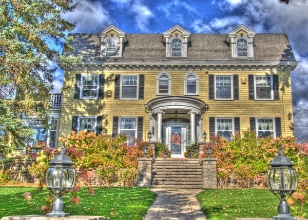
I'd have to think about that for a bit. It's one of those things that I know it when I see it, but it's harder to describe. The first two or three things that come to mind are that big contrasts in color usually pop more, that HDR (particularly if heavily saturated) pop more, and that metal objects and water usually come out better on metal prints.
Here are two examples. The yellow house came out quite well in metal print, while the Notre Dame one looked flat and uninteresting.

Jul 13, 2013 12:59:21 #
PrairieSeasons wrote:
I'd have to think about that for a bit. It's one of those things that I know it when I see it, but it's harder to describe. The first two or three things that come to mind are that big contrasts in color usually pop more, that HDR (particularly if heavily saturated) pop more, and that metal objects and water usually come out better on metal prints.
Here are two examples. The yellow house came out quite well in metal print, while the Notre Dame one looked flat and uninteresting.
Here are two examples. The yellow house came out quite well in metal print, while the Notre Dame one looked flat and uninteresting.
And yes - the Notre Dame one is a photo. Here's the original.

Jul 13, 2013 13:04:34 #
windshoppe wrote:
I'd be curious as to what characteristics of a particular photo you've discovered lend themselves to metal reproduction.
Here's another one that was part of the learning process. I took this for the owner of this bed & breakfast and tried it in metal - no good. It looked fantastic, though, on canvas.

Jul 13, 2013 13:23:34 #
Gal on the Go
Loc: Annapolis, Maryland
Adorama did a metal print of a sunset for me. Brilliant yellow and orange colors against a blue sky, also reflected in the blue water. Silhouetted trees frame it. Great job and hanging in my kitchen. Love it! Adorama also,does great canvas prints, true to color.
Jul 13, 2013 13:23:43 #

Love this discussion! It is fun and creative for me to try out different media with my images. Amazing the difference it makes.
PrairieSeasons wrote:
Here's another one that was part of the learning process. I took this for the owner of this bed & breakfast and tried it in metal - no good. It looked fantastic, though, on canvas.
Jul 13, 2013 13:28:03 #
wowbmw wrote:
Love this discussion! It is fun and creative for me to try out different media with my images. Amazing the difference it makes.
One of the topics over the last few days was about expensive paper and the cost of printing at home. I love the fact that I can experiment to see which image looks best on which media. Once I find it then it remains in the color management (ICC profile) for that photo. Even though I just have my SS to keep me going I don't mind spending some of that money to allow me to print a home.
Jul 13, 2013 13:58:43 #
I mostly love to do my own printing as well. Have an Epson 3880 and everything is calibrated with the colormunki. What more can a retired government worker want. No need to answer because I have the photography bug too and there is always something else.
nikonnut wrote:
One of the topics over the last few days was about expensive paper and the cost of printing at home. I love the fact that I can experiment to see which image looks best on which media. Once I find it then it remains in the color management (ICC profile) for that photo. Even though I just have my SS to keep me going I don't mind spending some of that money to allow me to print a home.
Jul 13, 2013 14:06:09 #
wowbmw wrote:
I mostly love to do my own printing as well. Have an Epson 3880 and everything is calibrated with the colormunki. What more can a retired government worker want. No need to answer because I have the photography bug too and there is always something else.
I could no agree more. My happiest time now are when I am out and about with my camera. There are times that I come home with a camera full of crap but the only cost I have is in the gas for my car. I never thought I would want to retire and now I have fun each and every day planning my next outing. My only problem is being able to afford what I do. The financial crisis left me with pennies on the dollars (or Euros in my case) but it is just something that I have to work around. I do get help from my two wonderful boys.
Jul 13, 2013 14:17:22 #
Blessed we are, my friend!
nikonnut wrote:
I could no agree more. My happiest time now are w... (show quote)
Jul 13, 2013 14:26:43 #
wowbmw wrote:
Blessed we are, my friend!
Yes we are. I never wanted to retire alone and broke and here I am, alone and broke!! LOL. Oh well it is what it is. I just have to plan better now than I would have.
Jul 13, 2013 16:59:13 #
Has anyone done metal on their own printer. I think I can do this on my Epson 2880. Any suggestions?
Jul 13, 2013 17:03:53 #
guy145 wrote:
Has anyone done metal on their own printer. I think I can do this on my Epson 2880. Any suggestions?
Where did you find the stock?
Jul 13, 2013 17:56:00 #

How would you print metal on a regular printer? Metallic maybe, metal ??????
If you want to reply, then register here. Registration is free and your account is created instantly, so you can post right away.