Wild and Crazy Post Processing
Feb 4, 2023 13:57:16 #

m43rebel wrote:
I had been struggling with one of my photos. I li... (show quote)
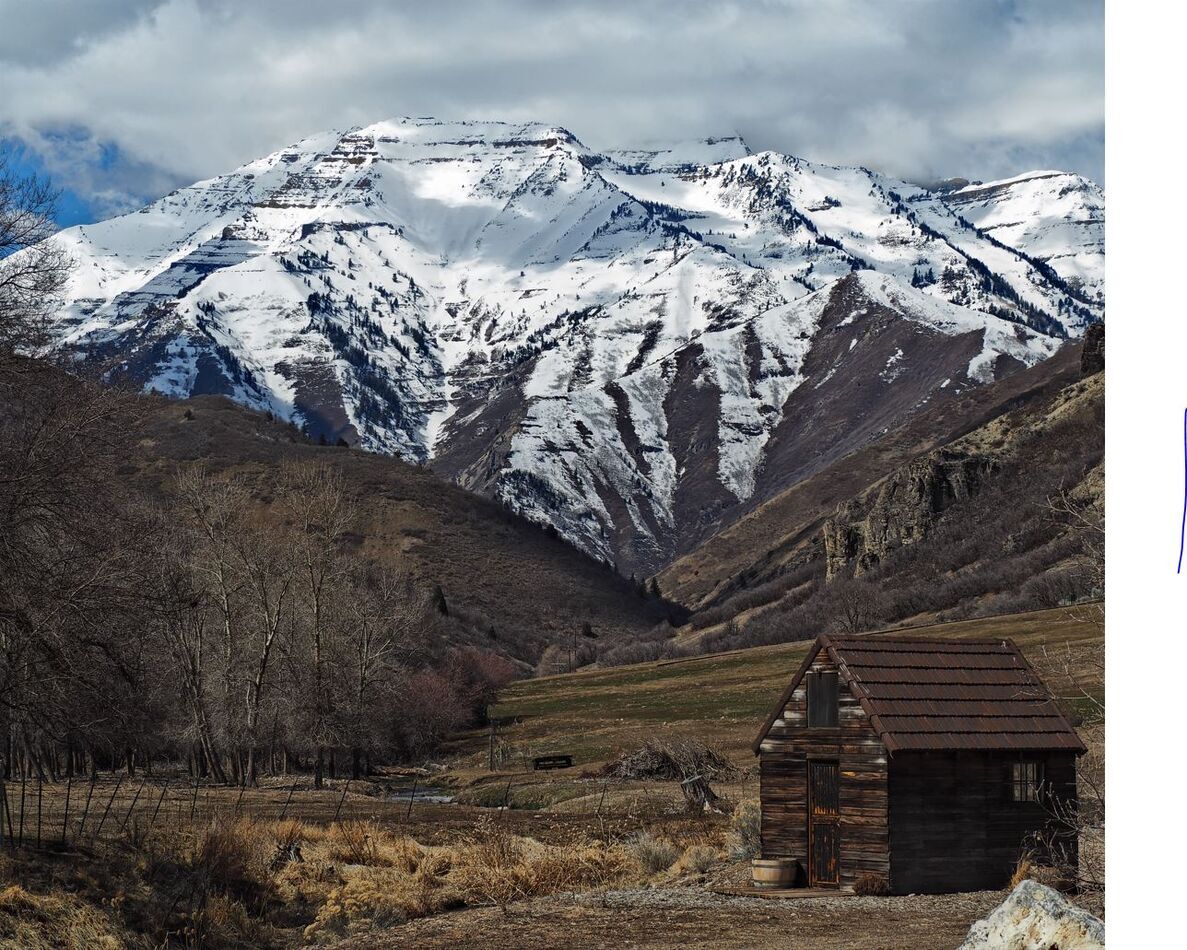
A tad brighter than your original maybe? I wanted to keep the sky in the photo and the colors more natural than unreal.
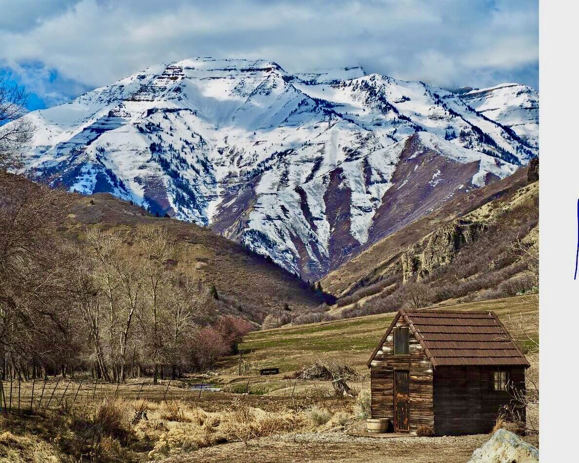
MINE
YOURS
Feb 4, 2023 14:00:40 #
m43rebel wrote:
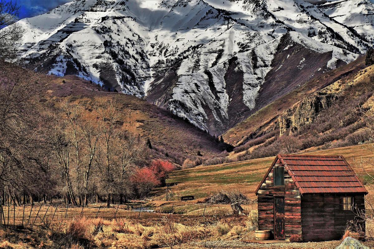
Based on some of your feedback. I thought I would simply back off the saturation a bit and see what happens. Here is the result. Your thoughts?
This now looks great in my honest opinion!
Feb 4, 2023 14:06:50 #

m43rebel wrote:
I had been struggling with one of my photos. I liked the composition but the day I took it was dull and overcast. . . . .
I appreciate any feedback you could give me ... even derisions. LOL
I appreciate any feedback you could give me ... even derisions. LOL
Looking at all the comments, I notice that none of them, even mine, mentioned the change in composition between your first and second images.
I feel you lost more than the mountain tops when you clipped them; bring them back.
Feb 4, 2023 14:15:01 #
Feb 4, 2023 14:41:16 #
Feb 4, 2023 14:47:11 #
As an aside, you may be interested in the fact that it is approximately 4 miles (6 km) from the foreground to the background in the picture.
Feb 4, 2023 18:28:15 #

Feb 4, 2023 19:23:05 #

IMHO, I like the first one the best. The second one is over saturated for my taste. Thanks for sharing you work.
Feb 4, 2023 21:16:26 #

All of this is pretty much just as personal as cropping. What one person really likes, another thinks its just wrong.
My favorite photos are the ones that are super sharp, have really great colors, and you just cant really tell whether any post processing was done.
If I was a professional, and relied on selling photos to pay my bills, I might process the Dickens out of them if that's what it takes. But I just do it to please myself and a few other folks, so I try and keep them guessing...is it processed, or is it right out of the camera?
But that perhaps has to do with my history: first camera was a Pentax 35mm manual focus, and required a hand-held light meter, and film and processing that costs too much to waste on multiple shots. You didn't have much choice except to get it right the first time, or trash it. And the favorite saying of the time was "The camera doesn't lie". Anyone remember that one?
Feb 5, 2023 14:29:22 #
Much better than the over saturated one but IMHO, back off just a bit on the saturation.
Feb 7, 2023 14:38:08 #

I really prefer the original. It looks more natural.
Your addition is a lot better. You don't have to dial up your corrections, sometimes what you see is the best.
Your addition is a lot better. You don't have to dial up your corrections, sometimes what you see is the best.
Feb 11, 2023 11:45:50 #
Thanks for all your comments and suggestions. With that, I did some additional processing and here is what I came up with.
Feb 11, 2023 11:59:58 #

m43rebel wrote:
Thanks for all your comments and suggestions. With that, I did some additional processing and here is what I came up with.
I think what you've done is lovely.
If you want to reply, then register here. Registration is free and your account is created instantly, so you can post right away.