Wild and Crazy Post Processing
Feb 3, 2023 22:43:16 #
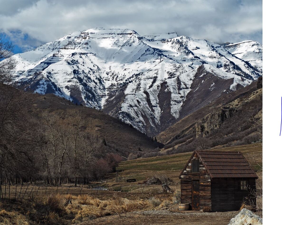
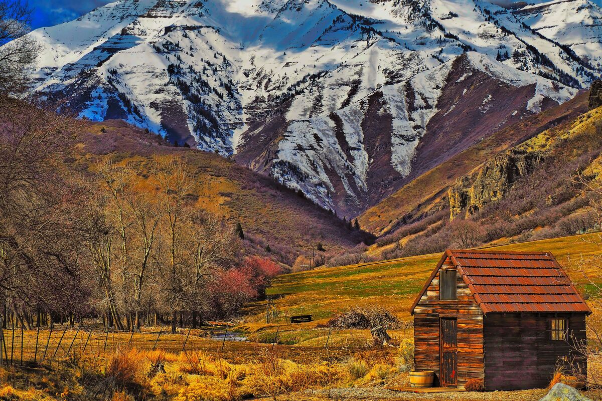
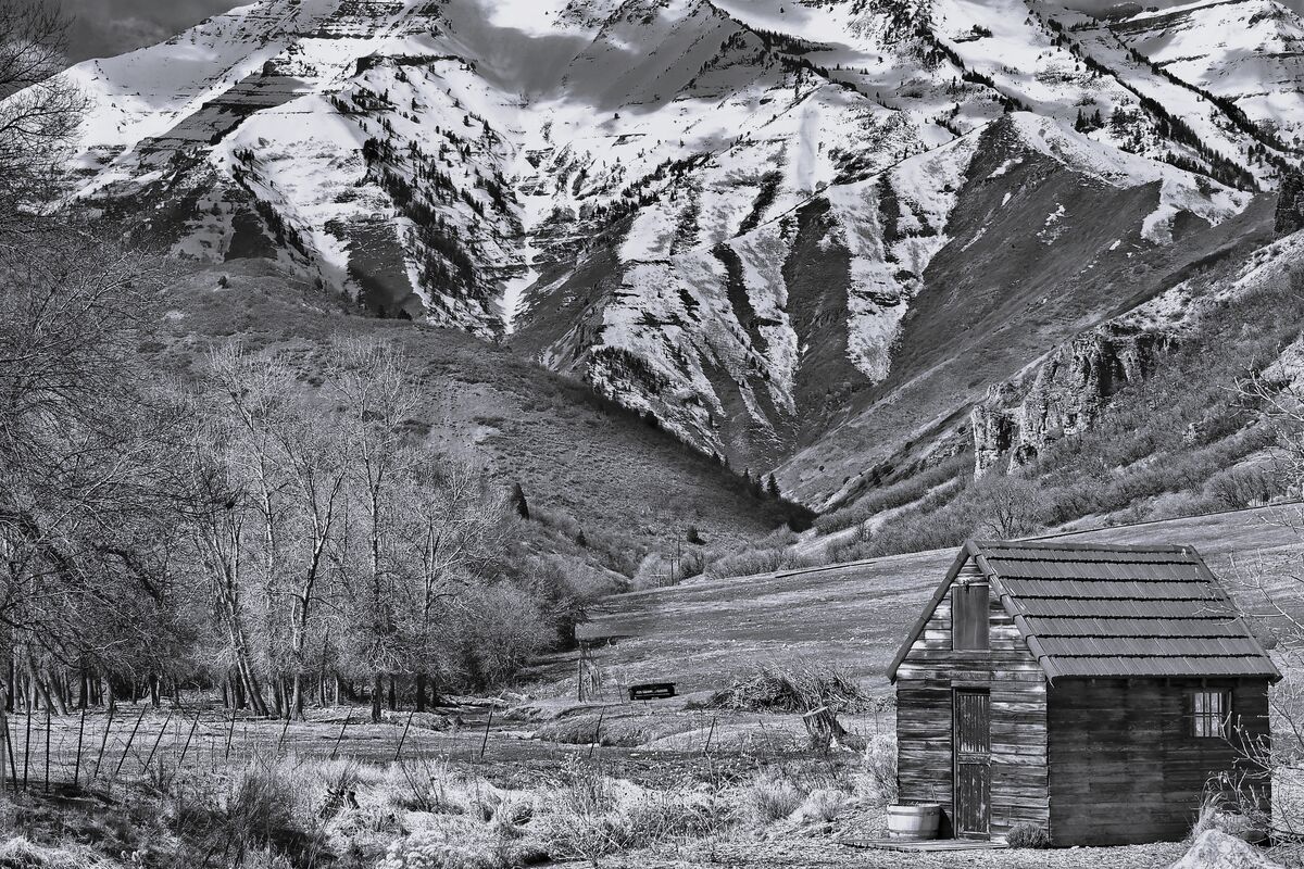
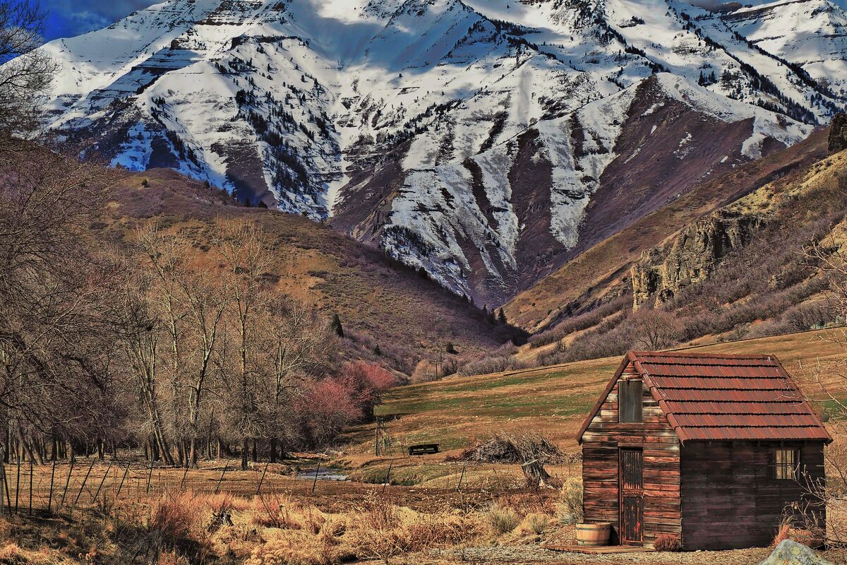
I had been struggling with one of my photos. I liked the composition but the day I took it was dull and overcast. Colors were muted and dingy. I took several approaches which were calculated to retain some sense of realism. But nothing worked. It continued to look uninspired and uninspiring.
Then I noticed some camera reviews by Ken Rockwell, who many of you have read. Many of his sample landscape images were surprising in their oversaturated, almost neon color effects. He is honest in his preference for strong vibrant colors. I thought to myself ... self ... nothing I have tried has worked so far. Why not give up on a realistic visage and try Ken's oversaturated and overstated approach to color application.
Here was my approach, using Luminar Neo:
1 ... I lightened exposure extensively,
2 ... triple saturated the existing colors,
3 ... added significant contrast,
4 ... added significant sharpening,
5 ... then added a strong "golden hour" coloration.
6 ... After that, I upscaled the image 2x with VanceAI Upscaler.
First, I appreciated how much I could lighten the exposure from my Olympus em10 file. Additionally, the dullness of the image started to come to life. I certainly left the world of realism. But as I continued to look at the results, I began to see the exaggerated colors in the same color pallet used by oil painters, strong, bold, and bright. The more I examined it, the more interesting the image became.
Most of you probably have tried this, and I am just a newby in the theater of wilder colorations. I have been dabbling in photography for decades, but I have never really found my own style. This was just another experiment for me, though probably old hat you many of you.
Attached are before and after pictures.
I appreciate any feedback you could give me ... even derisions. LOL
Feb 3, 2023 23:14:23 #
m43rebel wrote:
I had been struggling with one of my photos. I li... (show quote)
Sorry, but I Greatly prefer the original! It could use some work, but your processed image is way overdone. Of course, your mileage may vary. Hope you're not angry.
Feb 3, 2023 23:27:02 #
As they say,, "Beauty is in the eye of the beholder", so if you like your edit that is great. Stick with it, but for my taste I prefer the original, even tho I would do some subtle edits to it.
BUT, I am not an artistic expert and only go by what I like. There is some merit to your edit that I appreciate but for my taste I would have toned it down a little bit.
I also appreciate someone who edits to their taste and not to please the mainstream "experts". Keep it up, do what you like with your photos.
Feb 4, 2023 05:38:57 #

Oh, with and without the "as seen on TV" amber sunglasses. You have given us a 6 part receipt for cooking the second photo. The second looks very painting like... perhaps you "over-cooked"...
To compromise and make ygelman happy, blending the two photos with layers will fall pleasantly between.
To compromise and make ygelman happy, blending the two photos with layers will fall pleasantly between.
Feb 4, 2023 06:06:05 #

Your appetite must be a bit jaded if you prefer #2. By all means do that sort of editing as an occasional diversion but don't lose sight of the goal of boosting shots while still holding on to a natural look. IMO everybody should see that as Editing 1.01. Get that under your belt first. The experimenting can come later.
You are right that the brightness levels needed adjusting and it needed more contrast. It looks like you achieved that without having the highlights becoming too harsh. However, the colouring to my eye just looks overcooked. A common problem with snow shots is that the snow can end up with a blue tint. The usual answer is to use the WB tool to shift the overall colouring away from blue towards yellow. Usually a nudge or two is all that's needed. If you'd done that I suspect that the overall colouring would have looked more vivid to your eye and you wouldn't have felt the same need for generous amounts of saturation.
If you aren't using the HSL tool (or whatever your editor's equivalent is) for saturation etc, you should do. Sliders that give global adjustments to saturation are far too limiting. And you can use the HSL tool for tint shifts. For example your edit has a garish look to it and the usual culprit is yellow or yellow/green. You could use the HSL tool to tint-shift yellow towards orange a little and desaturate it somewhat. Orange may need a little desaturating too. That adjustment to yellow will make the biggest difference to the overall garish, overcooked look, but you can tweak the saturation of all of the colours individually as required. That's far more effective than using global saturation adjustments.
Another thing that I do to add colour to grey shots is to use split toning. Usually in Lightroom I add blue (~218) to the highlights and orange (~33-40) to the shadows at a saturation of 3-10 (out of 100). It varies a lot from shot to shot. However, in your case you already have an overall blue cast so it possibly needs just the orange tint to the shadows. That will help the brown mountainsides to stand out and look more colourful. Much will depend on whether you give it the WB adjustments I recommended.
Feb 4, 2023 06:24:15 #
I also prefer the first, but downloaded the second and clicked on the B&W filter in "Photos"; better than the color one in my opinion...
Feb 4, 2023 07:19:13 #
Feb 4, 2023 07:38:58 #
Feb 4, 2023 08:42:24 #
Feb 4, 2023 09:51:33 #
I too like saturated colors. But there is such a thing as over-saturated, and I think you are there! I think about 1/3 of the way back toward the original would be about right for me! JMHO
Feb 4, 2023 09:58:03 #

First of all, It's a great picture with lots of interest. I understand why you went the direction of #2. I think if you took the saturaction down a bit in it, it would be really nice. For my taste, it's overdone. But I know lots of people will like it.
Feb 4, 2023 11:38:08 #
Thanks for the insightful comments from everyone. Yes, this was an exaggerated exercise. But the comments have been helpful as I tackle a different approach with the original.
Feb 4, 2023 11:42:06 #

Feb 4, 2023 13:53:28 #
Based on some of your feedback. I thought I would simply back off the saturation a bit and see what happens. Here is the result. Your thoughts?
Feb 4, 2023 13:56:59 #
m43rebel wrote:
Based on some of your feedback. I thought I would simply back off the saturation a bit and see what happens. Here is the result. Your thoughts?
Now that's nice to my eyes
If you want to reply, then register here. Registration is free and your account is created instantly, so you can post right away.