Two versions done two different ways
Nov 4, 2022 13:46:32 #

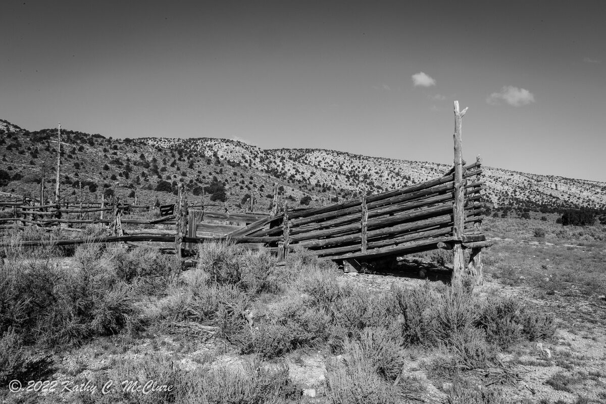
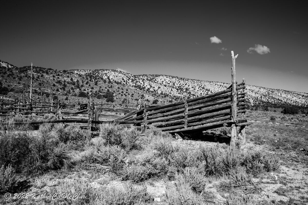
I maybe should post this in the Post Processing section, but I'll put it here. I shot this in colour, but thought at the time it would make a really nice B&W. My automatic thing to do was to do it in LR. So I simply clicked on the B&W button in LR, then did a tiny bit of tweaking. Then, someone reminded me of Silver Eflex, so I tried doing it in that program. I'm curious which one y'all think is better (without my telling you which is which). I sure have a favorite.
Nov 4, 2022 13:50:12 #

I like the first more. I'm not fond of the dark sky dome in the second.
Nov 4, 2022 13:51:30 #
Longshadow wrote:
I like the first more. I'm not fond of the dark sky dome in the second.
Thanks, Longshadow.
Nov 4, 2022 14:01:34 #
TheShoe
Loc: Lacey, WA
The first looks like there are dirt specks in the darker part of the sky and has obliterated the patch of clouds peeking over the ridge. The second has a cleaner sky and the timbers appear cleaner. I have no objection to the darker sky. I prefer the second.
Nov 4, 2022 14:30:27 #
Nov 4, 2022 15:01:41 #

I prefer #2 for the overall tonal range, but with subtle, selective adjustments. I would like the sky to not be quite as contrasty, and I would like the foreground dirt to be a bit darker. One easy way to adjust the foreground is with dodging and burning. The sky might require more work, depending on which software you use.
Kathy, I'd like to make my pedantic statement of the day and point out that we're not talking about "better" - merely personal preferences
Kathy, I'd like to make my pedantic statement of the day and point out that we're not talking about "better" - merely personal preferences
Nov 4, 2022 15:43:18 #
TheShoe wrote:
The first looks like there are dirt specks in the darker part of the sky and has obliterated the patch of clouds peeking over the ridge. The second has a cleaner sky and the timbers appear cleaner. I have no objection to the darker sky. I prefer the second.
Thank you.
Nov 4, 2022 15:43:40 #
josquin1 wrote:
Nr. 1 . The 2nd one is too contrasty for me.
Thanks.
Nov 4, 2022 15:47:05 #
Linda From Maine wrote:
I prefer #2 for the overall tonal range, but with ... (show quote)
I know what you mean about preferences. That's exactly what I was curious about. I see that the sky might be a problem if I were to darken the ground, wouldn't that have an adverse effect? Like flatten it?
Nov 4, 2022 15:54:43 #

#2 except for the strange banding in the sky which looks unnatural. #1 looks a little flat to my eye and therefore lacking the visual drama of #2.
Nov 4, 2022 16:37:56 #
AzPicLady wrote:
I'm not sure what you're referring to; the sky would not be part of the selective editing of the foreground.I know what you mean about preferences. That's exactly what I was curious about. I see that the sky might be a problem if I were to darken the ground, wouldn't that have an adverse effect? Like flatten it?
At any rate, I wasn't having much luck in trying to burn in the lightest patches of bare foreground. File size or tones or the textures, not sure. A little cloning worked better, but the result was minimal "improvement."
It will be fun to learn which is your preferred result from the two you posted

Nov 4, 2022 16:39:28 #

I would like #2 with a less contrasty/banded sky. The rest of the image is quite nice.
Nov 4, 2022 16:53:04 #
kpmac wrote:
I'm not seeing banding (such as from overprocessing a jpg), just faint cloud cover - if you're referring to the lighter patch just above horizon on the right side.I would like #2 with a less contrasty/banded sky. The rest of the image is quite nice.
Nov 4, 2022 16:58:44 #
R.G. wrote:
#2 except for the strange banding in the sky which looks unnatural. #1 looks a little flat to my eye and therefore lacking the visual drama of #2.
Thanks.
Nov 4, 2022 16:59:18 #
If you want to reply, then register here. Registration is free and your account is created instantly, so you can post right away.