The Ugliest Uniform in MLB
Sep 8, 2022 10:24:00 #
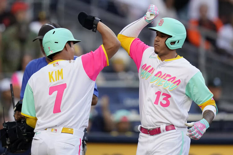
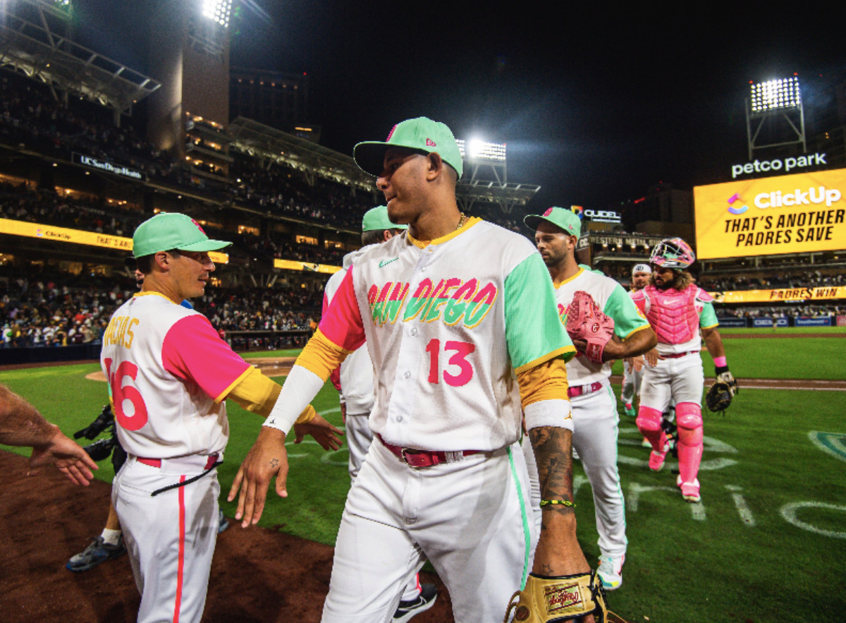
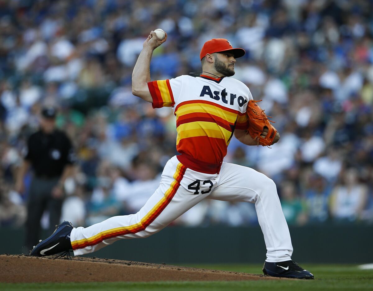
Yesterday, I was flipping through the TV channels, and stopped at an MLB game between the Arizona Diamondbacks and the San Diego Padres (in San Diego). Do my eyes deceive me? Has to be the ugliest MLB uniform I have ever seen...even out-did the striped Houston Astros uniform of the past. San Diego presented a combination of mint green on one sleeve and putrid pink on the other sleeve. Add in a touch of yellow trim, a mint green hat, the San Diego words in the same obnoxious colors in a hideous font, numbers in pink, and players name in an unreadable yellow against white. Also, check out the catcher with pink chest protector, shin guards, and mask. What were they thinking?
Sep 8, 2022 10:30:36 #
It's a trend.
https://www.nbcsports.com/washington/wizards/houston-rockets-unveil-new-uniforms-honoring-san-diego-roots?amp
https://www.nbcsports.com/washington/wizards/houston-rockets-unveil-new-uniforms-honoring-san-diego-roots?amp
Sep 8, 2022 10:33:42 #
Sep 8, 2022 10:35:57 #
Sep 8, 2022 10:38:27 #
Sep 8, 2022 10:44:35 #
Good God, you're right, the poor Padres must be embarrassed to be seen in public with those uniforms. Perhaps that's why they're being pounded so roundly by the Dodgers this year.
Sep 8, 2022 11:21:46 #
JTC wrote:
I think George Costanza (Seinfeld) designed them 
But they are 100% cotton so they breathe
Sep 8, 2022 11:23:17 #
whatdat wrote:
Sounds like a “woke” decision?
You are absolutely correct!
Our military uniforms are next for a makeover. Pink helmets
Sep 8, 2022 15:06:03 #
Sep 8, 2022 15:09:09 #
JoSkalka
Loc: San Diego, CA
This is all part of the MLB trying to shake things up a bit. The Padre's love them. They're a little too Miami for me, but they're growing on me. Plus they only wear them on Friday home games. Wednesday was an exception because it was a Juan Soto jersey give away. Here's a link to an explanation with some photos of others teams uniforms.
https://www.espn.com/mlb/story/_/id/34543383/mlb-power-rankings-week-22-edge-baseball-most-heated-division-battles
https://www.espn.com/mlb/story/_/id/34543383/mlb-power-rankings-week-22-edge-baseball-most-heated-division-battles
Sep 8, 2022 15:38:15 #
FreddB
Loc: PA - Delaware County
It's ALL (and ALWAYS) about the $$$$. Another jersey to sell.
Their fans, either woke or stupified, WILL buy it!
Their fans, either woke or stupified, WILL buy it!
Sep 8, 2022 17:19:05 #
You got that right. I'm thinking that the ugly colors were to test the camera man's filters, or something obvious to the cinema gang of the MLB.
Those (ugly) uni's were supposed to be for Friday Games. I'm thinking that the Padres were trying to get rid of the jinx, by wearing them on Wednesday. (Maybe it worked?)
We aren't sure [what committee] approved those uniforms, but I doubt that the players
had much of a say in the matter.
[[Maybe leave the pink colors off, next season.]]
Sep 8, 2022 17:24:10 #
I doubt that the Padre players had a chance to cast a vote on the combination of ugly, and pukey colors.
After watching the "new wave" of MLB uniforms, for over 70 years, I can think of a few other team uniforms that made you look twice. I remember the Houston Astro's bright uniform tops, back in the day.
Now they are just (the norm), in baseball jerseys.
......I still [take a step back] when I see the "Banana Suits" that the Padres showed up with a few decades ago.
Ugly, !
Sep 8, 2022 17:26:27 #
Please!
No Pink batting helmets.
How about clear Plexiglas helmets, to show off their $50 hair cuts?
No Pink batting helmets.
How about clear Plexiglas helmets, to show off their $50 hair cuts?
Sep 8, 2022 20:07:36 #

If you want to reply, then register here. Registration is free and your account is created instantly, so you can post right away.