Which is Preffered & Why
Sep 1, 2022 09:12:14 #

I agree with Salvagediver on this one. #3 for me. I just found #2 a little too contrasty. But I can see how some others would prefer it. "To each his own", said the old lady as she kissed the cow.
Sep 1, 2022 10:00:54 #

SalvageDiver wrote:
Of the three options, I prefer the third one. br ... (show quote)
 You said it all!
Sep 1, 2022 10:35:58 #

I like #2 best, but I would tone down the contrast a tad. I like #3, but would bring up the contrast a tad. Getting somewhere in between those two would probably by nice.
Sep 1, 2022 10:37:44 #
Sep 1, 2022 11:13:58 #

I'm voting for number 2. Great tonality and details.
--Bob
--Bob
TheShoe wrote:
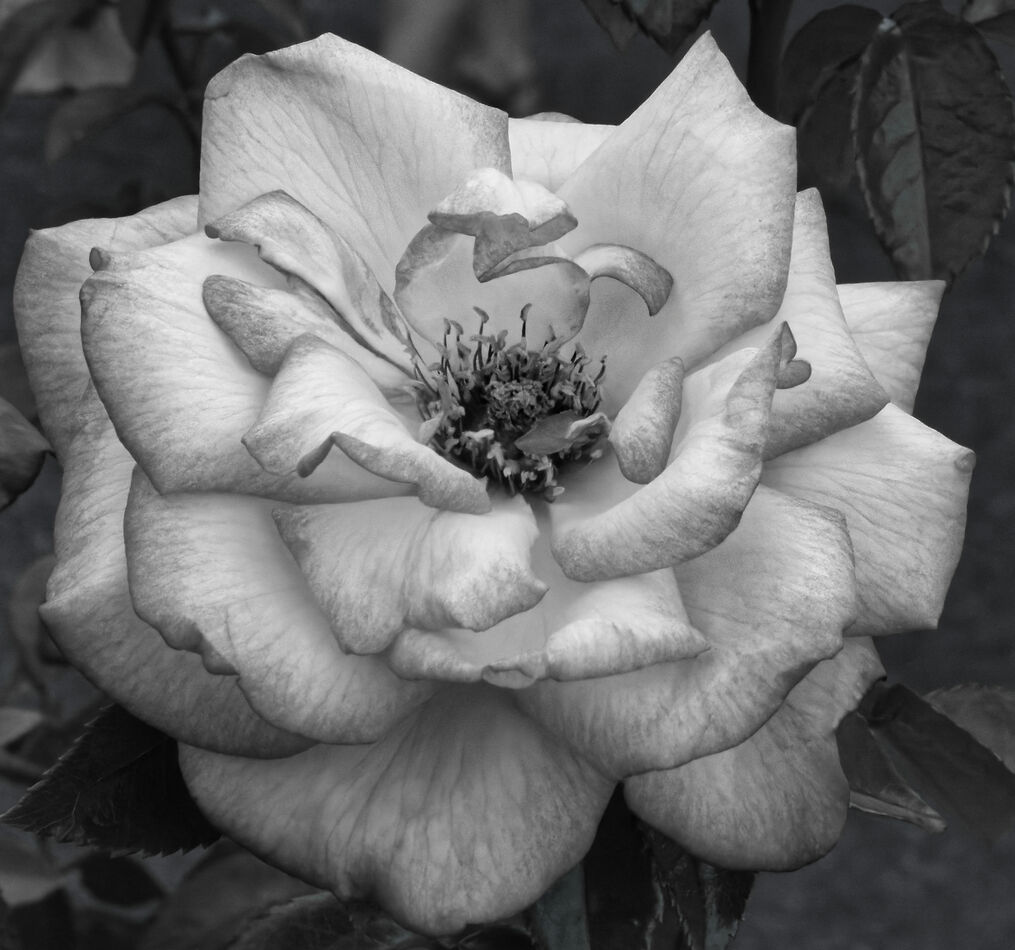
These three are B&W conversions of the same color photo. Two of them were done using different presets of DxO PL 5.4, while the third was just me fiddling with sliders.
Sep 1, 2022 13:58:20 #
TheShoe
Loc: Lacey, WA
Thanks to all who have replied, even if one of the replies was not relevant to the question. For any who are interested, the conversions done were: 1 - DxO B&W Preset, 2 - DxO HD B7R Preset, and 3 - me fiddling with sliders. I will try some additional fiddling and post the result in this thread.
Sep 1, 2022 14:11:44 #

amfoto1 wrote:
Of the three, I like the 3rd the best. It just seems the most appropriate for the subject matter.
BUT, I find #3 a bit too soft and flat.
I hope you don't mind... I tried to get somewhere in between #2 and #3. Sharper and a little more contrast than #3, but a little bit lighter touch than #2.
I'm not sure how it will look uploaded here, but here it is anyway...
BUT, I find #3 a bit too soft and flat.
I hope you don't mind... I tried to get somewhere in between #2 and #3. Sharper and a little more contrast than #3, but a little bit lighter touch than #2.
I'm not sure how it will look uploaded here, but here it is anyway...
A superlative floral portrait 🖤🤍🤍🤍🖤
Sep 1, 2022 14:16:46 #
TheShoe
Loc: Lacey, WA
SalvageDiver wrote:
... Adding a little glow, like an Orton effect would further add to the delicate feel of the flower. ...
Thanks for commenting. I have a question regarding one of your points. I see plenty of examples of creating an Orton effect using PS layers; however, I use DxO PL5 which does not have similar layers. Do you know of a process for producing the effect without using layers?
Sep 1, 2022 15:25:50 #
Charlie157
Loc: San Diego, CA
I like all three. The first photo is interesting. When I first look at it I don't see a rose, right off. I see shapes and forms. The second and third photos I see the rose. But the "coloring" of the image gives the rose a different feeling to it, if that makes sense.
Sep 1, 2022 16:06:07 #
TheShoe wrote:
These three are B&W conversions of the same color photo. Two of them were done using different presets of DxO PL 5.4, while the third was just me fiddling with sliders.
I'm not fond of colorful flowers photographed in monochrome. So, I'm voting for none.
Sep 1, 2022 18:07:51 #
TheShoe
Loc: Lacey, WA
I tend to agree with all who have preferred more detail in the image. I also agree with those have said that the second image perhaps went too far. This is a compromise between numbers 2 and 3. Have I gone too far or not far enough?
Sep 1, 2022 18:31:48 #
Sep 1, 2022 18:37:13 #

All nice- first one is the most interesting, I like the exposure and contrast of the 2nd one and the third one has the least amount of interest- kind of bla.
Sep 1, 2022 18:49:20 #

I vote for ALL THREE... It just shows that beauty lies in the eyes of the beholder... This is NOT an exact science governed by absolute rules.
Sep 1, 2022 19:19:21 #
TheShoe wrote:
Thanks for commenting. I have a question regarding one of your points. I see plenty of examples of creating an Orton effect using PS layers; however, I use DxO PL5 which does not have similar layers. Do you know of a process for producing the effect without using layers?
Sorry, I know nothing about DXO's photolab. However, it it's anything like Lightroom, you can try creating that ethereal glow by reducing clarity. You can further tune that effect by adjusting texture and dehaze. I don't know if or how that translates to dxo pl5.
I hope that helps
Mike
If you want to reply, then register here. Registration is free and your account is created instantly, so you can post right away.