Which is Preffered & Why
Aug 31, 2022 18:29:39 #
TheShoe
Loc: Lacey, WA
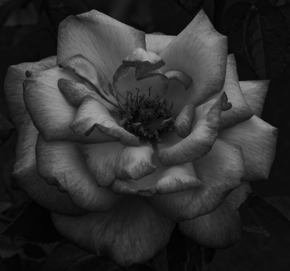
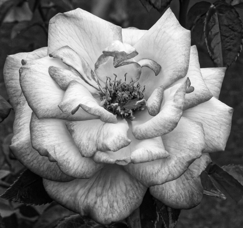
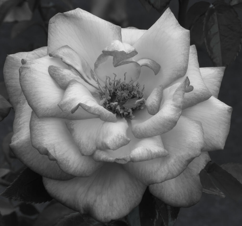
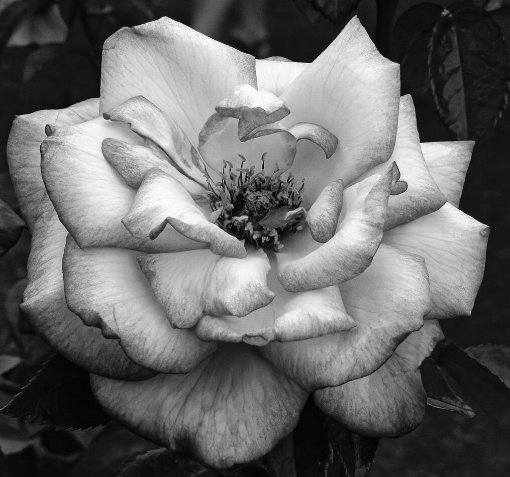
These three are B&W conversions of the same color photo. Two of them were done using different presets of DxO PL 5.4, while the third was just me fiddling with sliders.
Aug 31, 2022 19:24:11 #
Of the three options, I prefer the third one.
The first just looks underexposed, without any benefit.
The second, while a little brighter, is way to contrasty. The contrast loses the soft delicate nature of this flower.
The third has better exposure and softer contrast, but it still feels too hard and a little underexposed. IMO, the flower would look better if it was just a little brighter, bringing back a little more of the softer feel. Adding a little glow, like an Orton effect would further add to the delicate feel of the flower. Although, I would try to maintain some of the detail in the center of the flower. I like how the background is dark enough to isolate the flower but still have enough shadow detail so the viewer knows what's back there.
Just my preferences, YMMV.
Aug 31, 2022 19:30:52 #
I agree with SalvageDiver. I like the 3rd one best. It looks most like an actual B&W image from a film camera.
will
will
Aug 31, 2022 19:43:41 #

TheShoe wrote:
These three are B&W conversions of the same color photo. Two of them were done using different presets of DxO PL 5.4, while the third was just me fiddling with sliders.
#2
#3
#1
#2 has eye-catching contrast and details.
Aug 31, 2022 19:43:59 #
I also totally agree with SavageDiver! Nice conversion to black and white. I might also add a little local contrast (clarity, texture, or whatever your editing software calls it) to the center of the flower.
Aug 31, 2022 19:50:50 #
Badgertale
Loc: Albuquerque, New Mexico, USA
I tend to gravitate to contrast...but, I like the first one because it is dark and mysterious. I would frame it and mount an LED just above it in a dark hallway. Three is joyous and happy. It does look like film...The middle one is fantastic. The contrast peaks my interest. All of them are good. The middle one is my favorite, though.
Aug 31, 2022 20:52:21 #

I preferred the second one as the details seem clearer. Nothing wrong with any of them, just my preference!
Aug 31, 2022 21:14:45 #
Aug 31, 2022 22:04:41 #

I don't like any of them when all of them would've looked 100% better in their natural color
Sep 1, 2022 01:50:09 #
amfoto1
Loc: San Jose, Calif. USA
Of the three, I like the 3rd the best. It just seems the most appropriate for the subject matter.
BUT, I find #3 a bit too soft and flat.
I hope you don't mind... I tried to get somewhere in between #2 and #3. Sharper and a little more contrast than #3, but a little bit lighter touch than #2.
I'm not sure how it will look uploaded here, but here it is anyway...
BUT, I find #3 a bit too soft and flat.
I hope you don't mind... I tried to get somewhere in between #2 and #3. Sharper and a little more contrast than #3, but a little bit lighter touch than #2.
I'm not sure how it will look uploaded here, but here it is anyway...
Sep 1, 2022 06:41:04 #

Sep 1, 2022 06:56:59 #
Sep 1, 2022 07:14:27 #
burkphoto wrote:
#2
#3
#1
#2 has eye-catching contrast and details.
#3
#1
#2 has eye-catching contrast and details.
I agree with this. I like B&W sharp enough with which to shave. (See Mrs. Swindell, I remembered not to end that sentence with a preposition…😎.) I appreciate the vein detail in the lower petals.
Sep 1, 2022 07:58:23 #

The second has more detail, so I prefer it, followed closely by the third. The third? Way too dark.
Sep 1, 2022 08:10:20 #
petrochemist
Loc: UK
burkphoto wrote:
#2
#3
#1
#2 has eye-catching contrast and details.
#3
#1
#2 has eye-catching contrast and details.
Same here. And for the same reasons as listed above by those who chose the same order:)
If you want to reply, then register here. Registration is free and your account is created instantly, so you can post right away.