Thoughts on edit
Mar 29, 2022 10:54:15 #
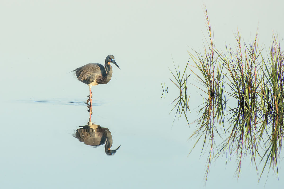
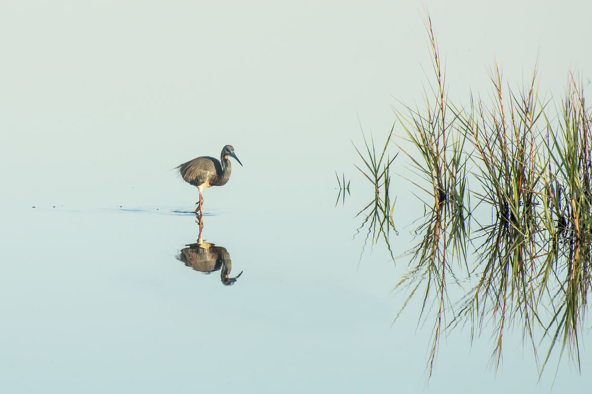
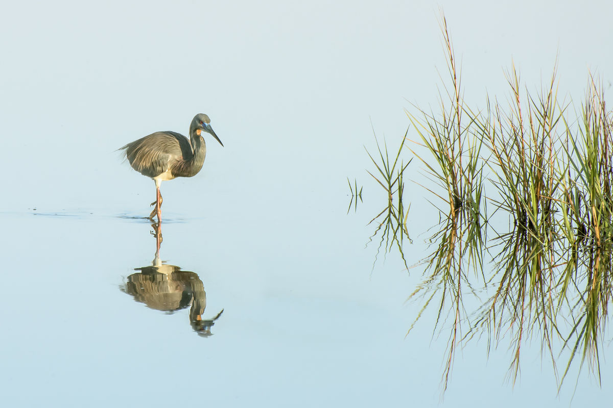
Interested in your thoughts on how I edited this photo. The first is my last edit and the last is after basic editing.
Do you think the bird needed to be enlarged, any other thoughts will be appreciated. Thank you.
Do you think the bird needed to be enlarged, any other thoughts will be appreciated. Thank you.

Mar 29, 2022 10:56:37 #

You might want to post this in "For Your Consideration" for a more detailed critique.
Mar 29, 2022 10:58:26 #
Jerry G wrote:
Interested in your thoughts on how I edited this photo. The first is my last edit and the last is after basic editing.
Do you think the bird needed to be enlarged, any other thoughts will be appreciated. Thank you.
Do you think the bird needed to be enlarged, any other thoughts will be appreciated. Thank you.

Mar 29, 2022 11:05:03 #
I'm no pro, but visually I prefer the 1st. photo. To my eye it makes good use of the "rule of thirds" that I have read about. It's a really nice photo, wall worthy.
Mar 29, 2022 11:08:42 #

Look at the image details at the 1:1 pixel resolution. Note and address the following:
1. There's a 'ghost' of the body and beak in the water slightly below the bird. I'm not sure if you moved the bird or what causes this. But, should be removed / corrected.
2. That same ghost beak / body appear in the water as well. Maybe this is just a reflection artifact of the water rather than a processing error? But, I don't see this reflection / ghost in the original, so it seems to have been added in the processing.
3. Look at the small halo of grain / luminance noise all around the bird. Your noise reduction and / or sharpening isn't tight enough to just select the bird from the water. For comparison, click into the details of the grass and note none of the blades have this surrounding halo.
4. Consider the temperature / yellow of the image. Of course, this is a matter of personal preference. I'd experiment with a bit less yellow / warm and a bit more red (removing the green tint) that is the yellow-green of this version. I think a bit more 'blue' for blue water will work better, something that should occur as you adjust the temp of the WB.
Overall, the crop is a great improvement as well as removing the sandbar (?) distraction.
Mar 29, 2022 11:37:59 #

I like the first one the most.
If it is a 24x36 aspect ratio (8x12), I (myself) would crop the 17% of the left side to make it an 8x10.
Just my preference for the location of the bird.
If it is a 24x36 aspect ratio (8x12), I (myself) would crop the 17% of the left side to make it an 8x10.
Just my preference for the location of the bird.
Mar 29, 2022 12:58:13 #
Jerry G wrote:
Interested in your thoughts on how I edited this photo. The first is my last edit and the last is after basic editing.
Do you think the bird needed to be enlarged, any other thoughts will be appreciated. Thank you.
Do you think the bird needed to be enlarged, any other thoughts will be appreciated. Thank you.
Hello Jerry,
This is a very nice image and I like it a lot. Of the three images presented, I like your first image the most. Your cropping, enlarging the bird and removing the distraction below the birds reflection were very positive improvements.
While enlarging the bird, you've left some remnants of your PP. There is some of the original birds beak, including in the reflection. This wasn't in the original image so it's a PP artifact. The birds beak is fading away, which looks like a masking problem. Additionally, there is a strong white halo around the bird. This is usually due to increasing contrast and/or sharpening. It's not very obvious in a small image on your monitor, but if you were to enlarge and print, it would become much more obvious. You might also want to selective sharpen the bird. It is a little softer that the grass which, both, are the same distance from the camera, likely caused by selectively enlarging the bird.
I've seen many similar images to this, so just another type of editing you might consider would be the create a high key B&W of this image. The best ones that I've seen were converted to high key B&W images and made very simple. The colors don't seem to very important to the image and there is a lot of negative space. Converting to a a high-contrast B&W leaves the negative space to the viewers imagination. There are 5 clusters of grass. I would remove all except the tiny cluster to the very left and the next one to it. Cropping to center the bird on the left and the grass clusters on the right balances the image. These edits simplify the image down to the very basics without changing the story. Just a consideration.
Mar 29, 2022 16:30:48 #

Making the bird larger draws our attention in an obvious "this is the subject" way. But I much prefer the middle image of the three. The setting and light are wonderful, and all the empty space gives me a sense of serenity and silence. I feel more emotion about the photo when the bird isn't enlarged.
Mar 29, 2022 18:32:41 #
I reworked the final edit to take care of the ghost images and the halo from sharpening. I also adjusted the color to add a bit more blue but was not happy with it so I left the yellow as that was more like the early morning light and actually brought out the weeds which I felt was as important as the bird. After all this work I agree with Linda, the more minimalist second edit has a more serene and solitude feel. Thank you all for you comments.
Mar 29, 2022 18:57:15 #
Mar 29, 2022 18:58:35 #
Jerry G wrote:
I reworked the final edit to take care of the ghost images and the halo from sharpening. I also adjusted the color to add a bit more blue but was not happy with it so I left the yellow as that was more like the early morning light and actually brought out the weeds which I felt was as important as the bird. After all this work I agree with Linda, the more minimalist second edit has a more serene and solitude feel. Thank you all for you comments.
Mar 30, 2022 05:18:00 #

Jerry G wrote:
Interested in your thoughts on how I edited this photo. The first is my last edit and the last is after basic editing.
Do you think the bird needed to be enlarged, any other thoughts will be appreciated. Thank you.
Do you think the bird needed to be enlarged, any other thoughts will be appreciated. Thank you.
Nice set Jerry
Mar 30, 2022 13:28:03 #
Mar 30, 2022 14:03:55 #

Jerry G wrote:
I reworked the final edit to take care of the ghost images and the halo from sharpening. I also adjusted the color to add a bit more blue but was not happy with it so I left the yellow as that was more like the early morning light and actually brought out the weeds which I felt was as important as the bird. After all this work I agree with Linda, the more minimalist second edit has a more serene and solitude feel. Thank you all for you comments.
A beautiful final product. Very nice work.
Mar 30, 2022 14:18:12 #
I really appreciate the ideas and differences you've shown with this great shot! It's such an idea inspiring post as to how many ways a single image can be presented through different processing!
Thanks for posting this and to all the highly qualified ideas on how to tune it up from different perspectives!
Rob
Thanks for posting this and to all the highly qualified ideas on how to tune it up from different perspectives!
Rob
If you want to reply, then register here. Registration is free and your account is created instantly, so you can post right away.